Wannabe Awesome Me
  • Viz 'Em
    • Tiny Tableau Tips
  • Mentor Match
    • Mentor Match Blog
  • A Pop of Color

The Hunger games aka iron viz

5/11/2018

0 Comments

 
Friends!! After a five month blog vacation (a blogcation?), I'm back.  If you remember from my last post at the end of December, I mentioned that it was not my viz season.   You can read about that here.  The truth is, I've had a lot of stuff going on the last year and it took significant energy. That creative spark died down and that made me super sad.   For reasons I've touched on in my new blog (about life, which you can read about here) coupled with an Iron Viz theme I was really excited about, I felt that creative spark and decided to viz. 

May the Odds Be Ever in Your Favor

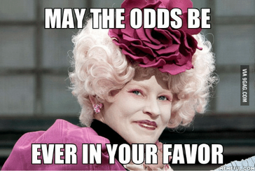
My first thought when the Iron Viz theme was announced was "May the Odds be Ever in Your Favor", a quote from Effie Trinket, Advisor to Katniss Everdeen. 
Picture
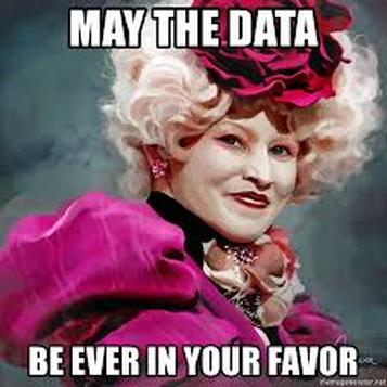
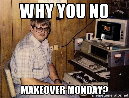
When I was looking for this meme, I also found this one, which I thought was fun and *had* to include in this post. 
Picture

Let the Viz Begin

I knew I wanted the title to be 'May the Odds be Ever in Your Favor'.  I found some data about the most prominent tributes (the players in The Hunger Games) survival and career status and started to create. 
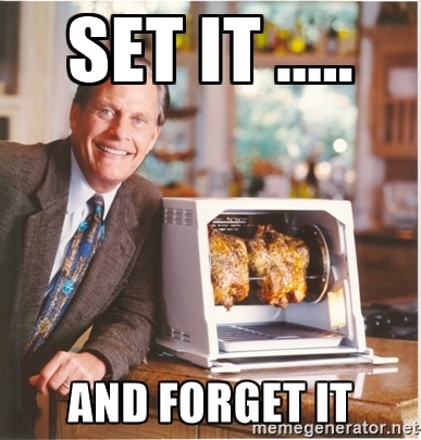
I tried a few different visualizations but kept coming back to the survival and the odds.  Career tributes are favored more than "volunteers." I kept it simple and just focused on a couple of things.  I worked on this viz for a hour or so to explore the data and then worked on refining the viz for a total of one hour spread over three days the week the submissions are due.  Here's what that effort got me:
Picture
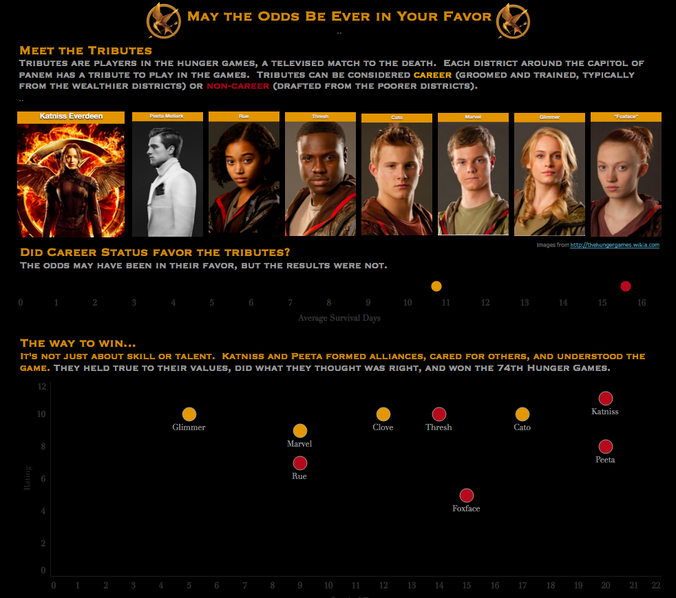
I'm submitting this viz, not because I think I'm going to win.  It's not spectacular or even the complex.  From a technical perspective, I just used circle plots.  When I asked Matt Francis for suggestions to make it better, I specifically asked him to provide me tweaks I could in limited time with my rusty skills.  I really appreciate his help to scope the suggestions for me.  

Why Submit?

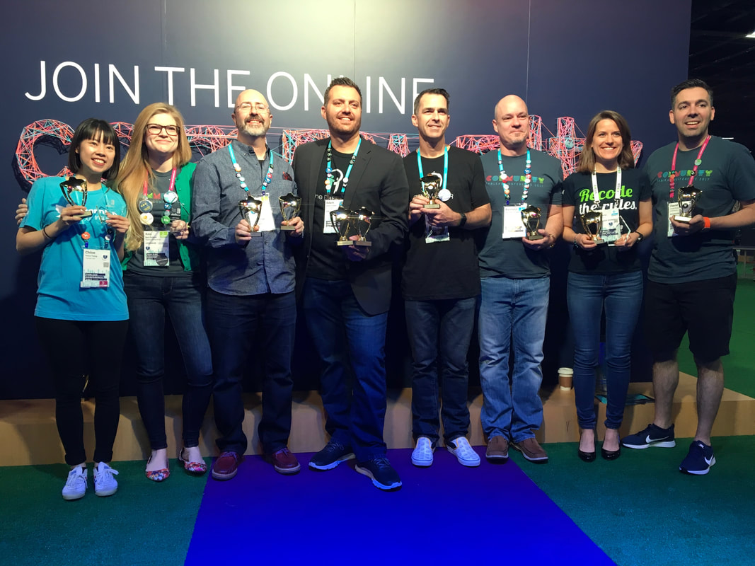
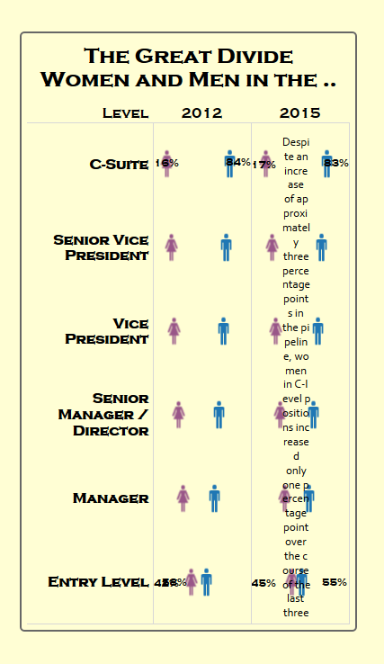
1. I have been a big supporter of having more women enter the feeder contest, so I felt like I had to show up. 
2. I felt inspired and wanted to share that.
3. Why not? After five years and a couple of feeders of wanting to enter, I didn't have the time or energy. So when I finally did, why not enter?  The worse that can happen is that I don't win and someone thinks this is WTF worthy.  Or maybe, one of the judges is like the world's biggest THG fan and really appreciates that I've used a color palette that was used in movie promos for the book.  Or they see the nuance of the game-makers rating (they tend to rate them similarly but will choose to rate a tribute higher than the others to make them a target). Or maybe they just love dystopian novels.  But seriously, there was no good reason for me not to submit it. This submission was for me. 

To the Iron Viz Feeder Contestants...

0 Comments

MY 2017 VIZ SEASON

12/28/2017

1 Comment

 
I have really been enjoying the retrospectives of 2017 from the Tableau Twitter community. It's a great way to celebrate what someone has done and serves to frame up what people might want to do in the year ahead.  In looking back at 2017, I came up with some interesting thoughts of my own.  
​It's not viz season for me.
I fully believe in having seasons of life.  I had a season of running which I thoroughly enjoyed from 2014-early 2017.  I am currently not in that season.  I am currently in my weight-lifting season, which I am LOVING. But enough about fitness.  I can't remember the last time I did a visualization.  It might have been an opioid viz in July?  Actually, it was the iron viz retrospective in October. Needless to say, it's not a regular thing.  I fully recognize that I don't feel that creative spark to viz anymore.  I once did a mother's day card and a comic book panel page in Tableau (shown above, my viz from 2014). Now, when I do viz, it's much more analytical, less creative (shown above, iron viz retrospective 2017).  

There are a couple of reasons why I believe I don't feel that spark. I'm working a lot and have a lot on my mind. Whether it's at my full-time job or organizing viz-related events (like the Tableau Fringe Festival), or putting together coaching materials, my brain is ON basically all the time.  This year has been stressful.  It started with a pretty significant cyber-bullying and harassment case, I trained for the Glass Slipper Challenge, prepped for a fitness competition, had some family issues to contend with, and am really trying to get Pretty Strong Smart to take off.  More stress equals less creativity for me.  

For years, I have had this goal of being a technical resource in the Tableau community.  I wanted that because I thought (and to a certain extent still believe) that that's what the Tableau community wants.  While Tiny Tableau Tips was fun and proved to be a good resource, I'm not a technical resource.  
And I'm okay with that. 
It's Cheerleading season
Picture
Image from Paste Magazine/SNL and one of my most favorite SNL skits of all time.
What I have been LOVING is being able to provide the Tableau community a space to share their knowledge and increase their visibility.  The fact that TFF is in its third year and is in three regions is astounding. I love thinking of ways to make it better, to provide more content, to make it official (so people can attend it as training for work and not feel compelled to take off to participate).  I feel like a Tableau community cheerleader, and I think it's a role that suits me.  I love being able to connect people and facilitate learning.  
So Now What?
Where does that leave this data viz hobbyist?  Well, there are some things that I am passionate about when it comes to dataviz and the Tableau community.  
  • Continuing the progress on TFF. 
  • Continuing the Tableau Wannabe Podcast and making it better. 
  • Supporting diversity and inclusion in the Tableau contests (starting with Iron Viz because there's energy around it).
  • Sharing institutional knowledge.  There has been a tremendous boom in the Tableau community.  I feel like I was late to the game when I started getting involved in the Tableau community in 2013, now that feels like two decades ago.  I think there are some observations to share since that time (look for this to be a podcast feature).  
  • Sharing my knowledge about dataviz with kids.  I did a one hour talk with first and fourth graders and LOVED it. I have planned out a curriculum for a kids camp to teach kids about VizMagic.  I'm reminded of the old voting adage, vote early and often.  Expose kids to viz early and often and spark an interest that they can then determine what they do with it.  
Picture
Image credit: WakeUpWilkesBarre
Lastly, the thing that I feel a spark about is helping Tableau community members reach their goals.  This is a great community comprised of really smart and supportive members.  So how can I contribute best?  By helping all y'all reach your goals.  I can fit pieces of the puzzle together when it comes to career planning. I have a conference that provides visibility and I can do my part to make it a diverse and inclusive conference.  I LOVE this stuff and I would love to help anyone who wants some support and accountability.  I think the last two images I have posted on my IG accounts is a really nice way to sum up my thoughts as I head in to 2018.
Picture
Picture
1 Comment

2017 Vizzies

11/13/2017

0 Comments

 
Written by: Matt Francis and Emily Kund
Picture
At data17 in Las Vegas, we had the great privilege to present the 2017 Tableau Community Awards, The Vizzies. These are awarded across 11 categories and are voted for by members of the Tableau community. Recipients of the awards have told us that the fact that it's a community award makes them very special.
This year we had the biggest number of votes yet and the largest number of nominees with lots of new names which was great to see. It's a great sign of the growth of the community and wonderful opportunity for people to be recognized for their contribution by their peers.
We gathered by the community wall in the expo hall at #data17 at 8am on the last morning of conference, and even though it was early we had a great crowd of people who came to support and applaud the winners. Speaking of winners, let's see who won what this year.

First up was best blog, and this year it was won by Charlie Hutcheson https://twitter.com/CharlieHTableau which you can read at www.learningtableaublog.wordpress.com.  llearningtableaublog.wordpress.comlearningtableaublog.wordpress.comearningtableaublog.wordpress.com

The Best Dashboarder, awarded to the best designer of dashboards, went to Mike Cisneros https://twitter.com/mikevizneros  and mikevizneros.com

Biggest Growth for the person who's knowledge (demonstrated through the quality of their visualizations or their advice) has grown significantly over the last year went to Ken Flerlage https://twitter.com/flerlagekr and kenflerlage.com

Data Do Gooder, trying to change the world, one data set at a time, went to Chloe Tseng, https://twitter.com/datachloe and her site VizforSocialGood.com

Best Storyteller, went to Mike Cisneros, a great partnership to Best Dashboarder.

Most Technically Sound and Hackiest went to Adam Crahen https://twitter.com/acrahen and at thedataduo.com

Most Notable Newbie went to Rajeev Pandey https://twitter.com/rajvivan of tableaulearners.com

The community decided that Eva Murray https://twitter.com/TriMyData trimydata.com Runs on Coffee or Coke.

Why have one Server Guru when you can have two? This year both David Pires https://twitter.com/davidmpires ivisualize.co.uk and Jonathan MacDonald https://twitter.com/macdonaldj won a vizzie.

And finally, we have the big award.  The Community Leader award is voted on by peers and recognizes the leaders that empower, educate, and give back to the Tableau community.  This year, the Community Leader award went to three amazing women, Eva Murray, Chloe Tseng and Ann Jackson https://twitter.com/AnnUJackson and at jacksontwo.com

Congratulations to all the winners and huge thank you to all that voted! 

Picture
0 Comments

Diversity, Leadership, and Iron Viz

10/28/2017

0 Comments

 
We have an opportunity to lead.  A lot of people who know me know that I love leadership.  Not just the formal kind (I’ll call that management in this article), but the anyone, everyday kind of leadership.  Here’s what I’m talking about. 
Now I know there’s been a lot of discussion about diversity and inclusion in the Tableau Public space and Iron Viz, specifically.  I’ve contributed to that conversation.  I have two thoughts on this.  

  1. We need to understand why more women aren’t winning the feeder contests and making it to the big stage. I think Anya (in 2014?) was the last woman to be on the big stage.  
  2. We need to increase the number of women participating.  More women participating means more   opportunity to be selected.  
These thoughts are on the opposite ends of the iron viz spectrum.  With respect to thought one, Tableau has done an experiment where community members judged entries to see if there is bias in iron viz judging. I think this is great because it will be either a validation or a discovery and then it can be addressed.  I haven’t really thought about bias in judging before.  I guess it’s because Ben sets a tone that is supportive of diversity and inclusion which I’ll take to mean, that they want to the best, no matter the gender or race, to win.  Certainly Tableau is ensuring a fair judging process.  However, before we say that the judging is biased, let’s make sure we have the data to back that up.  
So it could be the judging or it could be that because only 26% of the entries are from women, there’s just not enough opportunity to be selected (though the “due” theory would hopefully show up soon).  So why aren’t women entering?  From some twitter threads I’ve seen it’s fear of the big stage, not enough time, and being introverted.  It’s hard to determine how significant these factors are.   I think I saw from a tweet from Ken Flerage that about one-third of Tableau Public authors are women.  So we would expect a similar percentage of women participants in feeder contests.  
So why aren’t women participating in the Iron Viz feeders…if you’re not of the male persuasion, complete this survey. I’ll aggregate the results.  I will be open and honest with you all. I do not enter for two major reasons:
  • Time. 
  • My vizzes aren’t complex or compelling. ​
For those who are interested in participating, but haven’t participated, we can figure out why they haven’t and then start to address it.
For example, if the data shows that they haven’t participated in Iron Viz because of time, then we can make a suggestion to increase the amount of time to do the visualization.
Or, if the data shows that women are afraid to make it to the big stage, then maybe there’s an opportunity to do some confidence coaching/cheerleading and practice in highly visible situations.
And that’s where some everyday leadership comes in.
There’s an opportunity to mentor, to coach, or lead the way for change. I am more than happy to play the role of someone’s cheerleader or to organize some #vizheats for practice.
While this post has been about women in iron viz, it’s because it’s easier to slice off one piece of the bigger topic of diversity and inclusion. There is so much work that’s being done and that needs to be done in this space and not just in Iron Viz of Tableau Public. Diversity in the workplace is a significant issue. So here are my questions to you:
What are you going to do about it? Are you willing to be a lone nut?

Tiny actions, like sharing your knowledge with women and minorities makes a difference. Take a minute to list out ten tiny things you can do to support women and minorities.  
Picture
If you heard me speak at the data plus women panel at the Tableau Conference, you know I have a phrase that I say.
Picture
Let’s make sure women and minorities get the skills so that that they are confident in those skills.  It takes the “token” out of the conversation. 
Show up.  Whether it’s in feeder contests or applying to speak, go for it.  I almost didn’t speak at conference if it hadn’t been for two things, 1) the support of Matt Francis who told me to apply anyway (after I told him that I reviewed the criteria and I didn’t think I met the qualifications) and 2) (with respect to the data plus women panel), I thought: the worst they can do is say no.  This is a hard mindset to adopt…I still struggle with it, but I’m getting better (and if you need someone to help you say yes to the opportunity, let me know). 
Go up.  Having the skills and showing up provides the basis for promotions. If you’re in a decision-making position, make sure that you know your biases and adjust accordingly, so that any person who has the skills and who shows up, can go up. In this case, goes up on the big stage and has the time of their life creating a compelling visualization for thousands of people to enjoy.  

So, my challenge to me and to you is:


How are you going to demonstrate leadership and make a difference in diversity? 

0 Comments

VizGoals

10/13/2017

1 Comment

 
The Tableau conference is a magical time of year when nerds come together for some informative fun.  It's a great conference to build networks (in person and the graph varieties).  Attendees seem to have a buzz about them and are super excited about what they're going to do post-conference, after listening to the amazing speakers from the week.  And I'm no different.  Instead of a conference recap, I'm looking forward to some viz goals.  

Current Commitments

To provide some context, here's what my life looks like right now:
  • Fully employed in a non-data viz job
  • Momma to two awesome kiddos
  • Fitness competitor
  • Pretty Strong Smart Founder 
  • Mrs. Maryland US Continental
  • Junior League Member/Volunteer
  • Tableau Fringe Festival Founder
  • Tableau Wannabe Podcast co-host
  • GovTUG Advisor
  • DC Data+Women Co-organizer
    • Data analytics workshop presenter/organizer

Viz Goals

1. Curate data viz diversity resources.

Based on my table's discussion at Fanalytics17, there was less emphasis on the author and more focus on the content when we were perusing the Tableau Public profiles. To that end, our discussion focused more on ensuring we have a pipeline of diverse authors.  We discussed ways to accomplish that, but what really popped out to me is that we need one place to go to in order to find diversity resources.  Our time is valuable and if there are presentations or solutions that are being implementing, we should have those available to us.  To that end, I'm looking at the ways I can best curate these resources so that community members can go into their local areas and get a diverse group of students interested.  Stay tuned as I build this out (or facilitate it). Depending on how robust the solution is, I would like to have the initial resources available by the end of October (year-end at latest).  

2. Provide leadership and mentoring resources for the Tableau/Dataviz community. 

If you know me, you know that I love leadership and mentorship.  Not only do I love it, but I have a keen interest in helping establish and support a culture of leadership in tech and dataviz.   I need to put some additional thought around what this looks like so that it's more of a SMART goal.  With respect to mentoring, my mentor match viz is available to help facilitate mentorship.  However, I would like to refresh it so that it's a meaningful resource for members of the Tableau community.  For the next couple of months, I'll be thinking through what changes to make to the mentor match viz eco-system, with changes being implemented in 2018. 

3. Enter Iron Viz feeders. 

The information I gleaned from this conference on women (or lack thereof) showing up for Iron Viz resonated with me.  Why?  Because I have this guiding principle to get the skills, show up, go up.  Women are not showing up for Iron Viz (and therefore, not being selected). That assertion is based on my recollection of the data presented by Brit and Chloe during the data+women meet-up at conference on Monday afternoon.  I believe they indicated that 45 women entered.  That number feels low  Regardless though, we know that there are quite a few very talented women in the Tableau community and I believe (though I'm going from memory), that there has been one woman make it to the stage...Anya A'Hearn. So, while I put on my thinking cap about how I can support others, I also had a gut punch moment.  I am not showing up.  I intended to show up this year and enter, but I didn't have a lot of time and didn't immediately have a story I wanted to tell with the subjects.  Intentions though, are not showing up.  So my goal is to enter the Iron Viz feeder contests.  Because if women en masse show up, there is an opportunity to be selected. 

What About You?

What goals do you have after attending the Tableau conference?  Let me know! There's a community of support waiting to help you achieve your goals! 
1 Comment

Lessons from the Fitness World

6/26/2017

0 Comments

 
Sometimes my worlds collide in a beautiful way. Other times, it's a beautiful mess. I've noticed a couple of themes in the fitness community that I can also apply to the Tableau/dataviz community.


Plow Your Own Furrow
In fitness, it seems like everyone is passionate about their thing. If you're not keto, you aren't smart. If you're not vegan, you're an awful human being. If you're not eating a donut because #foodfreedom, you're well, I'll employ a saying my grandmother once said, "Bless your heart." Which in southern terms is like, "bless your stupid heart." In fitness, i try different things based on my goals, but it all comes down to doing what works best for me. I like counting macros because of the science behind it. I can also figure out what amount of protein, carbs, & fats work for me based on my goals (cutting for a fitness competition means a low carb, keto-like approach for me). Keto does not work for me when running a half marathon (trust me, I was incoherent afterwards. Not cool).


In Tableau and dataviz, I see the same theme. We are super passionate about Tableau and our coding, Makeover Monday, Workout Wednesday niches and I think it's great! We can gain so much from being engaged...regardless of the niche. If I put my mom hat on, I'd offer a warning to not be so into our thing that we make it exclusive, not inclusive. But it's not just in Tableau.


When I went to OpenVis, I found it interesting that it was so code heavy. It was almost like a d3 conference. When mentioning Tableau, it was almost like I was talking about a cute little cub in comparison to a bear. Even though the name of the conference is OpenVis, I thought the content was more about how to code the vis than the vis itself.


My point, is that we all have our thing. And I love that we're passionate about it. But let's make sure we're inclusive (& not just to those who want to join us in our thing), not exclusive.
Picture
Build and love your tribe, but not exclusively.
In 2015, I flew down to Elizabethtown, Kentucky by myself, not knowing a soul. I was scared, especially as an introvert. After that weekend though, I found my tribe. These are women who are like-minded and who understand that lifting doesn't make women look like men. From that moment on, these women have supported me in my big scary goals, supported me when I want to say eff it, I quit; and who help me celebrate successes. I don't think I could have done my first fitness competition without some of the women in my tribe. These are people who give and expect nothing in return.


One of the best things about Tableau is the community. I've mentioned it before, but it's what got me hooked. Tableau is a tool, but the people make it amazing. I've built a tribe of some really awesome people, those who I look up to and want to emulate, those who have my back, no matter what, and those who celebrate my successes. Without this tribe, using Tableau Public wouldn't be nearly as fun. I can only hope some community members have me in their tribe too. Find your folks (conference meetups are great for that), engage with them, ask them how you can help, support them and in return, you will have a tribe that you love hard.
0 Comments

Looking back: #5vizadaychallenge

5/30/2017

0 Comments

 
As Sophia from the Golden Girls would say, " Picture it. The Eastern Shore of Maryland, 2017. I was sitting on my parents couch and thought I should take advantage of the Special Sunday ahead of me on the Memorial Day Weekend. I wanted to do something data vizzy. Since I think about nutrition a lot, my first thought was around a serving of five veggies a day is good for me, so why not see if a serving of five vizzes would be good too? Hence, the #5vizadaychallenge was born.
I started off with this viz based on a tweet I saw about milk preferences for Indy500 drivers. It's kind of weird how I look at something and think, "I wonder how I would viz that?" Five years ago, that thought would have never crossed my mind.
By the way, if you saw that crash! Wow!!! It's amazing no one was hurt! No clue what I'm talking about? Check it here. Cause I'm a full service blog 😂
So as for the viz, I just played around and had fun and much to my surprise, I used a tree map. I trend to be a pretty simple viz person with lines and bars, a function of not having the skills to do the fanciness one would see all over Twitter. By the by, that's mostly a function of not having enough practice time in the tool.
There was one thing though that I really wanted to have as part of the viz and that was better labeling. I didn't want the label to show '17 whole'. I set out to find how I could add more of a narrative. A quick google search led me to a post on the forum which after a couple of tries, yielded almost the result I was looking for. One other point is that I wanted the viz to be readable on mobile, since that's how I consume a lot of stuff. So here's the before and after.
Picture
Before
Picture
After
One down, four to go! I've got this!
Since it was Memorial Day weekend, I wanted to do a biz about military deaths because of a guy who I went to high school with who made the ultimate sacrifice. Again, full service blog, check out this video that was made in his memory.
I found the data and got to vizzing. Looking at this now, I can't believe I used green for the font with a red themed viz. I also see a few other things I would change (the color of the font, maybe reversing the color palette are two that come to mind).
Picture
Two down, three to go! But time was not on my side. I had a 1.5 hour drive, dropped kiddo 1 off to a friend's house, had dinner with my best bird (kiddo 2), & went grocery shopping. But I was going to give it a go!
Since I didn't plan out this challenge, I started thinking through some data I could get my hands on pretty easy. Duh! I have a treasure trove of fitness data. I slept crummy the night before. Try sleeping with two kids in a full size bed because they just looooovvvvveeeee you so much. I love them but my back doesn't. And I'm pretty sure I was sleeping on bird's emoji purse at one point. 😩 Enter viz 3: How did I sleep in May? Also, I have a spelling error & there's something funky with the data. But since my goal was to viz and the trend would be accurate, I went with it.
Picture
At this point, it was 10:30 and I still had two vizzes to go. Oohhhh fudge. I was doubting my commitment to sparkle motion. And with that, I have referenced two of my favorite movies (A Christmas Story and Donnie Darko).
At this point, I was sweating it. I started looking on my laptop for data that I could quickly viz. I had this metro reliability data, so that was good enough to viz. All I could think about was #unsuckmetro
Picture
11pm and its way past my bedtime. I went to the laptop again and found some twitter data I had. Good enough! Let's do this (because I was tired and wanted to be done)! I wasn't looking to do a major analysis at this point, so I found a metric and vizzed. The 5th and final viz was done around 11:30pm!!! I actually met this crazy, unplanned challenge!
Picture

Challenge Takeaways

  • I should do this more often. I prioritize other things (work, momming, & fitness) above vizzing. So taking a time out when I 'just do the work' is nice.
  • Five vizzes that aren't really gonna wow the world still took me over 12 hours with the rest of the stuff I had to do. There's a reason why I don't do weekly vizzes.
  • Because I focused on production, not perfection, I was more open to using chart types I don't normally use (looking at you, tree map).
  • I loved learning about a way to do a calculated field to blend text and a data item! So even if the vizzes aren't award winning, this challenge is a win in my books!
I think I'll do another one soon! If you do one, let me know! And let's use the #5vizadaychallenge (unless there's a better hashtag to use)!
0 Comments

#5vizadaychallenge: Indy500 Driver Milk Preference

5/28/2017

0 Comments

 
As I was scrolling through the twitter this lazy Sunday morning, I saw this tweet with this image and I thought that I would really like to visualize it. 
Picture
And then I thought, "I don't tend to have a lot of time to viz. Since today is a special Sunday, I should see if I could get some practice in."  If we need to eat five servings of a day, then I should see if I can get 5 servings of viz in today. 
So that's what I'm attempting to do. Because there wasn't too much data, I entered it in to a google sheets, connected to Tableau Public and viz vam voom! I didn't really care too much about the driver's actual preference, but which milk was preferred more than the others.  And I did something wild and crazy and made a tree map.  There are a lot of cool things I could think to do with this data (marry it up to the state or country of each driver), driver's team (do Gibbs Racing drivers like whole milk? #HTTR).  But in the end, I'm looking for production, not perfection.  This was a really great learning experience for me though, because I needed to add a descriptive label that was a mix of text and data items.  Luckily for me, a quick google search led me to the tableau community forums where I found my answer. So here's my first viz of my #5vizadaychallenge
Picture
0 Comments

Tiny Tableau Tips for Customizing the Filter

1/31/2017

0 Comments

 
I received a question about the a workaround for selecting all in a filter.  In this tip, I show how to guide your users to select specific data items, because sometimes that's what your data demands.  Because your data is the boss. 
That little question about a workaround for All led me to a better discovery.  One where I think angels sang.  At least they did in my head.  It's the apply button.  When you customize and show all, you now become the #vizboss.  That's right.  Your view updates when you say so, not after every selection. Yay for timesavers! You go you #vizboss. 
0 Comments

Tiny Tableau Tips for Searching and Changing

1/24/2017

0 Comments

 
Hi friends! For my friends who love alliteration, here are two tiny tips to titillate on a Tuesday :) For everyone else, here are two tiny tips. 

Change Defaults for Similar Items 

When I found that we could change default properties for multiple items at once, it was like efficiency angel sang! 

Search and Ye Shall Find...Your Data Item Easier

0 Comments

Tiny Tableau Tips from the Data Source

1/17/2017

1 Comment

 
Typically, I just connect to my data and go to worksheet 1.  However, the other day, I needed to spend a little time in the data source window, so this week, I have two Tiny Tableau Tips that are all about the data. I'm also a fan of tips where I can...
Picture
Thanks Ron Popeil! I love your saying and rotisserie chicken.  So now onto the tip. 

Rename Data 

Data Source Sort Fields

There ya have it! Two tiny Tableau tips from the data source window and more to explore! 
1 Comment

Tiny Tableau Tips for 2017

1/10/2017

0 Comments

 
I love the whole idea for exploring and sharing tiny tips in Tableau. Who knew a Think Data Thursday could have such an impact! Haven't seen it yet? Get on that! Not only do I feature my favorite tips, but also ones from the community. It's a bunch of awesomeness (at least for me). So I had this bright idea to do Tiny Tableau Tips on Tuesdays. The alliteration for this sends me to into super happy excited land. So each Tuesday, I'll explore and share a video (via Twitter first) on a tiny Tableau tip. We can even have a Tiny Tableau Tip Twitter Party at 5am eastern (for a few minutes at least). I hope you enjoy this series as much as I do.

This week's video is on the drop down carrot. I hope you enjoy!
0 Comments

Get Along Little #data16 Doggy

11/11/2016

0 Comments

 
I'm reflecting from my time in Austin and what a weird, wild ride it has been! 
The Keynotes!

Tableau Vision
I really like how they’ve (gone back) to two separate keynotes for vision and operational changes. I like getting a sneak peek at the roadmap. Of particular interest in the vision section was Maestro. As y’all know, one of my platform issues is data prep to the people. It should be easy enough that someone like me—an LCD— can perform data prep to convey information accurately. This makes me super happy. I want there to be a Tableau Public version of it but pricing hasn’t been determined yet (as we were told in our exclusive on the Tableau Wannabe Podcast with Andrew Beers, which will be uploaded shortly). I also think Hyper tackles problems that people with big data complain about—performance. All in all, exciting stuff on the vision front.


My key takeaway
  • Tableau has diversified its product line and tackling big community concerns.

Shankar Vedantam
My initial thought is that he’s better on the radio. I was distracted by the (not so fantastic) visualizations in his presentation and old clips that he used. Admittedly, I did not follow directions and kept my phone out while discussing the irony of the data vizzes he used at a dataviz conference. However, that’s not to say that I didn’t learn something from his talk.

My key takeway:
  • I spend too much time on my phone. I need to scale back and be present. Something I have been working on.

Tableau Devs on Stage
Arguably, one of my most favorite sessions is Devs on Stage. I love seeing the Devs come out and show off what they’ve created. This year, I noticed that the women represented!!! I was happy to see Steph Dietzel on stage, whom met when I did the Tableau 10 VTUG. Since my first Tableau conference in 2011 to now, I’ve transitioned to a geeky fan girl. What was the sign? I welled up at some of the features—specifically distribute evenly, spacing, padding, and pdf connector. Things that will make my vizzing life so much easier. And it’s greater access to data! Data to the people!

My key takeaway:
  • I’ve graduated to a higher level of geekiness.
  • Awesome features are coming to the product within a year and I can’t wait to play with the beta.


Bill Nye the Science Guy
The final keynote of the conference was awesome! I might even say it was super awesome! First, I love Bill Nye the Science Guy. I grew up watching him. I love his passion for teaching science. Before I was a dataviz geek, I was a science geek. Exposure to shows like Bill Nye facilitated that. Fun fact, I was pre-med before I was a business major. The STEM is strong in this one. Anyway, Bill Nye was awesome. He addressed the election, which was polarizing in my opinion, but I think most people in the audience were not #teamrepublican. What I love is that Mr. Nye tied everything back to us. Another fun fact: I love interrelationships; it aids in comprehension. He tied election to the likely appointees that will oversee agencies like the EPA, who don’t believe in climate change. He tied that to clean water and why we need it globally and how it impacts women’s and girls’ empowerment.

My Key Takeaways:
  • Bill Nye the Science Guy is an awesome feminist.
  • Exposure to shows like BNTSG, I might not have been so STEMy.
  • Showing interrelationships is a great way to tell a story.
  • We can change the world by taking action, which we can do with data.


The Sessions!

There were so many sessions I wanted to attend this year. It’s almost not fair. I tried to get into a couple but the room was full before the start time and got turned away. There were a few that I particularly loved.


The ReViz Project with Matt Chambers, Nelson Davis, and Alex Duke

I think I wrote last year that Nelson is an amazing storyteller. That holds true. Matt’s discussion was fantastic. It was raw. He painted a picture that I think we can all relate to at one time or another. And Alex. So many words. First of all, I’m a big fan of Alex Duke. She stepped out of her comfort zone and communicated why she wanted to get involved. Alex has a track record of doing good with data and that came through. She elicited an emotional response. Even though I had to leave that session early, I felt a Braveheart kind of moment, where I was like: Yes! Let’s do this! Let’s viz all the causes! Let’s change the world. Alex presented her six elements of storytelling.

My key takeaways
  • Viz to raise awareness. This is a concept I believe in and was confirmed in this talk.
  • Everyone has a different perspective on the same set of facts. Three different vizzes for one data set.
  • Apply the six elements of storytelling according to Alex Duke.


Databases: The Primer You Wish You Had with Isaac Kunin
In my quest to have #datatothepeople, I wanted to get a primer on databases. I need to go back through and review the recording from start to finish. I liked how the information was conveyed. Isaac discussed the relational databases, joins, and even the fundamental concepts like schema. I want to watch this one again as I got to the session a little late.

My key takeaways:
  • You can get to your data through filter queries (removes rows that you're not looking for) or through a calculations.
  • A SQL calculation might be best understood by saying:
From
Where
Select
But it's actually written:
Select
From
Where
  • You can make your database fast through indexing.
  • Relational databases aren't going away ant time soon.


Forecasting with Tableau with Josh Weybourne and Kass Kettner
Here’s the deal. I’ve tried forecasting but it didn’t work for me and I had no idea why. WTF Tableau? I have a number, what’s your deal? Josh and Kett made their forecasting talk interesting with their riffs on each other. I’m adding them to my 'speakers I like' list. When it got to the parts about R, I was a little confused, but that’s on me, not them. Right now, I just want to understanding forecasting in Tableau. I don’t need to be fancy yet.

My biggest takeaway:
  • You need at least five data points to forecast in Tableau. Whoa!!! This session was worth it just for this knowledge! Four years? Turn it into quarters and then you can forecast!


The three takeaways Josh and Kett want you to know.
  • Tableau gives you forecasting superpowers
  • Tableau and R make a dynamic forecasting duo
  • It’s drag and drop, not pop and stop. (BTW, how catchy is that?!?! I’m definitely stealing that phrase)!

As I mentioned, there were sessions that I just couldn’t get to. The following are ones that I plan to watch recordings of later. If you attended these sessions, let me know if it’s worth a watch by filling out this form.
I’d be remiss if I didn’t mention the Data+Women Meetup. I have so many thoughts, that I'm writing this one in bullet form because it’s just easier for me.

  • Trina Chiasson was really engaging and set the vibe for the event.
  • Cathy Banks is great presenter. While she discussed a lot of what I already knew, it was good for those who might not understand why we need to support D+W initiatives.
  • Jon Agnone was really informative.
  • Chloe and Brit killed it. They are the dynamic duo of D+W. I also appreciate that they gave a shout out to the DC Data+Women group, which inspired them to do something in the Bay area. I love that they started She Talks Data! You all should check it out!
  • I was happy that Adam Selipsky showed up and spoke at the meetup. While there was opportunity for his talk to be more relevant (for example: keying in on why this is important as a father), how employing women in key leadership roles is important, or how women devs rock), I thought it was great that he showed up and spoke. To me, I look at it as a culture issue. It sets the tone at the top. Call me Pollyanna, but I think he didn’t have to stop by and talk, but he did and I appreciate that.
  • I think there were opportunities for better coordination amongst the data+women meet-up groups and Tableau to acknowledge the framework and collaboration we have developed.
  • There was a mention of mentoring, which I was super excited about but it was unclear what exactly it was about. Luckily, I’m a subject matter expert on mentoring and have the mentoring match tool that can facilitate those mentoring connections.


The Podcasting!

As one half of the Tableau Wannabe Podcast, I'm fortunate to spend my time learning about new products and people in the Tableau ecosystem. Podcasting was so great this year thanks to the support of Tableau employees who ran point for us. We were able to interview managers, executives, media specialist, and learn about a new company. It required a lot of scheduling (always the hardest part), but was so worth it! Thanks for all the listeners who stopped by and reached out to us during conference. It's so great to know that y'all find value in our conversations. Check out iTunes or Soundcloud!


The Connections!
It all started Sunday with meeting some twitter friends in real life! This community has grown so much that it was like rapid-fire discussions. It was great to see so many people come out and support women in data. A huge thank you to Emily Chen who spearheaded this meet up and Eva Murray of Exasol who sponsored drinks at the event. Check out Emily’s blog, Eva’s blog, and Exasol.

The week was full of community connections. I actually hung out with a new crew, which I shall call the UN Crew, comprised of friends from the UK, Germany, and Australia. I got to see old friends and meet new ones like Sarah Barlett, Nick Bignell, Sian Morgan, Lorna Eden, and Nai Louza.

One of my most favorite moments of the conference was when Matt and I announced the winners of the 2016 Vizzies. Thank you so much for everyone who came out and showed the Vizzies love! Check out the slide show (photos by Andy Kriebel). ​
I know I sound like a big softy, but I really love being a part of this community. I love supporting the community with initiatives like data+women, The Fringe Festival, GovTUG, and the Tableau Wannabe Podcast. I’m fortunate to have found members of my dataviz tribe. Conference is a time for me to nerd out, learn, and have fun with my dataviz friends. In the words of Andrew Beers, it’s super fantastic! I also want to end this post with a clip from the great Will Wheaton. I think it sums up my feelings on the Tableau Community quite well. ​
0 Comments

Vizzing in Public

10/19/2016

1 Comment

 
Friends! It's been a minute since I wrote a thought piece on data viz and I had so many thoughts in my head that I had to get them down on paper. 

Today's topic is about vizzing in public. Sounds like a lewd act you might be arrested for. As an aside, I think we have more safety monitors than viz police. I'll come back to this in a bit. 

I've been talking Tableau with folks the last couple of weeks at the AARP TUG (oh hai, Brittne) and on Think Data Thursday (high five to my TDT partner in crime Ravi Mistry)! In both talks, I advocated for projects like Makeover Monday (MM), which I obviously dig. Ahem... Em, do you even MM?
Picture
Why yes, I do! I don't participate every week like others and I’m okay with that. The biggest reason why I love MM is because it’s a data set playground, waiting for me to have fun. I viz when I have time or when the topics interest me.
Because I don't use Tableau in my work life (except as an end user), I use MM to keep current with Tableau’s features. Other people use it for different things, like learning new approaches or skills, or to be creative. I’ve had #barchartburnout from work and I was oh so happy to have an outlet to do something more. And I hope that people respect that I can support MM without being all in with it (heck, I'm lucky if I can get an hour on Sundays to sit at the laptop).  

I believe we need to respect how we individually use Makeover Monday and the vizzes we post to our Tableau Public profiles or Twitter (or name your forum). I think a really good example of this is this recent viz from Rody Zakovich. He visualized a recent MM data set on the U.S. Presidential election. He had a dream about how he wanted it to look and set out to make it so.
Picture
How awesome is that?!?! Now, when I saw this viz, I found it hard to read. It is visually stunning and looks like something I'd see onlIne from a news organization, not some random dude’s tweets.

This viz generated a lot of discussion on Twitter (yay)! I added to the conversation that there is a challenge with looking at vizzes in a tweet or on someone’s Tableau Public profile because you might not have the context around the viz, their ideas, and their thought process. How are we to know they're for fun or for creativity or a way to demonstrate best practices or created to learn a new skill?

I've seen some MM vizzes that are beautiful and informative and best practices. I’ve seen some that are cool and fun and some that are just… well, exploding pie charts. 
Picture
That's where I apply some critical thinking skills. When I look at vizzes like Rody’s or an exploding pie chart, I don't think it's an example of what I should do. I take it at face value; Rody wanted to see if he could make his viz dreams come true. Maybe exploding pie chart person wanted to have a little fun too. 

When we post our work in public, we need to be prepared for folks to ask questions and make comments. I am concerned that, to some extent, a new person to data viz/Tableau sees all of these vizzes from MM (arguably the biggest Tableau/Public community project) and think these are examples of what they should do. Further, I think there's a bit of danger when Zen Masters publish these fun, creative pieces. As a Tableau Community we hold these folks in high regard. At the end of the day, they are not the end all, be all and they have their own objectives as well. 

Just because a Zen Master publishes a viz or makes a statement, that does not make it a viz law. I remember a time on the Tableau Wannabe Podcast when Andy Kriebel talked about left justifying titles. After that episode, I saw several tweets about how people needed to go back and fix their titles. That was Andy’s preference, not viz law. But when he (& other zens) speak, people listen. 

Let’s go back to critical thinking and education. I know good data viz practices, and when I look at a viz like Rody’s, I'm not looking at that as good/best/better data viz practice (which he acknowledged as well). Do I respect what he did? Absolutely. Others asked questions about how to read the viz. I think that's a valid question. That's what's great (even though a bit uncomfortable) about vizzing in public…you get questions, people engage, understand thought processes, and learn! 

Are people trying to be viz police? Generally I don't think so, but as with anything there's always folks out there who think they are.  I believe more than anything, they're safety monitors, who in this age of data, are trying to do their part to engage so other people can learn and then apply critical thinking skills. 

I suppose my point to this post is that we should respect what people do, educate ourselves (ask questions/engage in discussion), and apply critical thinking skills.

That's my perspective. Certainly I'm not the Viz Police Commissioner, and I hope you'll think about this commentary and consider how you engage, viz, and think about vizzing in public. If you’re going to #data16, you can attend MM Live and experience it for yourself. Click here for the details!
1 Comment

Parameters for Non-Programmers

8/7/2016

0 Comments

 
For this week's study notes, I'm going to document my work in parameters. When I was developing the mentoring match tool, I had the exact design laid out.  Then I needed to make this sketch a reality.  My first thought was using a filter to identify the mentor or mentee and to identify the skill area (in the viz, it's called the focus area). The oh so wise Matt Francis suggested parameters through a not so subtle hint of messaging me one of his post on parameters. 
My Challenge

​I know what I want to do, but I just don't know how to do it.  I think my favorite calculation says a lot about me. It is... blank ' '. Whenever I need to use calculations, my brain turns to mush. Ugh. I get that parameters can be useful and I know that I need a calculation to make them work. But where do I begin?

How I Overcame the Challenge

But first...I was thinking that I could use a filter.  But that didn't work. Why?  #becausedata.  I have two columns that represent two questions...
1. Do you want to be a mentor?
2.Do you want to be mentored?

I also have two questions relating the focus/skill areas for each of the mentor and mentee sections.  

I have to tell you, it took a couple of explanations for it to sink in as to why I couldn't use a filter and why a parameter made sense.  I rang up Matt Francis and had him explain it to me so I could ask questions.  This was super helpful.  This was a key concept I realized...
  • I needed to set up my collection with two questions for mentor/mentee ID and focus area (because someone could be both a mentor and a mentee). Because I had two questions for each, I couldn't do a filter (that would have only worked if I had one question (Are you a mentor or a mentee?)

So, now that we'e moved past the part where filters aren't a viable option, I created a parameter. 
Picture
Awesome! I created this part of a parameter, look at me go! The next step was to do a calculation, oh...look at me stop. What kind of calculation do I need anyway?  My brain is saying, if someone selected mentor, then mentor (and likewise for mentee). Is that right?  Nope.  Instead, we just created a calculated field that was just the parameter. Why the heck do I even need that? It seems like such as waste.  If I create a parameter and show that control, isn't that doing the same thing?

Oh bless your heart, as my grandmother would say (and my peeps in the south can appreciate what that means).  No dear, that's not the same.  And here's another tweetable moment.  
  • Parameters are just the interface.  We can create lists or numbers but they don't work without an engine, which is the calculation.  

So, I asked Matt, why have the calculated field be the parameter (as opposed to the data items)? Because this is an easier way to get our selection.  Theoretically, I could have done a calculated field with the data items, but that would have been a lot messier.  No thank you! I'll take the easy road in this case. 

So we've got the parameter all set up for the mentor/mentee.  One other note: I pivoted my mentor/mentee data into one.  Now, I know I said if it had been one column, I could have filtered.  But here's the challenge I ran into...I couldn't pivot the focus area columns. Tableau wanted to add the data to the pivot I already created and that's not gonna work for me.
Okay, so now that we've got the mentoring parameter situation under control, we need to go it all over again for the focus area.  Cool! I build a sweet little parameter. 
Picture
Now it's time for the calculation.  Uhhh....errr...I do the same thing as before? (Hopefully you read that with some inflection upwards at the end). No, this time, we need two calculations! What the what? Why can't it be the one like in the mentor/mentee paramter?

Bless my heart...

So here's why we need two calculations (or we could have done one nested calculation, but let's not get too crazy here). 

1. We need to know if we're searching through the mentor or the mentee list.
2. We need to know what focus area we need to search for. 

That translates to this calculation:

The first is called Search Focus Area.
IF [Mentee/Mentor Switch]= "Mentor" THEN [Identify the focus area (for mentoring others)]
ELSEIF [Mentee/Mentor Switch] = "Mentee" THEN [Identify the focus area (to receive mentoring)]
END

We also needed a calculation to control the parameter, which in this case uses a contains statement. 

CONTAINS([Search Focus Area Switch Result],[Search Focus Area])

Why contains?  You're never gonna believe it. 

#becausedata

Google Forms brought over all of those data items I had as checkboxes as data separated by commas.  So the contains lets us search for server in a string that might contain server, design, and color.  

So the calculation in narrative form would be something like this...
When someone selects server, look through mentoring rows for server if they are looking for a mentor (and vice versa for a mentee). 

We threw up the calculated fields on the filter shelf, showed the parameter controls, and what do you know, two working parameter controls. 

Picture
Tweetable Takeaways

  • #becausedata Data drives what we do when it comes to filters/parameters.
  • Parameters are an awesome way to select sheets in a dashboard.
  • Parameters are pretty awesome to search for keywords in a string of text.
  • Parameters are the interface, calculations are the engine. 
  • Write out what you want/think the calculation should be in narrative, try it in the calculation language, and if you don't succeed, ask for help. 
And that my friends, is a discussion on parameters from a non-programmer.  I feel a bit better/more confident about using parameters. So now I'll look to reinforce this work with another viz soon.  Comment below and let me know if this was helpful! 
0 Comments

You've Got Email

8/5/2016

0 Comments

 
In my recent Mentor Match viz, I wanted to add email functionality when you clicked on someone's name. There were two reasons for this.
  • ​I didn't want all of the email addresses to be shown all at once.
  • ​I wanted it to be easy to facilitate a possible connection between mentor & mentee.

​How did I accomplish this?

I thought a url action in Tableau was the way to go. But what was the url? That's when I turned to my trusty friend, Google. I found these instructions in Tableau's knowledge base.
Picture
So that's what I did.
Picture
When you select a person in the viz, this is what it looks like.
Picture
I encountered some issues. Whomp whomp. When I was on my laptop, it didn't work for me. But I had Matt Francis test it and it worked for him. So I figured it was me. And then I got a couple of tweets about it not working.
Picture
My first thought was, what did I do wrong?
My second thought was, but I had someone test it. So why is this happening??

My second thought was more productive. I didn't do anything wrong. Going into problem solving mode, me & a couple of Twitter folks figured out that there's an issue with the email functionality on Windows machines, but not on Apple (the screenshot above is from my iPhone). I built this in v10 beta, so I'm going to report it in case it's related to v10.
So I think there are a few takeaways from this.
  • ​Email is great functionality to add to a viz.
  • Anytime you're new to using functionality, trust in yourself, especially if you've had it reviewed/tested.
  • No viz will be 100% perfect 100% of the time.
  • Community members are more supportive than not, so no one is going to tell you you're an idiot. So try the new thing and put it out there.
0 Comments

Study Notes 7.23.16

7/31/2016

0 Comments

 
from Tableau 201
 
First, holy cow! What an awesome resource Ryan has put together!! 
Shaping data
  • It's optimal to have one column representing one field (layout is vertical not horizontal)
  • One recommendation for time: if it's presented as 1Q16, add a column to data for the actual date (3/31/16) 
Measures vs Dimensions
  • Measure is quantitative and dependent (i.e Sales by itself just gives you a total but a  dimension will give it context (sales by region) 
  • General rule of thumb: measure is a number, dimension is what to slice & dice by
  • A good question to ask when you have numbers as data items, does it make sense to sum it up? If yes, then measure. If no, then it's likely a dimension. 
  • When null is the first value, Tableau may misclassify because the first value is a string. 
Discrete vs Continuous 
  • Discrete is blue, continuous is green pill (Emma Whyte would smack me for using the incorrect term of pill).
  • Discrete fields draw headers (which can be sorted) while continuous draw axes (cannot be sorted).
Level of Detail for a View
  • The detail marks card allows you add a dimension which can take a view from a high level of aggregation to be more granular (defined by that dimension). 
    • It's not the only way but another way that may help the viz process flow better. 
0 Comments

Gettin' Schooled

7/27/2016

0 Comments

 
I have been wanting to focus on building my technical skills for awhile now. I go in fits and starts but I know that I need to be consistent so I can can capitalize on my learnings. My challenge: limited time given my work, my mom status, & my fitness which is just as, if not more, important to me. So, I'm developing a plan with the help of a few friends to help me stay on track.

The Plan
To balance my life, I'm planning to spend three-five hours per week on data viz. it's not a lot compared to what others might spend, but I think it's realistic for me (and that's what's important).
Review trainings available such as
  • Ryan Sleeper's Tableau 201
  • Review the Qualified Associates test materials
  • www.learntableau.com
  • Finish reading Ben Jones's Communicating Data with Tableau
  • Read Andy Kirk's book, Data Visualisation: A Handbook for Data Driven Design
Practical Application
  • Weekly viz, typically focusing on a certain training aspect
  • Monthly viz

​Document Learnings
Each week, I'll recap my notes in a basic blogpost which will range from good reminders I want to remember to new concepts I've learned.

While this is my personal study notebook, I hope others might also find it useful!

Now, time to hit the books!
0 Comments

July 24th, 2016

7/24/2016

0 Comments

 
From Tableau 201

First, holy cow! What an awesome resource Ryan has put together!!

Shaping data
  • It's optimal to have one column representing one field (layout is vertical not horizontal)
  • One recommendation for time: if it's presented as 1Q16, add a column to data for the actual date (3/31/16)
Measures vs Dimensions
  • Measure is quantitative and dependent (i.e Sales by itself just gives you a total but a dimension will give it context (sales by region)
  • General rule of thumb: measure is a number, dimension is what to slice & dice by
  • A good question to ask when you have numbers as data items, does it make sense to sum it up? If yes, then measure. If no, then it's likely a dimension.
  • When null is the first value, Tableau may misclassify because the first value is a string.
Discrete vs Continuous
  • Discrete is blue, continuous is green pill (Emma Whyte would smack me for using the incorrect term of pill).
  • Discrete fields draw headers (which can be sorted) while continuous draw axes (cannot be sorted).
Level of Detail for a View
  • The detail marks card allows you add a dimension which can take a view from a high level of aggregation to be more granular (defined by that dimension).
  • It's not the only way but another way that may help the viz process flow better. 
0 Comments

Gettin' Schooled

7/24/2016

0 Comments

 
​I have been wanting to focus on building my technical skills for awhile now. I go in fits and starts but I know that I need to be consistent so I can can capitalize on my learnings. My challenge is the limited time I have given my work status, mom status, & my fitness which is just as, if not more, important to me. So, I'm developing a plan with the help of a few friends to help me stay on track.

The Plan

To balance my life, I'm planning to spend three-five hours per week on data viz. it's not a lot compared to what others might spend, but I think it's realistic for me (and that's important).

Review training available such as
  • Ryan Sleeper's Tableau 201
  • Review the Qualified Associates test materials
  • www.learntableau.com
  • Finish reading Ben Jones's Communicating Data with Tableau
  • Read Andy Kirk's book, Data Visualization: A Handbook for Data Driven Design

Practical Application
  • Weekly viz, typically focusing on a certain training aspect
  • Monthly viz

Document Learning

Each week, I'll recap my notes in a basic blogpost which will range from good reminders I want to remember to new concepts I've learned.

While this is my personal study notebook, I hope others might also find it useful!

Now, time to hit the books! 
0 Comments

You Rock

7/13/2016

0 Comments

 
It's that magical time of year when Tableau opens up Zen Master nominations. What are the criteria? Check out the image below which I snapped from Tableau.
Picture
I'm encouraging everyone to nominate folks. The deciders may not know how awesome someone is unless they see the nomination. I've got three tips that I wanted to share when nominating someone. This is my advice/opinion only (not Tableau's).

1. Use the questions as considerations

Is there some other relevant consideration that you think should be included? I say, add it. I *think* it helps the deciders have sufficient, relevant information. Only think the person meets three of four questions, but rocks the F out of those three? Make the case.

2. Show demonstrated performance

Use data (whaaaaaatt!!). Provide evidence that the person you are nominating has demonstrated their zen-ness. Blog all the time? Tell them. Present all the time? Provide links. I think you get the idea.

3. Proofread

This one is actually just a pet peeve of mine. Make sure your message is not distracted by poor spelling and grammar.
Now, my biggest piece of advice!
Picture
One reason why I hosts events like The Vizzies or the Tableau Fringe Festival is that we have a kickass community and I want to highlight the people in it. Zens have a platform others don't (Zens on Tour, the Zen track at conference). All of the really awesome folks can't be Zen Masters. And that's okay. Being a Zen Master doesn't mean you are the best person. Some Zen Masters demonstrate better leadership qualities than others. It doesn't define how nice you are, whether you are smart, a good family member, or a fantastic data storyteller. So for all the people out there who are hoping to attain or retain their Zen Master status, my message to you is this:

You Define Your Worth

If you want to be a Zen Master and you've demonstrated those qualities, I hope you get it. But if you don't, don't fret.

You Rock!

0 Comments

Women in the Workplace 

6/25/2016

0 Comments

 
My productive vacation is coming to a close and one of the things that I wanted to do but hadn't really gotten a chance to do was some viz work.  Enter me telling multiple folks that I just need to do a viz. The last viz I did was for Data Chain back in April.  Whomp whomp.  I've been uber busy. So, I went a searching for something that piqued my interest and that was easy.  I wanted production, not development.  Luckily, Andy's Makeover Monday has a plethora of topics for me to chose from and are tied up in a nice little bow so that I can start vizzing away.  So, for some Saturday afternoon fun, I picked Women in the Workplace Pipeline. Here's the original viz.
Picture
And here's my viz. I am having some issues saving to Tableau Public at the moment so for now, it's just an image. 
Picture
Here's a little peek into my thought process. 

For the viz itself...I created a couple of vizzes but I kept coming back to this one, so I thought, this one is the one that resonates with me, so I'll use it.

For the design...I chose to double-encode with color and shapes. I might go back and just make everything black. I used purple and blue for women and men, respectively because I wanted some kind of color but I'm tired of pink and blue.  I also used a light yellow background because light yellow reminds me of the legal notepads I use at work.  I used the font Copperplate Gothic Bold because it reminded me of corporate lettering.  I also re-ordered the positions so that entry-level was on the bottom and c-level was on the top. 

For the analysis...I just wanted to highlight the one point that stuck out to me (even though there was improvement in the ranks, c-level percentages didn't really change that much). 
I also played with it in the version 10 beta 4 to play with the device previewer.  So, here it is on a tablet and phone.  I still need to play around with it because obviously, the annotation isn't really readable on the phone. But I am LOVING this functionality.  
Picture
Picture
0 Comments

Data+Women+Leadership

6/20/2016

1 Comment

 
I wanted to write about a topic that I'm pretty passionate about...the data+women initiative. So, I wanted to take a minute (or several) to write down pretty much everything that I've been thinking.  These are my current thoughts, which of course can evolve.   

​I've heard the commentary that's out there.
By singling women out, it makes us more divisive.

Aren't we further exacerbating the issue by continuing to talk about it?

So, just because you're a woman, you think you deserve to get special treatment...not all women are qualified. 


Perspective
Sure, by singling women out, maybe it makes some people feel this divisiveness. However, I submit to you that when you look at it through another lens, the discussion is about bringing awareness to an issue some may be unaware of.  Challenges in the workplace are real and we need to recognize them. These conversations aren't meant to be a pity party we attend all the time.  They are meant to acknowledge and address the issue. 
So, do we want special treatment?  Speaking only for me, the answer is no.  I want perspective. Let me share a personal story that I find funny.  When I was talking with my husband about about our tastes in music, I said that I had varied tastes...I like pop, R&B, rock, a little country (oh hey Bonnie Raitt), and a little dream pop (SIIVB). My husband also said he liked lots of different music too...classic rock, grunge rock, and indie rock. You might have noticed a common theme...it's all rock music! His perspective is a bit narrow.  I liken this to women actively participating in the workforce. Women bring a different perspective and as a result can shape a better result. This is a concept that really sunk in when I attended a talk by Sarah Bloom Raskin, who talked about this concept in why it's important to have women involved in lawmaking. 
Equality vs. Equity
Picture
 I believe that having qualified women represented in leadership or decision-making roles is essential for creating equity.  In my day job many moons ago, I participated in a community development tour where I heard this leader once say that generally, people want a hand up, not a hand out. That resonated with me and I think the image above speaks to that.  

Leadership Principles Apply Here
​A good leader is one who develops others and gets shit done (or more eloquently, is productive). This concept was reinforced for me at Leadercast where speakers like Dr. Henry Cloud and Andy Stanley speak extensively about leadership.  I see a tie back to one of the prongs of leadership; development. Developing others gives them a hand up. ​ But then there's the other prong; productivity.  Either personally or through your influence, women (and people in general) can be more productive because they have the skills and abilities (because of the hand up they received), which then positions them to demonstrate their skills and go for that promotion/new job/leadership or management role. 
D+W Impacts
The data+women initiative is a good way to learn about the issues and about yourself.  I love the d+w meetups. But there are other ways this can be addressed that we may or may not see.  Visible efforts include TUGs. Invisible efforts may include mentoring. Both are important for different reasons.  TUGs and meetups are great for leading by example for everyone to see. Through highlighting women as speakers or even by having women in the attendance; women can either demonstrate their abilities through presentations or can learn something new to apply later.  But let's be clear, women aren't to be trotted out at every meeting to show that the TUG/meetup is a supporter of this initiative.  There are so many factors; scheduling and domain knowledge are just two.

​Let's take an example.  If a local TUG asked me to present on server, I would say no...not because I'm skerred, but because I don't have that knowledge, my domain knowledge is more centered around engagement, Tableau public, color, etc. So maybe they ask Jen Vaughan, but she's not available. This doesn't mean that the TUG/meetup doesn't support women or that a woman has to present every single time. Support should be consistent, but let's recognize that this is real life and that can't always happen. Conversely, having a woman speak once or twice might signal opportunity for greater support.

Additionally, one of the things we don't see is mentoring. And I think this is a great opportunity for me to talk about how important I think men are to this initiative. When men (and women) recognize potential in another person, we should do something about it. Support and encourage them (tying back to the development prong of leadership)!  Jonathan Drummey is a really great example of this.  He would sit with me on a conference call at o' dark thirty to go over my questions about Tableau.  Jonathan isn't the only guy out there that does this.  I've heard of others too (Paul Banoub and Joe Mako for example).  

Personally, here lately, I've been on a 'Women of the World, Demonstrate your skills' kick.  So when I mentioned earlier that D+W is a good way to learn about yourself. I started to reflect.  I feel hypocritical if I'm asking for other people to do this, but I'm not doing it myself.  So, I have some big, scary goals, and one of them relates to Tableau and trying to do more talks.  Scary stuff, but the thing is...while I'm not a Tableau technical guru, I have knowledge to pass on after using the tool on and off since 2009 (and more so since 2013). It makes me cringe, but I'm gonna go for it. 

Another concept we can learn from d+w meetups/discussion?  When hiring officials/managers (maybe some of the folks in the room), realize that we might have a unconscious bias on how we hire or rate women vs. men employees. Once we recognize that, then we can take actions to address that.  My hope?  That once addressed, we start decreasing the 23% pay gap (that's a national number). And if I apply that to me, what does that mean?  My family gets a 23% raise and I can spend a little more, save a little more, and do some things that increase our family's quality of life (my point?  it's not just me getting a pay raise...my family is impacted as well). 
Our Civic Responsibility
The point to this post is that we all need to be responsible members of the Tableau community and give women a hand up.  Women need to show up, step out of their comfort zones and demonstrate their skills (and by the way, knowing that you have a smaller community that understands as discussed in d+w meetups is super helpful).  The end result as I see it?  
  • Better quality vizzes in the public and private space,
  • Another step towards equality, and our 
  • Being good role models for our future generation. 
Picture
1 Comment

Entertainment Weekly

4/3/2016

1 Comment

 
March's Data Chain theme was about entertainment.  I tracked how I spent most of my free time in google sheets and then visualized it.  What's not shown below are the activities that I do pretty much all the time, like fitness (strength training, running, and now posing practice) and engaging over social media.  Recently, I've been on Pinterest more in an attempt to gain more insight about figure and bikini competitions given my upcoming show. I had found a YouTube clip from Kara Corey Fit Life on Pinterest and have kind of binge-watched these short little clips. And the major highlight, An Evening with Greg Dulli.  Now that's the visualization is done, I'll update the blog post with the postcard once it's drawn out! 
Picture
1 Comment

Sugar, We're Going Down

3/27/2016

0 Comments

 
My first time participating in the Makeover Monday challenge was sweet! If there's a way to incorporate music into a viz or a blogpost, I'm likely to do it. Like Sugar, We're Going Down by Fall Out Boy. I thought this song title was appropriate because hopefully it's foreshadowing!

Now on to the viz...I like the wrapped candy shapes and used the pink which represents sweetness (to me) for this viz. I kept it super basic, but hopefully informative. The point that really jumped out at me in the data? Soft drinks comprise 27% of TODDLERS' added sugar consumption!!!! I can't imagine my kids when they were toddlers drinking soft drinks (they had enough natural energy). So here's my contribution.
Picture
0 Comments
<<Previous
    Follow my blog with Bloglovin

    RSS Feed

    What's This About?

    After using Tableau in my last position, I'm now a data viz hobbyist and this is my little slice of world dedicated to data visualization...typically Tableau related. 

    Vizzed and Confused? 
    Here are some great resources!

    Anya A'Hearn 
    Andy Cotgreave 
    Kelly Martin
    Andy Kriebel
    Matt Francis
    Jonathan Drummey
    Jewel Loree
    Peter Gilks
    Paul Banoub
    Dan Murray
    Ramon Martinez
    Ben Jones
    Allan Walker

    Tweets about "#dataviz"
    Tweets about "@tableau"

    Archives

    May 2018
    December 2017
    November 2017
    October 2017
    June 2017
    May 2017
    January 2017
    November 2016
    October 2016
    August 2016
    July 2016
    June 2016
    April 2016
    March 2016
    February 2016
    January 2016
    December 2015
    October 2015
    September 2015
    August 2015
    July 2015
    June 2015
    May 2015
    April 2015
    March 2015
    February 2015
    January 2015
    December 2014
    November 2014
    October 2014
    September 2014
    August 2014
    July 2014
    June 2014
    May 2014
    April 2014
    March 2014
    February 2014
    January 2014
    December 2013
    October 2013
    September 2013

Powered by Create your own unique website with customizable templates.