Wannabe Awesome Me
  • Viz 'Em
    • Tiny Tableau Tips
  • Mentor Match
    • Mentor Match Blog
  • A Pop of Color

Agents of Change: A Different Story

2/17/2014

0 Comments


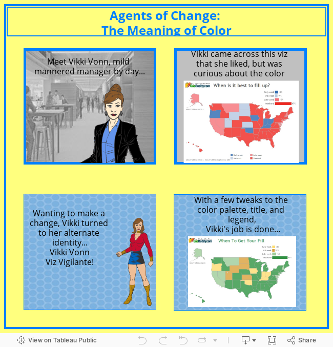
@Matt_Francis @emily1852 For fun - why don't you or @emily1852 give it a makeover? I'd be honored. Is this a job for Vikki Von??

— Kelly Martin (@VizCandy) February 10, 2014

Oh crap! Oh my! What have I gotten myself into? I think angels sing when Kelly publishes a viz. After the customer conference last year, I showed a coworker one of her vizzes and said, "See how beautiful these visualizations can be?" So why would or how could I change one of her vizzes? However, I gave it a go, because I thought two things would either happen. I would either do a good job or I would get some valuable lessons from Kelly (read: it would suck and she would very politely tell me where I went wrong and then instruct me to never attempt to makeover one of her vizzes in the future, as thunder claps and I shake in my boots and bow before her, telling all of her greatness. Okay, that last part might be a little dramatic).

Honestly, this was a bit of a stretch for me in that I, err... Vikki Vonn, didn't really have a question about the viz, as with the GasBuddy one.   There was only the very broad question, "Is there anything I would change about this viz?" 

Picture
Kelly Martin's viz from her blogpost Bubble, Bubble, Oil, and Trouble (such a clever title)!

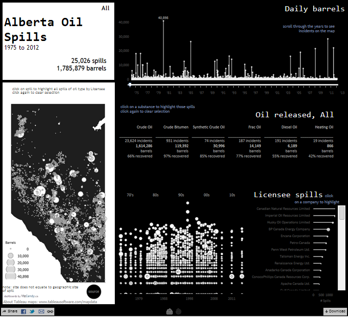
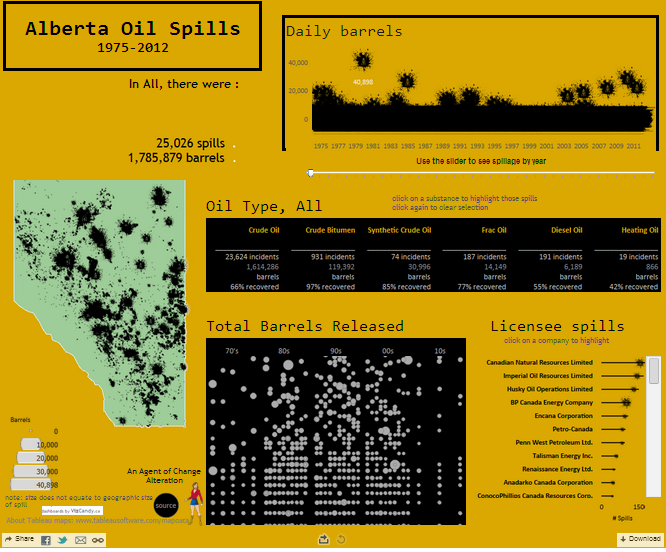
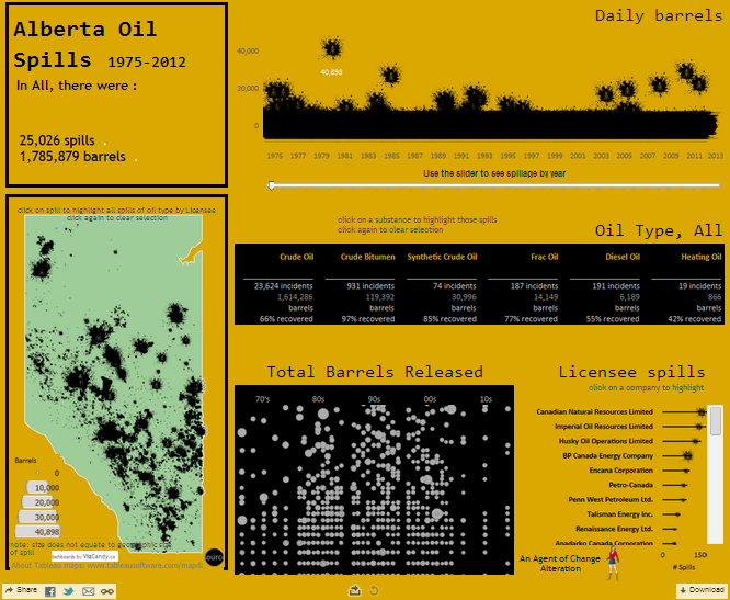
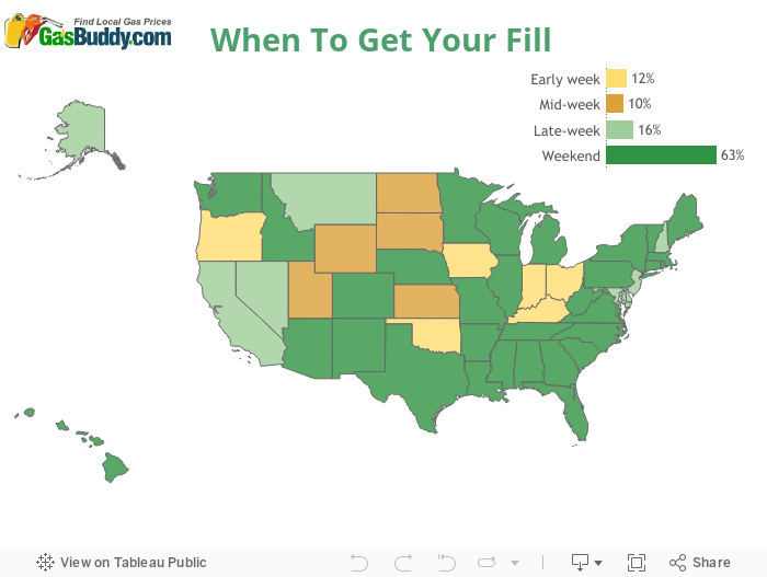
Having that question really helped focus me.  My first thought was that I wanted to make it more oily looking. Kelly's narrative that accompanies her viz is really good, and I thought making it oilier really emphasized her points. So instead of a black background, I switched the colors so the marks were black. And I thought it would be cool to have oil splats because I thought it would work well in the viz.  I fired up ye ole Google and lo and behold, found a shape I wanted. I'm sure a bunch, if not everyone, knows this but you can save an image as a picture file and then copy it to the shapes folder in your My Tableau Repository, that way you have some custom shapes you can work with. Not shown in the published version, but a feature I really liked, was putting the date on the page shelf for the daily barrels view. It was really neat to see the incidents over time on a playback loop. The only problem with it is that it didn't really work well when published (boooooo!!!!! C'mon Tableau, help a non-techie nerd out!).  Anywho, here I was, thinking about Black Gold again.

In addition to getting The Beverly Hillbillies theme song stuck in my head, I also had the background...gold (or gold-ish). Admittedly, I was crazy busy this week and didn't have time to get the exact specifications for gold, but I'm hoping the black gold, oil that is, comes across in the viz.  So, I had my splats, I had my black gold, and there was one other change I made...I made the map a shade of green to represent land/the environment. I know, I could have left it as gray like Kelly did, but now you can see my bias...I think oil spills harm the environment (I'm a bit of a tree-hugger).  

So, is it better or worse?  I don't think it's better, I'm hoping it's not worse, and actually, I just think it's different.  I don't think you all know how nervous I was when I sent Kelly the altered viz.  There may have been some rambling, and a please dear lord, please don't let me suck, because that would be so embarassing.  I think I closed out the message with 
"please-don't-curse-me-or-think-I-have-zero-skills."  However, at the end of the day, this would be a good opportunity for me because she would either tell me where I went astray or she would like it, and I would be happy either way.  Overall, Kelly thought it was neat to see how some tweaks can put a different spin on the same story.  

Picture
The altered viz. Click on it to go to Tableau Public!
And of course, she had a few tweaks of her own, primarily as it relates to alignment. Of course, she made some changes and sent me the file, only for me to pull a total ditz move and overwrite them based on feedback I read about.  So, I'm going to pretend that my changes matched up perfectly to her zen changes and I became queen of the world (too much?).  Not surprisingly, the final one (well, as final as it's gonna get for now) is much better.  
Picture
One of the biggest lessons I learned in this alteration is that it's fun to play but I can't forget to keep track of the changes. And unless Kelly has changed her mind, I think she's like Mikey in the Life cereal commercials...she likes it!  What a relief! and of course, she displayed the very common traits that the Zens display, which is encouragement and kindness. Which goes to show that given the same data, the same bones of a viz, and a little play, you can get a different story from each person that tells it.  And on that note, I recapped this little adventure in Agents of Change: A Different Story.

Learn About Tableau
0 Comments

The Meaning of Color

2/8/2014

4 Comments

 
Oh my gosh! I have a few things that have been rolling around in my head and I just need to get them out. First off, tableau's data blogging month was cool. Personally, I love how supportive and accessible the community and tableau employees are. One prime example is shown in the clip below. A data blogging panel discussion? Fun times made even funner by accessorizing Ben Jones. I felt really good after listening to the discussion because it validated what I think I do...write for me in my own voice. Sadly, I couldn't attend the hangout live because I was in a meeting. However, I took to twitter after I watched it and asked Andy Kriebel and Ben what made them start a Facebook (FB) page for their blogs. I summed up their responses in two thoughts; level of activity (don't spam your friends on FB with skiing the slopegraphs all the time) and meaningful interaction (FB gives you the opportunity to have a conversation longer than 140 characters available on Twitter). Cool. I'm not planning to start a FB page, but maybe someone sees that little nugget and makes a good decision about whether they should start a page. 

Check out the Data Blogging Hangout below! 

Andy Kriebel created a nifty viz on his blog that answered the question every car owner has asked,"When is the best time to fill up?" His blogpost was really more about the visualization type and how a map can be better than a table. What caught my eye though, was his use of a red and blue palette for the map. So, I asked the question and had a good dialogue (that's what the FB page is for, right?). Encouraging me to give it a go, I downloaded the workbook and tweaked the colors, title, and legend. The result is demonstrated below in a little four panel comic I put together in tableau. I seriously was frustrated and had fun at the same time trying to do this comic, which I think may be a recurring feature (and hopefully it will improve over time). Big props to Matt Francis for his help! 

Click on the maps to visit Andy's post or the remade viz on tableau public. 
Learn About Tableau
This leads me to the third thing I wanted to chat about; the meaning of color. When I was conversing about color palettes and was asked which color I would use, I replied with green...green is good, weekends are good, I have more green in my pocket because I pay less in gas. I was really curious as to why Andy didn't use green in the map.  His focus on on the palette type; he wanted to use a diverging palette and he also considered colorblindness when picking his palette.  I get that, but I didn't really use that methodology.  I picked colors out of a palette (either traffic light or tableau medium 20), that used green. I also played around with a couple of different color choices. Like, green with more brown, which I liked.  I also used green and a shade of blue...that was really pretty, but I didn't use it because I thought someone might associate blue with water and green with land since they were looking at a map.  So, I tried the green and yellow/gold combo and I kept going back to it as the one I liked. I'm not really sure if it's right, but I am digging it (and it kind of incorporates the colors of the GasBuddy logo, which I totally meant to do (if you didn't catch the humor, it's really just a happy coincidence). 
Learn About Tableau
There are a bunch of good articles and blogposts on color and I'm not even going to try to recount all of that now.  I think color selection can make a big difference and that's discussed in a Tableau Public blogpost I like from Ryan Sleeper called Leveraging Color to Improve Your Data Visualization. I like his post for a couple of reasons; he breaks down the color wheel (super helpful) and also talks about the psychology of color.  Which, is kind of the point to this whole post...there is meaning associated with colors and I think visualizations are made better for considering that colors have meaning.  I know colorblindness causes issues with how we present data, I've run into it at work. I'm measuring performance and it's a good/bad and originally I picked a red/green to visualize the data.  It was after taking the Visual Analytics course soon after I developed the visualization, the light bulb went off and I went to someone in management and told them that I really needed to change the colors in the viz because folks with the typical colorblindness won't be able to see what we're trying to show. So, the change was made (yay me! though I do admit that things like having to be in compliance with section 508 helped my cause).  My whole point with this post is really to serve as a reminder to me to be present when making my color choices and to try to make the best decision I can. And that not everyone wants a pinkalicious custom palette I created...I don't know, maybe they think it's too girly.
Picture
4 Comments
    Follow my blog with Bloglovin

    RSS Feed

    What's This About?

    After using Tableau in my last position, I'm now a data viz hobbyist and this is my little slice of world dedicated to data visualization...typically Tableau related. 

    Vizzed and Confused? 
    Here are some great resources!

    Anya A'Hearn 
    Andy Cotgreave 
    Kelly Martin
    Andy Kriebel
    Matt Francis
    Jonathan Drummey
    Jewel Loree
    Peter Gilks
    Paul Banoub
    Dan Murray
    Ramon Martinez
    Ben Jones
    Allan Walker

    Tweets about "#dataviz"
    Tweets about "@tableau"

    Archives

    May 2018
    December 2017
    November 2017
    October 2017
    June 2017
    May 2017
    January 2017
    November 2016
    October 2016
    August 2016
    July 2016
    June 2016
    April 2016
    March 2016
    February 2016
    January 2016
    December 2015
    October 2015
    September 2015
    August 2015
    July 2015
    June 2015
    May 2015
    April 2015
    March 2015
    February 2015
    January 2015
    December 2014
    November 2014
    October 2014
    September 2014
    August 2014
    July 2014
    June 2014
    May 2014
    April 2014
    March 2014
    February 2014
    January 2014
    December 2013
    October 2013
    September 2013

Powered by Create your own unique website with customizable templates.