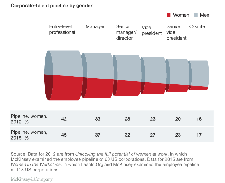
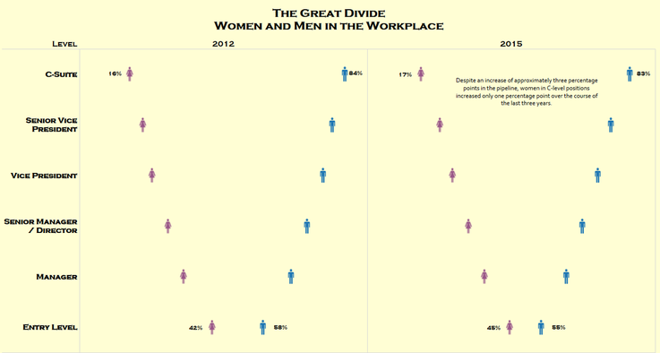
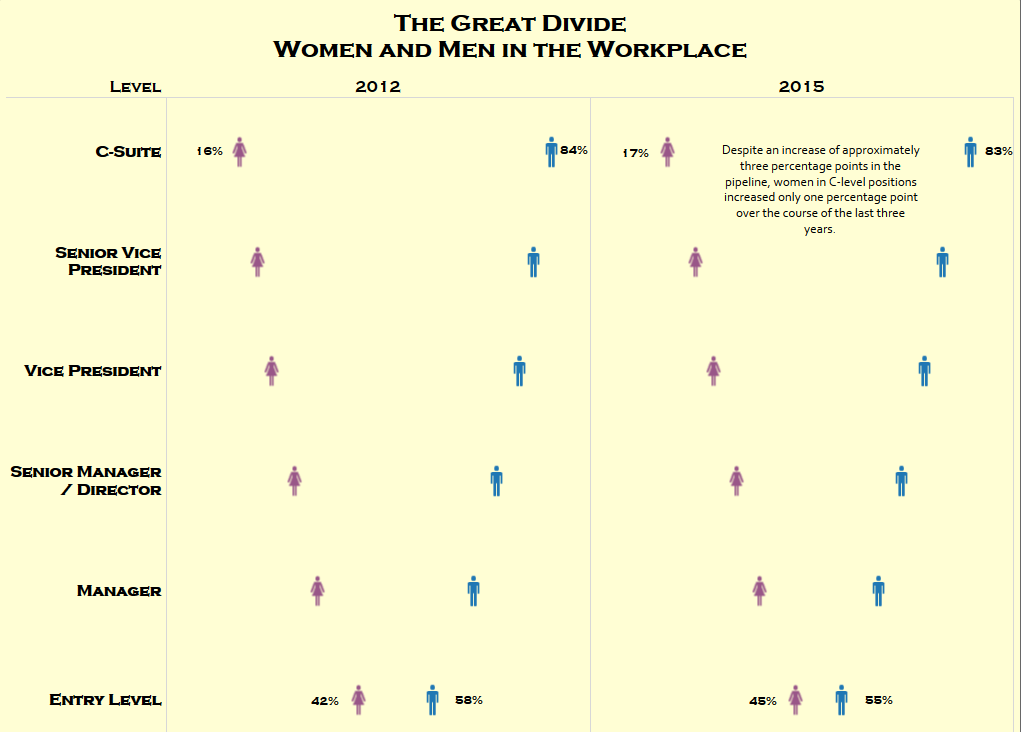
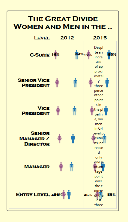
For the viz itself...I created a couple of vizzes but I kept coming back to this one, so I thought, this one is the one that resonates with me, so I'll use it.
For the design...I chose to double-encode with color and shapes. I might go back and just make everything black. I used purple and blue for women and men, respectively because I wanted some kind of color but I'm tired of pink and blue. I also used a light yellow background because light yellow reminds me of the legal notepads I use at work. I used the font Copperplate Gothic Bold because it reminded me of corporate lettering. I also re-ordered the positions so that entry-level was on the bottom and c-level was on the top.
For the analysis...I just wanted to highlight the one point that stuck out to me (even though there was improvement in the ranks, c-level percentages didn't really change that much).


 RSS Feed
