Wannabe Awesome Me
  • Viz 'Em
    • Tiny Tableau Tips
  • Mentor Match
    • Mentor Match Blog
  • A Pop of Color

Tweakend 

3/30/2015

0 Comments

 
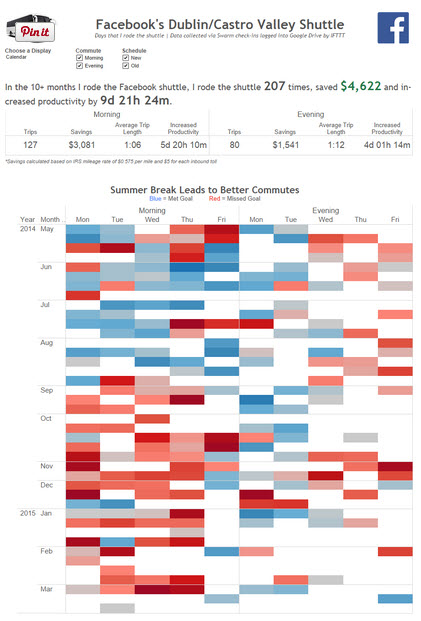
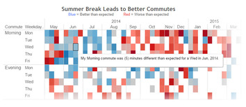
You know when the kids are watching Scooby-Doo, you're enjoying a cup of coffee reading your Bloglovin' feed and start looking at a viz, and then think, "I wonder what this would look like, if...". The kiddos granted me enough peace that I could actually ponder life's questions and play around with Andy Kriebel's FB Commute by Shuttle Analysis viz. 
Picture
Click the image to interact with Andy's viz.
So there were three things that I noticed when I was looking at this viz.  
1) The header said that Summer Breaks Lead to Better Commutes but then I see weekdays on columns. So I was wondering what it would look like if weekdays and months were swapped, so that I could more easily see if the commute was better in the summer. 
2) Super nit-picky, but I wanted to see  what the summary above the viz looked like without the lines.
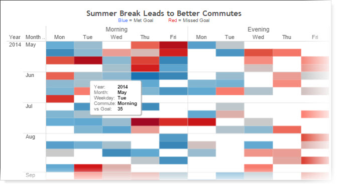
3) As I was playing around, I saw the tool tips, which are based on the defaults. Personally, I love to customize tool tips. 
Picture
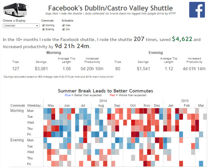
So this was kind of frightening on Saturday morning....I heard Andy's voice in my head telling me to download it and see what the viz would look like if I made some changes.  So that's what I did. I swapped the columns and rows, I tweaked the tooltips to look more like a sentence, I changed 'goal' to be 'expected' (I think he's played/watched too much soccer/football), and I got rid of the gridlines. I was also playing around with the size of the viz. So, why exactly did I do all of this?  I suppose because I was curious and because I could.  I really wanted to see if swapping would make a difference (because then I'll think about that the next time I build a viz).  Here's an image of the viz with my changes. 
Picture
Click the image to interact with the viz.
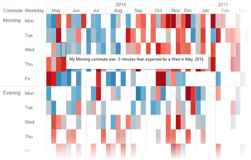
Picture
Tooltip tweaked!
So here's a visual comparison recap.  Big shout out to my kids for the peace and Andy for having a nice viz I could play around with.  

Visual Comparison

So, what do you think? Curious about some other changes? Download the workbook and give it a go!
Picture
Picture
Picture
Picture
0 Comments

Tapestry Threads

3/11/2015

0 Comments

 
This year, Tapestry was held in the charming little town of Athens, Georgia. The keynote line up included Hannah Fairfield of The New York Times, Kim Rees of Periscopic, and Michael Austin, a Provost of Newman University and author of the book Useful Fictions. And then there are the short stories, the demos, and the networking. When someone asked me what advice I would give to attendees going to Tapestry, I summed it up with some awesome alliteration (see what I did there): Notes and Networking. Take lots of notes and network with folks. That's one of the benefits of a conference that's capped at about 120 folks. In thinking about the conference, I've had three big threads that I keep coming back to.
Picture
Explain Yourself
This wasn't really a topic that was presented but it was a thread that I first saw on Twitter awhile back.
Conference attendees were asking critical questions to presenters. One such line of questioning to Hannah Fairfield reminded me of something Alberto Cairo talked about at last year's conference (you can find my post about it here)...let the data tell the story, don't come at it with a story and present only the data to support your position. My personal feeling on this is that it's tricky. Of course, if you have the data right in front of you and you ignore it just to tell a story you want, that's not fair to the reader. If you don't have the data available to show perhaps a more complete picture, then I think it's fine to tell the story of that limited data set. My use case for this is women's empowerment data. There are sooooo many factors that go into empowering women that it's difficult to tell the whole story without getting too mired in the details. It's more manageable to talk about pay equity or political empowerment. My position on this might evolve, but for right now, that's what it is. Attendees also questioned Kim Rees heavily on the gun deaths viz and the model used to project the potential life expectancy and cause of death had the person's life not been cut short by gun violence. 
Humanize Your Work
Again, not a new comment, but it's one of the topics I heard about at the Data Dive held at the Urban Institute last fall. In her opening remarks, Urban President Susan Rosen Wartell recalled how she was discussing data during a speech and was loudly criticized because it's not just data; the data represents a person. Part of Chad Skelton's talk was about putting the You in the Data. People want to know about themselves (& as I learned, he's still waiting for someone to make a 'What Kind of Chart are You?' BuzzFeed quiz). He asserted (& I totally buy it) that we should start at the individual level and then zoom out to the bigger picture. What was fascinating was that they tested the hypothesis and it showed (not really surprising) that people are focused on themselves first. 
Which made think (scary, I know).  I've had this question bouncing around my head for awhile...where's the line between engagement and best practice? I bring this up because one of the comments I've received lately is that the scatter plot just doesn't connect with people. So how do we connect with them, to elicit an emotional response (either by putting the You in Data or by engaging them in other ways)? One way that Hannah Fairfield of The New York Times showed to engage is by showing the cost of certain medicines in the US versus other countries. She described it as having a little fun with the data and it was, but it was also engaging and I wonder if more people would have read the visualization because of the raining medicines versus if it was displayed as a bar chart.
Think Critically
Kim Rees of Periscopic wanted to make sure we were awake after lunch. She came out with a pretty bold statement against data storytelling and for data documentaries. That's a pretty controversial statement to make at a data storytelling conference. Kim walked through the gun deaths and other visualizations that the folks at Periscopic created. 
Given some of the chatter in the room and on Twitter, folks thought that her viz was a story given that the age and cause of death was not based on hard facts (they are based on actuarial data). What I find funny is that Kim stated that stories remind her of fiction. Some of the response to her viz was that because the lives stolen section wasn't based in fact, then it's a data story. Ummmm, so that's where I think, didn't she just prove out her point? I take a look at the gun deaths viz and I love it. I love the look and I love the message and I'm not one to let the use of projections get in my way from comprehending the message (if that were the case, no one would look at business vizzes with projections). She came out with a bold statement and while Kim may have been trying to persuade us that data stories are bad and data documentaries are good, at the end of the day, it's her opinion. Maybe she's right. Maybe she's wrong. It's up to me to listen to what she said, what she showed, and make up my mind for myself. So where do I fall on the great story/documentary debate? I'm fine with data stories because we can have fiction and non-fiction. But unless someone is just lying or embellishing beyond belief, wouldn't all data stories be non-fiction? I have a questioning personality, so even though I love the work of Periscopic and their Do Good with Data tag line, I'm not just going to accept what is stated without thinking about it myself. I was even thinking about what she discussed in the final keynote talk by Michael Austin. I actually want to review his discussion again so I can glean some practical takeaways I might apply to either blogging or my data stories. 
Weaving together other threads
The short stories were awesome. I especially liked Ben Jones's work on Seven Data Story Types as a thought starter. They all made sense (and were referenced in subsequent talks)! 
Picture
I also had the chance to hang out a little with R.J. Andrews, whose work you might have seen on the Creative Routines visualization. R. J. is smart and creative (and as I learned, moving to Kenya for a few months). He thought one of the reasons why one of his visualizations went viral is because the reader could relate...Geniuses sleep and so do I...they're just like us! (there's that humanizing your work thing again).
Picture
Check out the little video I took of R.J.'s Bloom visualization. 
One of the cool things about Tapestry is that you get to see what other folks are doing in the Demo Room. Last year I zipped through. This year though, I couldn't spend enough time in there. I saw a cool data discovery project from the folks at the Microsoft Garage. And Jeffrey Shaffer and Allan Walker are totally taking visualization to a whole other level. While it was one part movie-fantasy with being able to control a viz by moving your hand in the air like a conductor (yes!), a user could also speak commands. How effing fantastic is that for accessibility?!!? It is literally a game changer so that everyone can experience a visualization! Other folks like Nelson Davis and Mark Jackson discussed their data stories which were done in Tableau using the story points feature. There was also a group, the Global Forest Watch that provides data (and the visual) on changing environment and forestation. And I can't forget about a group that was highlighting their e-book for beginners on data analysis and design, which you can access here.

I met fantastic folks, got to catch up and have great conversations. This year felt more show and tell than last year, but still quite valuable. Tapestry conference is great if you want to be a data story-teller, develop a data documentary, or are a data journalist.  A big shout out to the one, the only Dan Murray, who gave me a ride to the conference. And a super big shout out to the those behind Tapestry for hosting a solid event! I think it's awesome that you can tell that the organizers are passionate about data story-telling.  And doesn't that just make a for a great story?
0 Comments
    Follow my blog with Bloglovin

    RSS Feed

    What's This About?

    After using Tableau in my last position, I'm now a data viz hobbyist and this is my little slice of world dedicated to data visualization...typically Tableau related. 

    Vizzed and Confused? 
    Here are some great resources!

    Anya A'Hearn 
    Andy Cotgreave 
    Kelly Martin
    Andy Kriebel
    Matt Francis
    Jonathan Drummey
    Jewel Loree
    Peter Gilks
    Paul Banoub
    Dan Murray
    Ramon Martinez
    Ben Jones
    Allan Walker

    Tweets about "#dataviz"
    Tweets about "@tableau"

    Archives

    May 2018
    December 2017
    November 2017
    October 2017
    June 2017
    May 2017
    January 2017
    November 2016
    October 2016
    August 2016
    July 2016
    June 2016
    April 2016
    March 2016
    February 2016
    January 2016
    December 2015
    October 2015
    September 2015
    August 2015
    July 2015
    June 2015
    May 2015
    April 2015
    March 2015
    February 2015
    January 2015
    December 2014
    November 2014
    October 2014
    September 2014
    August 2014
    July 2014
    June 2014
    May 2014
    April 2014
    March 2014
    February 2014
    January 2014
    December 2013
    October 2013
    September 2013

Powered by Create your own unique website with customizable templates.