Wannabe Awesome Me
  • Viz 'Em
    • Tiny Tableau Tips
  • Mentor Match
    • Mentor Match Blog
  • A Pop of Color

Mid-Term Review

3/26/2014

0 Comments


I'm a nerd (this probably is not shocking to anyone). Here's a prime (& relevant) example. In high school, when my parents couldn't make a parent teacher conference, I held it with my anatomy & physiology teacher (I think it was the first time he had ever had a student hold a PTC). And those who know me know that I like to plan. What do you get when you combine a nerd who loves to plan, who asks for feedback, and who is goal oriented? You get an accountability blog post! It's been six months since TCC13 where I resolved that I wanted to keep the energy from the conference alive in order to build my profile and skill set to be a good resource at work. Am I still energized? I think so. Here's what I've done in the last six months to keep the spark alive!

Picture
In October, I held a Design Skills to Thrill contest at work. It was completely fun and I loved loved loved it. I hope others did too so that we can do it again next year. The goal of this contest was more about creativity than about visual best practices. The vizes had chart junk and Tufte would curse me out, of that I am sure. But it did open people's eyes to a different way of using tableau that went beyond the defaults. It was about what is possible. And it built some networks too and that's always a good thing. 

Picture
And as people at work and my husband know, I tend ask a lot of questions. I think folks get tired of hearing me say, "So I have a question..." I can't help it. It's the way I'm built (seriously, I have a questioning personality type, which kind of works out well as an examiner). And so me being me, I asked Andy Kriebel a question about his gas buddy viz. Andy was super nice and while he mentally may have been thinking (in what would probably sound like the Wizard of Oz speaking with a booming voice) "I am the great and powerful Data  Visualization Guru, how dare you question me. What he actually did was to encourage me to download his workbook and play with it. Oh and in the process, I created a very rough kind of comic book panel and data viz super hero, Vikki Vonn. That was so fun, because I pretending that I was creating Wonder Woman.  

Now, we have a little theory at work where you'll learn enough to realize that there is still so much to learn. I think that's where I was at with my Tableau Identity Crisis post. What do I want to be when I grow up? I ask that all the time. I wanted to raise my profile and increase my skill set, with the ultimate goal of being a recognized resource at work when it comes to visualizations. Three major things happened for me earlier this year; my identity crisis blog post was named as one of the most influential Tableau related blog posts (I seriously felt like I won a major award and I *might* have given a speech to my vanity mirror); I did a guest post for the tableau public blog (how awesome is that!!!), and Paul asked me to do Two Minutes With... for his blog. I was honored to be asked and I thought was great fun (hopefully his readers liked it too)!

And lucky me, I have an awesome support system, which was actually one of the goals I set for TCC13. I got such positive feedback from the identify crisis post and have a network that truly supports me. The list would be too long to write everyone's name down, but I do want to give a shout out to a few people...Anya, Andy K, Andy C, Matt, Kelly, Paul & Ramon! This network makes me be a better analyst (cue the patriotic music) and that's what I want. The feedback sucks sometimes and I have my doubts that I can actually do this, especially when hacking seems so commonplace and I'm still trying to remember how to do a parameter. But that's when I think back to a good ole fashion pep talk my dad once gave me (You're a Todd! You do what you can do to prepare and go in there and do the best you can)! The nerd in me takes over and refreshes my memory that the feedback will make me better and like a good little nerd, I take comfort in that.

I also got myself into a pickle. Kelly Martin & Matt Francis thought it would be neat to see what I could do with her
Bubble, Bubble, Oil, and Trouble viz. This time I didn't have a question, but just a challenge to explore. Now I think Kelly's vizes are great. I made some tweaks and I don't I love it nearly as much as hers, but I did love the thought process. 

I also had a goal to do six vizzes between conferences. That might not seem like a lot, but factor in a long driving commute, a job, two young kids, working out, and life in general, I think six is reasonable. Since I don't actually do the viz magic at work (I oversee it), I wanted to do some off-hours vizzing so that I could build my skills. I created a Wonder Woman viz before floating dashboards and boy, I should really go back and remake that one.  It's poppy and fun and awful, but I got my first exposure to IFTTT out of it, so it's not all bad. I also downloaded some holiday sales data in November and made a fun viz (for me).  Neither vizzes set the world on fire (and truth be told, some people may want to set my vizzes on fire) and that's okay. Now I have something to go back and remake. Side note: I really wish Tableau Public had folders that I could file my work in. Like a "I'm Goofing Off" or a "Channeling Tufte" folder so that people could tell when I'm having fun and when I'm try to create something that abides by visual best practices. 

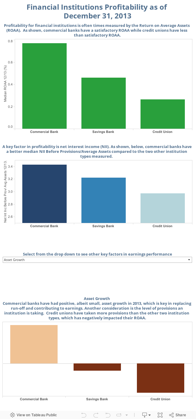
I recently got excited because the light bulb went off in this random brain of mine. So in an effort to build my skills, I remembered that I could download financial data for banks and do some vizzes with that data.  This is perfect for me! It takes a skill that I already have, such as assessing the condition of banks and allows me to focus on the building my tableau skill set. And because there is such a breadth and depth of data, I can do little snippet now and another snippet next month or next quarter, so that I have a series! If you couldn't tell that I'm excited about this, you should see how fast I typed these sentences out...my keyboard was on fire! And another reason why I'm happy about this is because I can really focus on those things I learned at Tapestry (a little on that in a minute). The examiner in me is not totally impressed with this...I can dig much further to better understand the level, quality, and trend in earnings.  However, this really just started with me messing around and now...it seems like the possibilities are endless.  I feel a little like a kid in a candy store, a big data candy store.

Learn About Tableau
Now let me touch on Tapestry. I was super lucky to attend. The conference was so great and I'm really hoping I get an invitation back (don't make me beg, Tapestry conference planners. I mean I will, but I prefer not to). I learned so much, had such great discussions, and had fun. Read about my takeaways here. 

And then there's the big one, this MS viz that I've been working on for a couple of months. I want this to be a really good viz, not just one that I play with for an hour. To that end, I used my network. I reached out to others to get their feedback and it was tough, but necessary. This is where the dad pep talk and the nerd entered. And I took a step back and thought, the viz that I put out there for comment was my fifth one I think (including two work projects). So I let that settle for a minute. For my fifth one, it wasn't so bad. And that's when I felt better (though still frustrated). I hope to finish it soon so that I can time it with WalkMS. And then I'll do a post on it, since there are a couple of stories waiting to be told about it. 

Sure I have room to improve and I have lofty expectations. But the way I see it, I've made progress. I've really enjoyed the ride the last six months since TCC13 and I'm looking forward to the next six months being just as awesome!

0 Comments

Tapestry Takeaways

3/4/2014

4 Comments

 
This was my first Tapestry conference and wow, was it a fantastic experience! To start, I loved that it was in Annapolis (woohoo Maryland!!!) and it was super pretty with ambient snow, but dang, was it cold! Tapestry marries up data visualization and story-telling in a one-day conference packed with keynotes, short stories, and demos and posters that presented in a science-fair style format.  And, the conference is limited to 100 attendees, so I was super lucky that my request for invitation was accepted! All I can say is that I'm requesting an invitation to next year's conference, I loved it so much! 

The networking was great.  During the conference, I had the opportunity to talk with Tableau Zen Master Ramon Martinez, who is so kind and helpful! I hung out with the incredible Anya A'Hearn and I'm hoping that her design sense rubs off on me! I met Peter Gilks in person instead of twitter, and I'm hoping he/Slalom will be kind enough to let me post my MS viz to Viz for a Cause when it's done. In addition to the always charismatic Tableau employees, I was in a conversation with Jock McKinlay(!!), who is extremely bright and talented.  And though not there in person, Matt Francis never slept and was tweeting away to the point that he is responsible for me making a connection with Regina Nuzzo, a freelance journalist and stats professor. We spoke about the Rubber Duck concept that Matt recently blogged about.  Oh, and I can't forget the very smart and funny Dan Murray! We had a great conversation and he looks good in a women's turquoise scarf! Having a conference that small really allows for some genuine connections and that's the best way to build great networks.  

Alberto was Insightful

After a cool introduction by Ellie Fields, the Tapestry Chair, we got to listen to the amazing Albert Cairo, Professor at the University of Miami.  One of the things I'll remember most about Alberto's talk is that he can provide constructive criticism in such a great way, like you know is commentary is harsh but at the same time, you know you'll be better as a result.  Listening to him talk, I wanted to get his book that's out and plan on getting his new book when it's released.  He discussed points that we need to consider when doing visualizations; be truthful, functional, beautiful, insightful, and therefore enlightening.  He also talked about visualizations for social change. This one resonated with me as I'm in the process of doing a visualization about Multiple Sclerosis, and based on what I heard, I'm going about it the right way.  His overall message is that we should be evidence-driven communicators as opposed to activists.   Alberto suggested that we never begin with an idea and get data to support it, but rather see what the data says.   My other takeaways from Alberto's talk was to embrace but be skeptical of creativity.  Even with creativity, there must be a focus on the core message.  So, design to bring attention to the message.  Finally, he recommended to be very familiar with the traditional graphs before moving on to the more exotic graphs. He definitely set the stage for a great conference.  I could have listened to him speak for at least another hour, if not more. 

Short Stories

From there, the conference moved into the Short Stories section.  First up was Jon Schwabish from the Congressional Budget Office. He was really good! I had a few key takeaways from his story. He's dealing with massively huge numbers, which can be hard to communicate.  He provided some really good examples of how to make comparisons, and offered the following advice.
  • Make comparisons big enough but not too big
  • People remember things in context
  • Have a soul...connect by making people feel 
  • Communicating requires connecting

The next short story came from Jock McKinlay of Tableau. Jock talked about Data Sushi, which is to make visualizations beautiful on the outside and have raw data on the inside.  Jock gave a few reasons why we should have data sushi and a few excuses not to. 

Reasons

  1. Increase dwell time (the amount of time spent on the page/view)
  2. Validate the author (by providing the data used in the viz)
  3. Encourage conversations

Excuses 

1. There's cooked data! 
2. Lots of work goes into making data usable, so there might be a tendency not to share.
3. It's just hard technically to share. 
The next short story was by Emma Coates, who worked at Pixar and is now a freelance movie writer.  This was a little different, but I really liked it. My overall takeaway from her story was to engage! During her story, she mentioned that the audience wants to be enthralled, delighted, and to connect (hey, Jon talked about communicating required connecting!!)  Another takeaway that applies not only to written but visual stories, is that simplicity is key for the message (didn't Alberto talk about a focus on the message?!) 
Next up in the short story line up was Santiago Ortiz.  Wow! I don't even know where to begin with him. You know when you hear people so brilliant that you just sit there in awe? That's basically what I did when Santiago talked. His presentation was beautifully done, the way he slid through slides, and wowza! the earnings v. taxes visualization he is working on is crazy good.  You can draw a shape like _/ for example and companies with performance that match that shape will appear.  He's hoping to publish it this year and I'm looking forward to it. 

Last up in the short stories line up was Giorgia Lupi in a talk called Beautiful Reasons.  I'm sensing a bit of a theme...connection! The biggest takeaway from her was that you can generate attention and emotional connection, if done well. The example they used to support this assertion was from a visualization they were commissioned to develop. Click on the image to read more about the visualization!

Picture

Aron was Engaging

Aron Pilhofer is the Associate Managing Editor, Digital Strategy at The New York Times. Because I was so engaged in his talk, I didn't take many notes (nor did I tweet, which is unlike me!). The biggest point that I took away was that they are incorporating visualizations in the stories to start a conversation and to know your audience/reader, just don't launch things (one could say they are being evidence-driven (communicators) by doing some analyses of their readers. See what I did there? If not, then read the Alberto section again). 

Now, this made me feel pretty good. Why? Because on this specific point, we've done that with our a couple of our analytics.  We have a narrative analyses that accompanies our charts and because we know people still like to print or don't have time to get all interactive, we have the static chart with a link to the interactive one for those who want to explore...so we're trying to meet the needs of two types of readers in the one document. 

Science Fair Fun

The demos and posters that were presented in a science-fair style format were fantastic!  There were some really smart people presenting some innovative ideas.  It reminds me of Malcolm Gladwell's advice that I heard at a Tableau Customer Conference: Be a tweaker (and I'm pretty sure he wasn't talking about drugs). It's great invent something first, but the first one isn't necessarily the most successful one.  There were several folks that were presenting their versions of data visualization tools.  One of the ones I'm most excited about is a data visualization tool without programming that some folks out of Stanford are working on. It's currently static (not interactive), but I think it will be very interesting to see what happens with this and others. The posters were fantastic (I wish I took pictures of them).  A lot of people people spent a lot of time and energy to make some really magnificent work. 

Fernanda Viégas and Martin Wattenberg were Entertaining and Informative

One of the biggest things I learned is that Fernanda and Martin do not like periodic tables or subway maps.  I think Fernanda's exact words were "They need to stop."  Their point was that viz developers can't just shove data into a formula, when it doesn't make sense. 
Picture
One example I found on the interweb of a periodic table map of the good ole US of A. I'm pretty sure Fernanda and Martin would be opposed to this one.
Another point they made, which I found interesting is about infographics. They are the pop stars of visualization right now.  Keep simple, be careful, be purposeful.  They then compared different visualization types to different genres. This is the point where I wish I took better notes. Again, I was engrossed and trying to keep up with these brainiacs.  The one that I remember most was the collections genre. I don't know why. Maybe it's very similar to the genre name, so I didn't have to think to hard. Maybe it's because I saw a big butt (and I cannot lie!).  I'm really hoping slides will be posted for keynotes and short stories, so I have better materials.


My biggest takeaway: request an invitation to next year's conference! 

Between the networking; the fantastic and informative talks (of both of the keynote and short story variety); and the science fair demos and posters (which were informative and spurred really good discussion), Tapestry is a conference I want to attend for years to come. 
4 Comments
    Follow my blog with Bloglovin

    RSS Feed

    What's This About?

    After using Tableau in my last position, I'm now a data viz hobbyist and this is my little slice of world dedicated to data visualization...typically Tableau related. 

    Vizzed and Confused? 
    Here are some great resources!

    Anya A'Hearn 
    Andy Cotgreave 
    Kelly Martin
    Andy Kriebel
    Matt Francis
    Jonathan Drummey
    Jewel Loree
    Peter Gilks
    Paul Banoub
    Dan Murray
    Ramon Martinez
    Ben Jones
    Allan Walker

    Tweets about "#dataviz"
    Tweets about "@tableau"

    Archives

    May 2018
    December 2017
    November 2017
    October 2017
    June 2017
    May 2017
    January 2017
    November 2016
    October 2016
    August 2016
    July 2016
    June 2016
    April 2016
    March 2016
    February 2016
    January 2016
    December 2015
    October 2015
    September 2015
    August 2015
    July 2015
    June 2015
    May 2015
    April 2015
    March 2015
    February 2015
    January 2015
    December 2014
    November 2014
    October 2014
    September 2014
    August 2014
    July 2014
    June 2014
    May 2014
    April 2014
    March 2014
    February 2014
    January 2014
    December 2013
    October 2013
    September 2013

Powered by Create your own unique website with customizable templates.