I am way overdue on this post, but the new job has kept me busy! So I'm took some time this Mother's Day weekend to talk about WEViz and the submissions I received.
I have met some great folks through the data viz and Tableau community. I've also been compelled to try to be a data do-gooder. I think it's part of our civic responsibility to try to make the our community, whether that's local or global, a better place. I have especially been struck by women's empowerment data and trying to make a difference. I don't have a massive platform, so it's hard for one person to make a difference. I also think it's great to see the different perspectives we have. Add to the mix a little four year old girl who I am completely in love and want the best for, and it equals a Women's Empowerment Visualization event. With the help of my friend Matt Francis, we assembled a list of women's empowerment data sets. I was also super fortunate that Derek Schwabe from Bread for the World collaborated with us to provide data to visualize.
I am so grateful for those who took their time to explore the topic. My goal was to raise awareness and socialize the issue so that maybe a viz or a blogpost would resonate with someone and they in turn would take action. One of the biggest challenges in data visualization is to illicit a response. We can visualize data, but how might a bar chart or scatter plot really convey the issues? You want that figurative punch to the gut, call to action response as a result of seeing the visualization. It's very hard to do and it's something I'm now committed to trying when I do my social good vizzes.
I love that while we worked with similar data, each person had a different perspective. So, without further ado, let's see the visualizations! Click on the visualizations to explore.
The Submissions
Jen Vaughan is a total viz rockstar and did two visualizations; one on global HDI rankings and a geospatial analysis of gender inequality. The HDI data is a challenge because it's not complete, so kudos to Jen for creating something meaningful with the data that was present.

Further cementing her data dogooder status, Jen also visualized data on gender inequality.


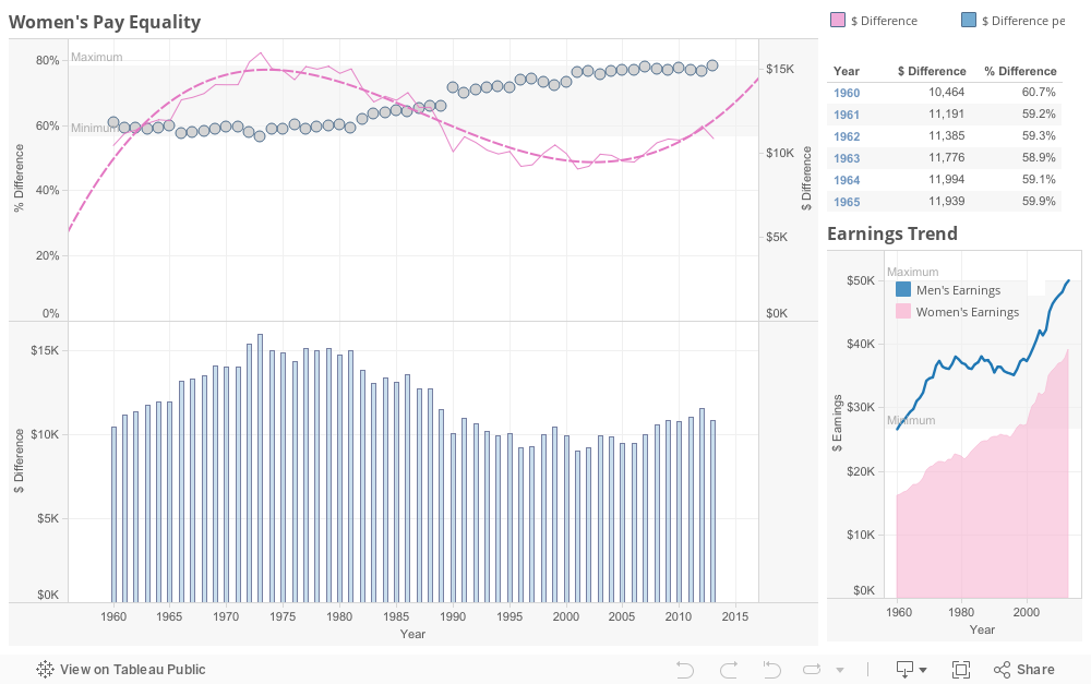
I love how Franca shows the dollar and percentage difference for differences between men and women's wages. What I find so interesting is that when the Pay Equity Act was passed in 1963, the wage difference was 59%. In 2009, when the Lilly Ledbetter Fair Pay Act was passed, the difference was 77%, while the latest data in 2013 reflects a difference of 78%. Aren't we going in the wrong direction?
Finally, we have Matt Francis's visualization. I have to confess that I tried to push Matt by constantly asking him, “Will it be impactful? Will it cause a reaction?” I'm pretty sure he's tired of my questions. Anyone who knows me knows that I like to tweak tooltips. In this case, I thought it was extremely important because I thought it would aid in understanding. In this horizontal panel (a layout Matt wanted to explore) visual, we can see the entire story laid out in front of us, with each panel representing a piece of the story. While Matt and I originally intended to work on this viz together, he did most of the vizzing, while I did most of the texting. I would love to see how we could incorporate images in this viz to make it more impactful.
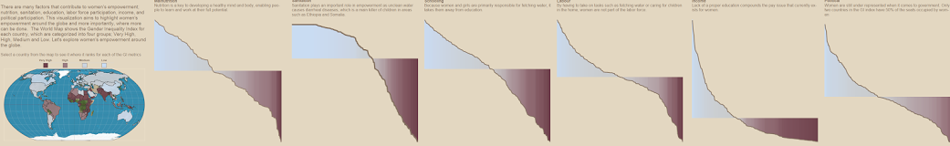
Click on the full or partial image to interact with the visualization.
So, will this virtual data viz event have made an impact? I can't speak for others, but for me, it has. See, through doing some research for the narrative on Matt Francis's vizualization, I discovered this youtube clip. And I'm pretty sure I was yelling at my computer questions like: How can this still be a thing and how could they do that to their daughter? and Why is her life not valued as much?
It's not the impact I expected, but it certainly resonates with me, and hopefully one day in the near future, will spur some action on my part to #ENDChildMarriageNOW.
It's not the impact I expected, but it certainly resonates with me, and hopefully one day in the near future, will spur some action on my part to #ENDChildMarriageNOW.
 RSS Feed
