Wannabe Awesome Me
  • Viz 'Em
    • Tiny Tableau Tips
  • Mentor Match
    • Mentor Match Blog
  • A Pop of Color

A Story about a Story

6/30/2014

0 Comments


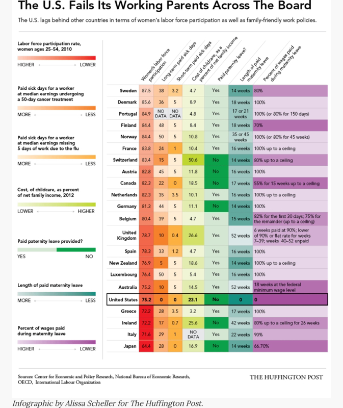
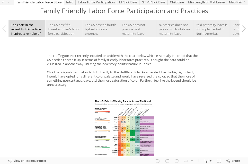
I like HuffPo and I can usually find an article on the twitter timeline that will grab me. Most recently, it was a story about how the US doesn't provide for family leave and has a lower participation rate of women in the workforce. Last time I read a similar article about how pay equality wasn't a big issue as people were making it to be, I wrote a blogpost about how pay equality wasn't just a lady issue. This time however, it was the chart that caught my attention.

Picture

I like the idea of putting some narrative with each area that I want to call out. I had story points on the brain the other day when I attended my first hackathon at
Bread for the World Institute. I was part of a group that was working on visualization concepts to raise awareness and show the linkage between women's empowerment and stunting. Since we ran out of time, I now have another little side project to work on...telling the story of child development/stunting among various countries. I think story points could be very impactful.


Getting back to the current story, I didn't read a help file, so I've probably just scratched the surface on what story points can do and how I can really make it look sharp. The way I see it, I have lots of stories to tell, which means lots of opportunities to leverage this new feature in Tableau.


Tell your own story by getting some data and downloading Tableau Public 8.2!

Learn About Tableau
The story here was about the US and it's position amongst the other countries. As I was reading the chart, I was all like, "Dang, the US is the only country that doesn't provide paid maternity leave?" And I would make a similar comment for each area being measured. Then the light bulb went off...What if I remade this chart using story points? It gave me a good excuse to play around with the new feature. So that's what I did.

0 Comments
    Follow my blog with Bloglovin

    RSS Feed

    What's This About?

    After using Tableau in my last position, I'm now a data viz hobbyist and this is my little slice of world dedicated to data visualization...typically Tableau related. 

    Vizzed and Confused? 
    Here are some great resources!

    Anya A'Hearn 
    Andy Cotgreave 
    Kelly Martin
    Andy Kriebel
    Matt Francis
    Jonathan Drummey
    Jewel Loree
    Peter Gilks
    Paul Banoub
    Dan Murray
    Ramon Martinez
    Ben Jones
    Allan Walker

    Tweets about "#dataviz"
    Tweets about "@tableau"

    Archives

    May 2018
    December 2017
    November 2017
    October 2017
    June 2017
    May 2017
    January 2017
    November 2016
    October 2016
    August 2016
    July 2016
    June 2016
    April 2016
    March 2016
    February 2016
    January 2016
    December 2015
    October 2015
    September 2015
    August 2015
    July 2015
    June 2015
    May 2015
    April 2015
    March 2015
    February 2015
    January 2015
    December 2014
    November 2014
    October 2014
    September 2014
    August 2014
    July 2014
    June 2014
    May 2014
    April 2014
    March 2014
    February 2014
    January 2014
    December 2013
    October 2013
    September 2013

Powered by Create your own unique website with customizable templates.