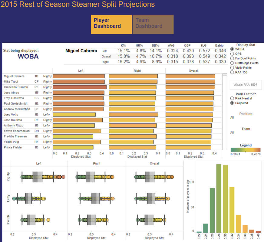
About a year or so ago, I received what I think is one of the best pieces of advice I will ever receive. An organizational consultant once told me to come from a place of genuine curiosity. So that's how I ended up picking Dash Davidson's 2015 Steamer Projections visualization to discuss on the podcast. What was I curious about? Outlining marks. I saw a little image of the viz on the VOTD Facebook page and immediately thought of the question and knew I wanted to have a dialogue around when it's appropriate to outline marks.
But then in preparation for the podcast, I realized two things...Dash is a mothereffing genius when it comes to baseball stats. Why? Well, I know a little about baseball (Go O's!), but I didn't quite understand the story his viz was trying to convey. Now, I get baseball is a very stats heavy game, but to me, it seemed like a bunch of stats were visualized and I was left trying to figure out what to make of them. But that's just me. While I didn't think Matt would have a clue about baseball (no offense Matt “Mr. Baseball” Francis), I knew that Andy Kriebel, who was our scheduled guest, is sporty and he could be able to help make sense of it for me. You can listen to his comments on the podcast, but I think we are of the same position. Okay, so then I thought, maybe Andy loves soccer/football more than baseball. Let me ask my husband who played on an all star team in high school, played JC ball, manages the O's from our TV, & who is an assistant coach for my son's little league team. He's sure to set me straight & then look at me as if I'm some moron for not knowing what WOBA means. Side note: I've been trying to get my husband interested in data viz and this baseball viz was sure to appeal & we could then talk data viz at the dinner table, solve the world's problems, and go on to raise Nobel laureates who were influenced by the fascinating dinner table discussion. Okay, so I might have taken that daydream a little too far. Anyway, I asked my all knowing husband to give me his thoughts on the viz. I asked what WOBA meant and if he understood the viz. For someone who has been playing or watching baseball for 30+ years, he stated that he didn't quite know what it was about and he did have to look up information (which he then sent to me).
Now, is my husband *the* authority on baseball? Nope (sorry, husband. You've got a lot going for you but you are not the alpha and omega for baseball). But my question...is that what it takes to understand this visualization? Is this the type of dialogue we are supposed to have about the viz?
Ben came out with this great clarifying post on what Viz of the Day is and what it isn't. Basically, it's an engaging, beautiful data story and about creating a dialogue. It's not a data visualization best practice resource. Got it. But when I go back to this viz, I don't understand the story being told. Maybe some narrative would help me understand the message being conveyed On the podcast where we discussed it with Andy, he suggested that the Tableau Public team should summarize why a viz is chosen. I fully support this recommendation.
Why do I agree with Andy's suggestion? Because it goes back to the reason why we talk about VOTD on the podcast; I want to use them as a learning tool. I'm not looking to argue the merits of VOTD and I'm not actually looking to dissect a viz. I want to understand what makes up good data stories or learn about visualizations that use hacky stuff that I can't do (but at least I know it's possible). I believe that providing a synopsis can help others in their personal development. Maybe the folks that are very analytical want to develop engaging, beautifully designed stories. Or maybe it's the storyteller who wants to grow their technical or analytical side. As I write this, I feel like begging with the team to provide a synopsis of why the selected visualization is an engaging, beautiful story.


It would really help me and all other folks who are at the beginning of the data viz learning curve. I know that it might be uncomfortable and thoughts may be challenged, but as long as we come from a place of genuine curiosity and not right/wrong, aren't we all better for it? I think so.
 RSS Feed
