So I was looking at the twitter one day and saw this fascinating discussion going on because of this visualization developed by Stephanie Evergreen.
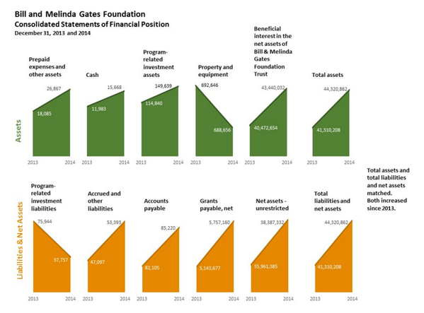
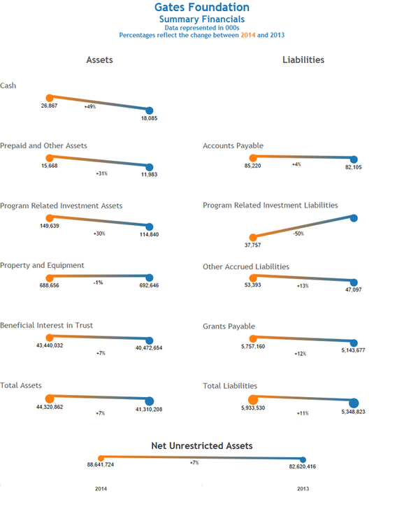
Whew doggie, did it generate some discussion, which I found very fascinating. I was curious to see how I might makeover what Stephanie developed. The last time I tried to visualize financials, I found it very challenging, so when Stephanie put it out there as a challenge, I thought I would see what I came up with and here's where I landed.
What I Tried and Why
- Removing the reliance on the axes. I thought if I removed the axis and just labeled the end points, I would remove scaling issues.
- One reason why I didn't use a bar or area chart is because I wanted to de-emphasize the space to alleviate any confusion about the scales.
- Added context. I wanted to bring out that percent change for each account, so that the reader can start asking questions like, "Hey, why are A/P extending?"
- Color coding. I wanted to color code the years. I made part of the title the color legend because I didn't like how a color legend looked when I placed in on the viz. I also labeled years at the bottom to reinforce it. I also used color in an unnecessary way by color coding the lines. I didn't like how gray looked and blue and orange already represented something. I'm still not sure this is the best thing to do. Someone really digging into the data might say that it doesn't reflect the change (because I color coded by year). That's a fair point. My primary objective was to color it and make it a little interesting for someone who would look at it from a high-level and be more concerned about the big picture.
So what do you think? How would you represent this data?
 RSS Feed
