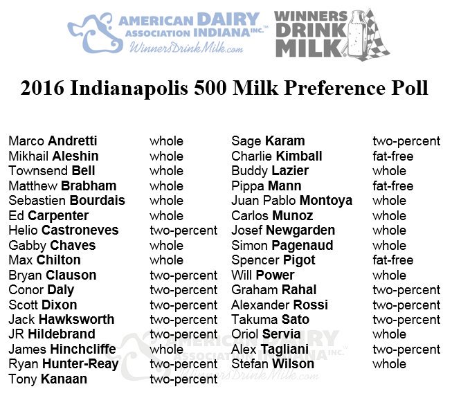
As I was scrolling through the twitter this lazy Sunday morning, I saw this tweet with this image and I thought that I would really like to visualize it.
And then I thought, "I don't tend to have a lot of time to viz. Since today is a special Sunday, I should see if I could get some practice in." If we need to eat five servings of a day, then I should see if I can get 5 servings of viz in today.
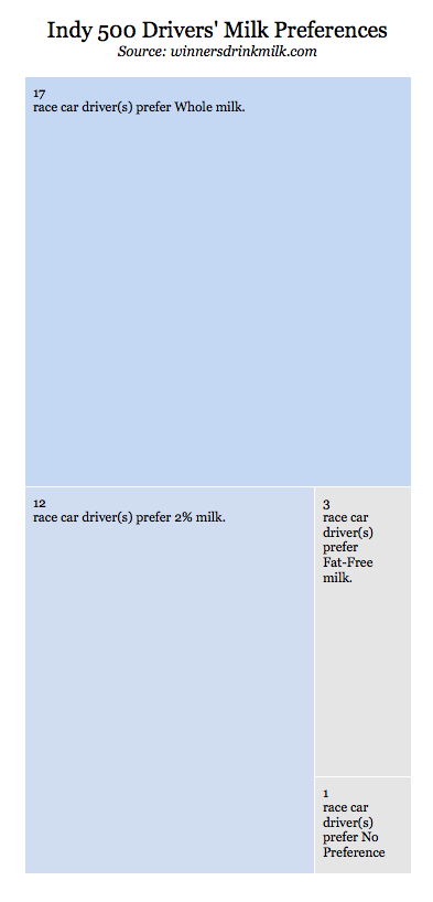
So that's what I'm attempting to do. Because there wasn't too much data, I entered it in to a google sheets, connected to Tableau Public and viz vam voom! I didn't really care too much about the driver's actual preference, but which milk was preferred more than the others. And I did something wild and crazy and made a tree map. There are a lot of cool things I could think to do with this data (marry it up to the state or country of each driver), driver's team (do Gibbs Racing drivers like whole milk? #HTTR). But in the end, I'm looking for production, not perfection. This was a really great learning experience for me though, because I needed to add a descriptive label that was a mix of text and data items. Luckily for me, a quick google search led me to the tableau community forums where I found my answer. So here's my first viz of my #5vizadaychallenge
 RSS Feed
