This was my first Tapestry conference and wow, was it a fantastic experience! To start, I loved that it was in Annapolis (woohoo Maryland!!!) and it was super pretty with ambient snow, but dang, was it cold! Tapestry marries up data visualization and story-telling in a one-day conference packed with keynotes, short stories, and demos and posters that presented in a science-fair style format. And, the conference is limited to 100 attendees, so I was super lucky that my request for invitation was accepted! All I can say is that I'm requesting an invitation to next year's conference, I loved it so much!
The networking was great. During the conference, I had the opportunity to talk with Tableau Zen Master Ramon Martinez, who is so kind and helpful! I hung out with the incredible Anya A'Hearn and I'm hoping that her design sense rubs off on me! I met Peter Gilks in person instead of twitter, and I'm hoping he/Slalom will be kind enough to let me post my MS viz to Viz for a Cause when it's done. In addition to the always charismatic Tableau employees, I was in a conversation with Jock McKinlay(!!), who is extremely bright and talented. And though not there in person, Matt Francis never slept and was tweeting away to the point that he is responsible for me making a connection with Regina Nuzzo, a freelance journalist and stats professor. We spoke about the Rubber Duck concept that Matt recently blogged about. Oh, and I can't forget the very smart and funny Dan Murray! We had a great conversation and he looks good in a women's turquoise scarf! Having a conference that small really allows for some genuine connections and that's the best way to build great networks.
The networking was great. During the conference, I had the opportunity to talk with Tableau Zen Master Ramon Martinez, who is so kind and helpful! I hung out with the incredible Anya A'Hearn and I'm hoping that her design sense rubs off on me! I met Peter Gilks in person instead of twitter, and I'm hoping he/Slalom will be kind enough to let me post my MS viz to Viz for a Cause when it's done. In addition to the always charismatic Tableau employees, I was in a conversation with Jock McKinlay(!!), who is extremely bright and talented. And though not there in person, Matt Francis never slept and was tweeting away to the point that he is responsible for me making a connection with Regina Nuzzo, a freelance journalist and stats professor. We spoke about the Rubber Duck concept that Matt recently blogged about. Oh, and I can't forget the very smart and funny Dan Murray! We had a great conversation and he looks good in a women's turquoise scarf! Having a conference that small really allows for some genuine connections and that's the best way to build great networks.
Alberto was Insightful
After a cool introduction by Ellie Fields, the Tapestry Chair, we got to listen to the amazing Albert Cairo, Professor at the University of Miami. One of the things I'll remember most about Alberto's talk is that he can provide constructive criticism in such a great way, like you know is commentary is harsh but at the same time, you know you'll be better as a result. Listening to him talk, I wanted to get his book that's out and plan on getting his new book when it's released. He discussed points that we need to consider when doing visualizations; be truthful, functional, beautiful, insightful, and therefore enlightening. He also talked about visualizations for social change. This one resonated with me as I'm in the process of doing a visualization about Multiple Sclerosis, and based on what I heard, I'm going about it the right way. His overall message is that we should be evidence-driven communicators as opposed to activists. Alberto suggested that we never begin with an idea and get data to support it, but rather see what the data says. My other takeaways from Alberto's talk was to embrace but be skeptical of creativity. Even with creativity, there must be a focus on the core message. So, design to bring attention to the message. Finally, he recommended to be very familiar with the traditional graphs before moving on to the more exotic graphs. He definitely set the stage for a great conference. I could have listened to him speak for at least another hour, if not more.
Short Stories
From there, the conference moved into the Short Stories section. First up was Jon Schwabish from the Congressional Budget Office. He was really good! I had a few key takeaways from his story. He's dealing with massively huge numbers, which can be hard to communicate. He provided some really good examples of how to make comparisons, and offered the following advice.
The next short story came from Jock McKinlay of Tableau. Jock talked about Data Sushi, which is to make visualizations beautiful on the outside and have raw data on the inside. Jock gave a few reasons why we should have data sushi and a few excuses not to.
- Make comparisons big enough but not too big
- People remember things in context
- Have a soul...connect by making people feel
- Communicating requires connecting
The next short story came from Jock McKinlay of Tableau. Jock talked about Data Sushi, which is to make visualizations beautiful on the outside and have raw data on the inside. Jock gave a few reasons why we should have data sushi and a few excuses not to.
Reasons
| Excuses1. There's cooked data! 2. Lots of work goes into making data usable, so there might be a tendency not to share. 3. It's just hard technically to share. |
The next short story was by Emma Coates, who worked at Pixar and is now a freelance movie writer. This was a little different, but I really liked it. My overall takeaway from her story was to engage! During her story, she mentioned that the audience wants to be enthralled, delighted, and to connect (hey, Jon talked about communicating required connecting!!) Another takeaway that applies not only to written but visual stories, is that simplicity is key for the message (didn't Alberto talk about a focus on the message?!)
Next up in the short story line up was Santiago Ortiz. Wow! I don't even know where to begin with him. You know when you hear people so brilliant that you just sit there in awe? That's basically what I did when Santiago talked. His presentation was beautifully done, the way he slid through slides, and wowza! the earnings v. taxes visualization he is working on is crazy good. You can draw a shape like _/ for example and companies with performance that match that shape will appear. He's hoping to publish it this year and I'm looking forward to it.
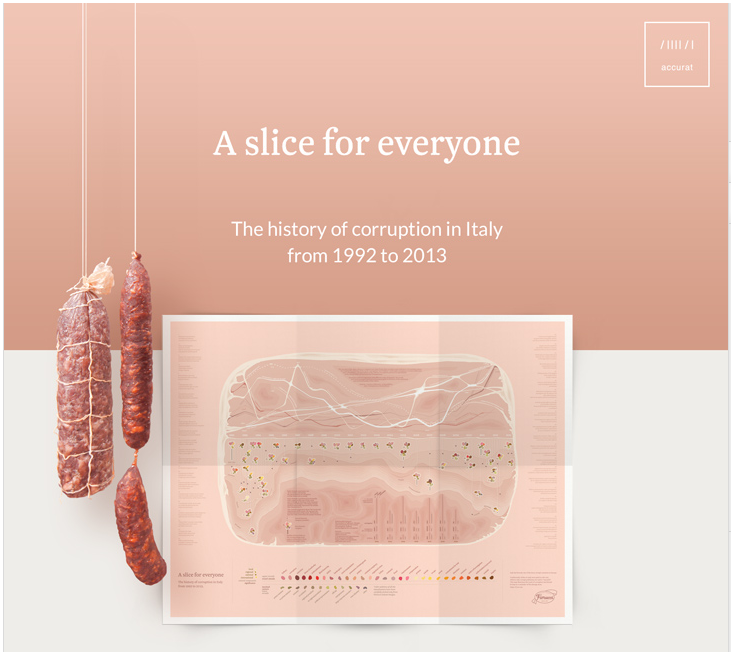
Last up in the short stories line up was Giorgia Lupi in a talk called Beautiful Reasons. I'm sensing a bit of a theme...connection! The biggest takeaway from her was that you can generate attention and emotional connection, if done well. The example they used to support this assertion was from a visualization they were commissioned to develop. Click on the image to read more about the visualization!
Aron was Engaging
Aron Pilhofer is the Associate Managing Editor, Digital Strategy at The New York Times. Because I was so engaged in his talk, I didn't take many notes (nor did I tweet, which is unlike me!). The biggest point that I took away was that they are incorporating visualizations in the stories to start a conversation and to know your audience/reader, just don't launch things (one could say they are being evidence-driven (communicators) by doing some analyses of their readers. See what I did there? If not, then read the Alberto section again).
Now, this made me feel pretty good. Why? Because on this specific point, we've done that with our a couple of our analytics. We have a narrative analyses that accompanies our charts and because we know people still like to print or don't have time to get all interactive, we have the static chart with a link to the interactive one for those who want to explore...so we're trying to meet the needs of two types of readers in the one document.
Now, this made me feel pretty good. Why? Because on this specific point, we've done that with our a couple of our analytics. We have a narrative analyses that accompanies our charts and because we know people still like to print or don't have time to get all interactive, we have the static chart with a link to the interactive one for those who want to explore...so we're trying to meet the needs of two types of readers in the one document.
Science Fair Fun
The demos and posters that were presented in a science-fair style format were fantastic! There were some really smart people presenting some innovative ideas. It reminds me of Malcolm Gladwell's advice that I heard at a Tableau Customer Conference: Be a tweaker (and I'm pretty sure he wasn't talking about drugs). It's great invent something first, but the first one isn't necessarily the most successful one. There were several folks that were presenting their versions of data visualization tools. One of the ones I'm most excited about is a data visualization tool without programming that some folks out of Stanford are working on. It's currently static (not interactive), but I think it will be very interesting to see what happens with this and others. The posters were fantastic (I wish I took pictures of them). A lot of people people spent a lot of time and energy to make some really magnificent work.
Fernanda Viégas and Martin Wattenberg were Entertaining and Informative
One of the biggest things I learned is that Fernanda and Martin do not like periodic tables or subway maps. I think Fernanda's exact words were "They need to stop." Their point was that viz developers can't just shove data into a formula, when it doesn't make sense.
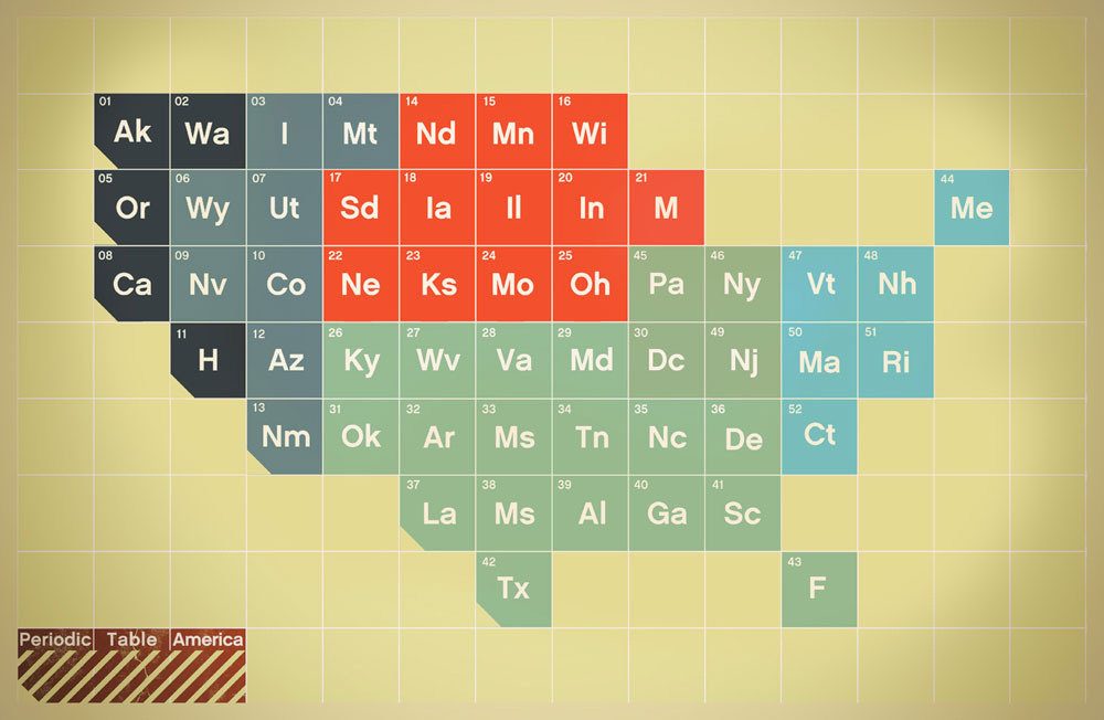
One example I found on the interweb of a periodic table map of the good ole US of A. I'm pretty sure Fernanda and Martin would be opposed to this one.
Another point they made, which I found interesting is about infographics. They are the pop stars of visualization right now. Keep simple, be careful, be purposeful. They then compared different visualization types to different genres. This is the point where I wish I took better notes. Again, I was engrossed and trying to keep up with these brainiacs. The one that I remember most was the collections genre. I don't know why. Maybe it's very similar to the genre name, so I didn't have to think to hard. Maybe it's because I saw a big butt (and I cannot lie!). I'm really hoping slides will be posted for keynotes and short stories, so I have better materials.
My biggest takeaway: request an invitation to next year's conference!
Between the networking; the fantastic and informative talks (of both of the keynote and short story variety); and the science fair demos and posters (which were informative and spurred really good discussion), Tapestry is a conference I want to attend for years to come.
 RSS Feed
