Wannabe Awesome Me
  • Viz 'Em
    • Tiny Tableau Tips
  • Mentor Match
    • Mentor Match Blog
  • A Pop of Color

Pantone's Fall Color Report

9/6/2016

0 Comments

 
Picture
Image from Pantone.com
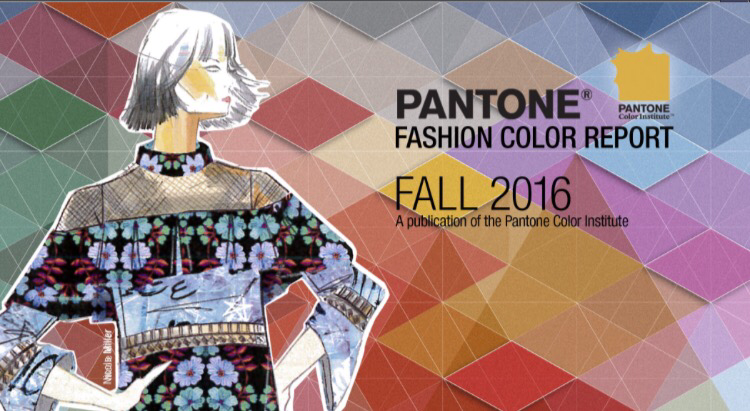
Pantone is the authority on color trends in my book. While I was answering a question for a friend of mine, I found that Pantone published their Fall Trends Color Report, which you can find here: www.pantone.com/fashion-color-report-fall-2016#intro

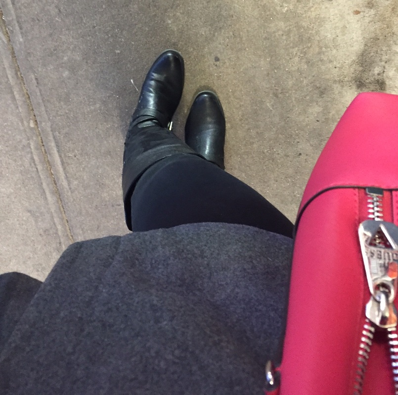
Take a look and let me know what you think! Personally, I love the colors, which are led by the blue family.
0 Comments

Yellow

3/26/2016

0 Comments

 
I wrote a blog post for you and it was called "Yellow."
Ever since I decided I wanted to write a blogpost about yellow, I knew I had to include this Coldplay song (and hopefully you caught the (cold) play on the lyrics. Ba-dum-dum. I'm here all week.  
Anyway, there was a twitter conversation prompted by this viz by Andy Kriebel. 
Picture
Viz Credit: Andy Kriebel
The brief twitter conversation revolved around how yellow was an appropriate color choice (and I don't disagree). But, it was something I wanted to delve deeper into.  I've been reading this book (on and off) about color theory called Your True Colors: A Practical Guide to Color Psychology by Catherine Shovlin. In it, the author talks about how yellow, which is generally perceived as a happy color isn't always the case. I think the following quote from her book is pretty powerful.
Yellow also has its physiological effects and is known to increase endocrine activity, heightening emotion and emotional reactions.
Context in Color
What I've gleaned from my readings is that how we perceive color is based on context. 

On the bright side, yellow can mean happiness, optimism, enlightenment, and cheerfulness, just to name a few.

But there's a dark side to yellow. It can be anxiety-producing, caution, and illness. 

What Ms. Shovlin submits in her book is that if we see a big yellow happy face and we're already in a positive frame of mind, then we'll continue to feel happy.  If we see the big yellow happy face and we're feeling down, that happy face makes us feel down because we're not happy.  One striking point for me in this book was when she related it to de-escalation rooms or baby rooms.  When we think we want the baby's room to be yellow (cheerful, happy), it can have just the opposite effect when the baby is stressed out. As a mom of two, I can say for certain, that I need all the help I can get...so no yellow room for the kids. In reading one of my new favorite color blogs, Color Matters, they dispute the notion that babies cry more in yellow rooms.  I think I need to read more about it before I agree or disagree.  I think it's possible that the color by itself won't cause a baby to cry, but I think it's possible that the baby will continue to cry if it's already upset.  More reading to be done!
Harmonize
What is color harmony? Put simply, it's when the colors make sense together.  I found a really great website that discusses color harmony but also used yellow as the example. Some of the images are lifted from that site, which you should check out. ​Knowing the position and understanding the color wheel becomes key. Additionally, our eyes recognize yellow before any other color (even red) and it has a high reflectance value, which means it can act like a light source. And just like staring at the sun, too much bright yellow, can hurt your eyes. 
Picture
Image credit: uni.edu
Expanding on understanding the hue, tint, tone, and shades of yellow, I found this nifty chart that shows the difference choices for each. The pure hue and tints below reflect the positive emotions associations with yellow, whereas the shades and tones are more reflective of the negative emotions.  It really is the light vs. the dark side. Which would be the perfect time to insert a Star Wars quote. 
Fear is the path to the Dark Side. Fear leads to anger, anger leads to hate, hate leads to suffering.
                                                                                                                                                 --------Yoda

Picture
Found on the wilds of the Internet
The above are examples of using a monochromatic palette to create harmony.  Other options include the triad, complimentary, and analagous, which are shown below. All images from sensationalcolor.com.
Considerations for Visualizations
Yellow can be a great color to use in your visualizations, as long as it's used appropriately.  Here are a few key considerations for using yellow.  
Picture
0 Comments

Color Deficiency Considerations

3/2/2016

0 Comments

 
Last year, I wrote one of my favorite blog posts on color deficiency considerations with respect to red and green.  The overarching message is that if producing content for others, consider how you might want to use red/green (and as Naomi Robbins pointed out in the comments, even orange) in your viz so that as many people as possible can see your message.  I plan on exploring this a little more, but for now, click the pic to the read the post. 
Picture
0 Comments

Ryan Sleeper's Leveraging Color to Improve Your Data Viz

3/2/2016

0 Comments

 
Ryan's post from 2013 is probably one of my favorite color resources. I feel like it does a good job providing a recap of the psychology of color to how to do custom color palettes in Tableau.   This is a must read for anyone wanting to understand the basics of color.  Click on the image to go to the blog post.  
Picture
0 Comments

A Pop of Color

2/11/2016

0 Comments

 
If you know me, then you know I love a pop of color.  But I know my data nerds are like, show us the data behind that statement. Being that I like data viz, here are three recent pictures from my Instagram feed. Pops of pinks and red...that's basically how I think. You're basically reading a post from a girl who went back to her natural medium brown hair color (which actually looks dark), because it would contrast nicely with a hot pink cocktail dress I wore at a wedding.
So as I thought about data viz in particular, it was only natural for me to want to do something with color. 
So, what am I doing here?
I really want to curate color content (I couldn't help myself with the alliteration). In all seriousness, I really want this blog to develop into a reference for color as it relates to data visualizations.
What will you find here?
  • Makeovers and makeunders. Too much color? Not enough color? These revisions will focus on color (along with the what I changed and why).
  • Curated content. Whether it's blogposts, infographics, or other information, I want to have it one place so that I (errr, I mean you) don't have to search too hard for it.
  • Tableau how-tos.
  • Anything else my colorful little heart desires (that's relevant to color and dataviz).

    What would you like to see here?

Submit
Thanks for stopping by and stay tuned for more pops of color!
Picture
0 Comments

February 11th, 2016

2/11/2016

0 Comments

 
0 Comments

    About Me

    I LOVE color in my everyday life, whether it's my makeup (or hai pop of red lips against black and white), or in my clothes, and in my data viz.

    Categories

    All
    Color
    Color Blindness
    Color Deficiency
    Curated Content
    Custom Color Palettes
    Data Viz
    Psychology Of Color

    RSS Feed

Powered by Create your own unique website with customizable templates.