I wrote a blog post for you and it was called "Yellow."
Ever since I decided I wanted to write a blogpost about yellow, I knew I had to include this Coldplay song (and hopefully you caught the (cold) play on the lyrics. Ba-dum-dum. I'm here all week.
Anyway, there was a twitter conversation prompted by this viz by Andy Kriebel.
Anyway, there was a twitter conversation prompted by this viz by Andy Kriebel.
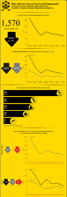
Viz Credit: Andy Kriebel
The brief twitter conversation revolved around how yellow was an appropriate color choice (and I don't disagree). But, it was something I wanted to delve deeper into. I've been reading this book (on and off) about color theory called Your True Colors: A Practical Guide to Color Psychology by Catherine Shovlin. In it, the author talks about how yellow, which is generally perceived as a happy color isn't always the case. I think the following quote from her book is pretty powerful.
Yellow also has its physiological effects and is known to increase endocrine activity, heightening emotion and emotional reactions.
Context in Color
What I've gleaned from my readings is that how we perceive color is based on context.
On the bright side, yellow can mean happiness, optimism, enlightenment, and cheerfulness, just to name a few.
But there's a dark side to yellow. It can be anxiety-producing, caution, and illness.
What Ms. Shovlin submits in her book is that if we see a big yellow happy face and we're already in a positive frame of mind, then we'll continue to feel happy. If we see the big yellow happy face and we're feeling down, that happy face makes us feel down because we're not happy. One striking point for me in this book was when she related it to de-escalation rooms or baby rooms. When we think we want the baby's room to be yellow (cheerful, happy), it can have just the opposite effect when the baby is stressed out. As a mom of two, I can say for certain, that I need all the help I can get...so no yellow room for the kids. In reading one of my new favorite color blogs, Color Matters, they dispute the notion that babies cry more in yellow rooms. I think I need to read more about it before I agree or disagree. I think it's possible that the color by itself won't cause a baby to cry, but I think it's possible that the baby will continue to cry if it's already upset. More reading to be done!
Harmonize
What is color harmony? Put simply, it's when the colors make sense together. I found a really great website that discusses color harmony but also used yellow as the example. Some of the images are lifted from that site, which you should check out. Knowing the position and understanding the color wheel becomes key. Additionally, our eyes recognize yellow before any other color (even red) and it has a high reflectance value, which means it can act like a light source. And just like staring at the sun, too much bright yellow, can hurt your eyes.
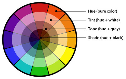
Image credit: uni.edu
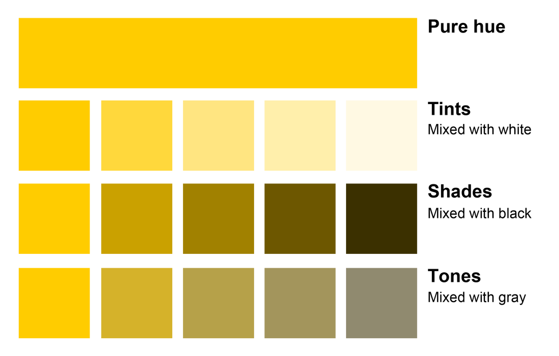
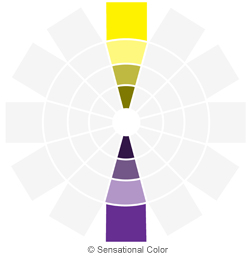
Expanding on understanding the hue, tint, tone, and shades of yellow, I found this nifty chart that shows the difference choices for each. The pure hue and tints below reflect the positive emotions associations with yellow, whereas the shades and tones are more reflective of the negative emotions. It really is the light vs. the dark side. Which would be the perfect time to insert a Star Wars quote.
Fear is the path to the Dark Side. Fear leads to anger, anger leads to hate, hate leads to suffering.
--------Yoda
Found on the wilds of the Internet
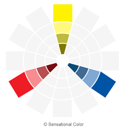
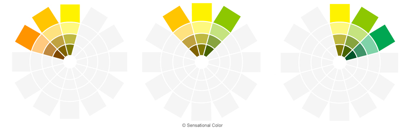
The above are examples of using a monochromatic palette to create harmony. Other options include the triad, complimentary, and analagous, which are shown below. All images from sensationalcolor.com.
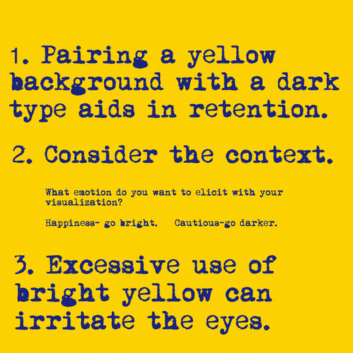
Considerations for Visualizations
Yellow can be a great color to use in your visualizations, as long as it's used appropriately. Here are a few key considerations for using yellow.
 RSS Feed
