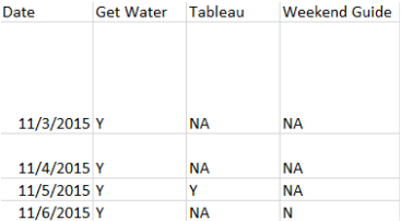
| I wanted to track and visualize my Tiny Habits data, so I entered it into Google Sheets so I could try out the relatively new web data connector. That was a fail. But it's something I'll have to try again (a WDC worked so well with my fitbit data-thanks Craig!). Instead, I downloaded the data into an Excel document and used the plain ole boring Connect to Data via Excel. I ran into some questions along the way, so I reached out to Jonathan Drummey to help me understand what's going on. Jonathan's knowledge about data and Tableau is immense and he is gracious enough to provide some of his pearls of wisdom throughout this post (in the green narrative to the right). But let's start from the beginning First, what are Tiny Habits? They are based on the concept that by using an anchor and taking a micro or small action, you can build up to a bigger change. For example, my bigger habit is that I need to drink more water (a gallon a day). In order to work up to that, I'll use a tiny habit based on an anchor such as...After I push the power button on the coffeemaker, I will drink a cup of water. You keep building on these habits until you achieve the bigger habit. So I entered my data as shown below, where I had each date on a row, and tiny habits on columns. I entered it in a format that made sense so I could see how I did each day. | Hi, Jonathan here. I’m virtually going back in time to kibitz about the steps Emily took with this data. |
| 'Now I want to visualize it so that I can see my data and make my message pop. Let me throw it into Tableau so that I can answer this question... Did I do my all of my tiny habits each day? |
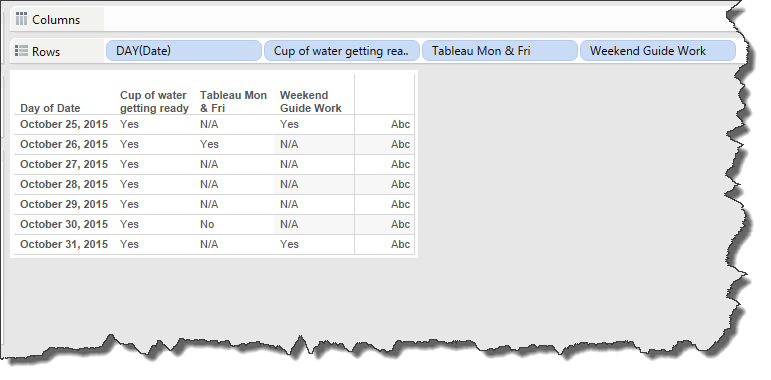
| I was looking for a heatmap or something to really highlight when I did not do my tiny habit. The problem with the above is that I have to read through all of the data values shown to see that on October 30th, I did not open my Tableau program after waking up. Plus, it's gray and boring. I need a pop of color in my life. Let me try this. |
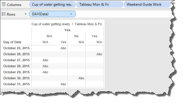
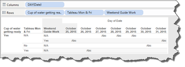
| Maybe it's something with the structure of my data. I thought I created a tall data set, which Tableau likes. Wouldn't it be wide if I had the dates on the columns and the habits on the rows? Maybe it needs to be wide? I'm not really sure what to do at this point, except to call in my data expert. |
| talked with Jonathan Drummey about my conundrum and learned a couple of things. 1) My three tiny habits are part of a super dimension. I didn't know that was a thing! Conceptually, I get it. Water, Tableau, and weekend guide are three items that make up my tiny habits. I need to consolidate the three into one because I have more dimensions than shelves. If I just throw one of the three, say water, on the color shelf, it's only visualizing my water results, not my overall performance (what I really want). 2) To get this super dimension, I go to the data window, select the three columns I want to consolidate and click pivot. Watch this super short, silent video on what to do. I renamed the data (by using the down arrow) to my super dimension: Tiny Habits. I can rename my results as: Results. | I’m always looking for categories that are crossing columns of the data. If you’ve built databases before then you’re used to hunting for these patterns, if you haven't then this is a new skill to build. A couple of examples: Survey questions Q423, Q814, etc. are all members of a "survey question” category. Jan, Feb, Mar, etc. are all members of a “month” category. Besides the challenges with the layout above, another sign is what Emily stated so well: "I have more dimensions than Shelves" where she wanted to put Cup of water, Tableau..., and Weekend Guide all on the Colors shelf in the same view. |
| |
| Sweet! Now if I go back to the worksheet, I can throw date and tiny habit on the view, and put result on the color shelf and yippee skippy, I have a visual! Now I can see I didn't open my Tableau program on Friday. |
| So that's cool and all. I can format this and make it what I want know. But I asked Jonathan this question, "So how should I have structured the data?” I wanted to know if it was an issue on my end so I could learn from it. Jonathan explained three different examples and the consequences of each. |
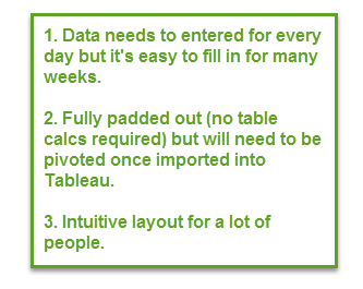
| Option 1) Enter the data as you (or I) would think about it. The benefit here is that the data is fully padded, but you'll just need to consolidate the tiny habits once inside Tableau (and as I learned, it's not difficult). Though I thought I was creating a tall data set, it was actually wide. |
| Option 2) Tableau likes, but you might need to do some work (a table calc to pad the data with N/As) once inside. Here's what it looks like: |
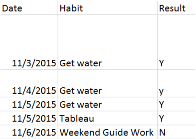
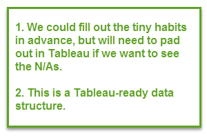
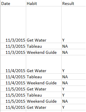
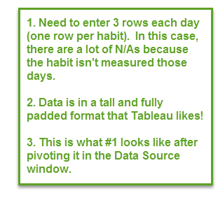
| Option 3) Create a tall data set. This isn't intuitive for me, but what you'd do is to have date and result with the date repeated for each tiny habit to record the result. Here's what it looks like. |
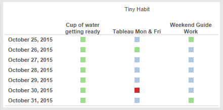
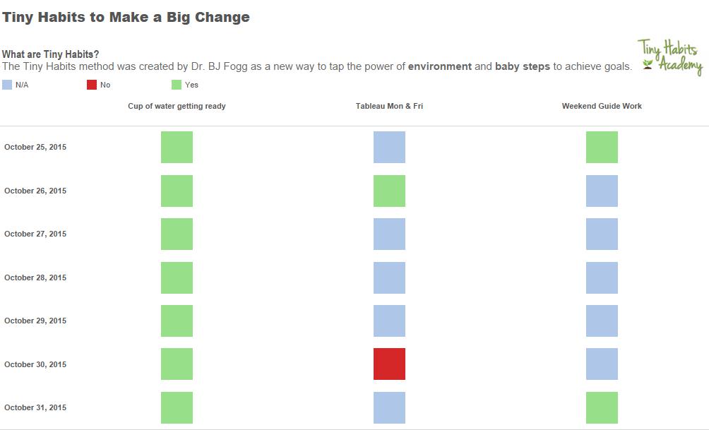
| 'So, Tableau likes options 2) and 3) because they're tall, but number 1) is more intuitive for me (and maybe you?). So what should we do? It depends on what level of work you want to do. Do you want to do a table calc to pad the data (heck, no! table calcs are not for me). Want to put the data in a format tableau loves? Then option 2 or option 3 are your best bet. The conversation with Jonathan was super insightful for me because I needed to see and experience the real life 'if this, then that' of data structure and how it impacts what I do in Tableau. And as GI Joe would say, "Knowing is half the battle." A super huge thank you to Jonathan for annotating this blogpost! And now that I have that little bit of knowledge, I build out a viz like the one below. | What Emily said here is right on, there is no single data structure that works in all cases. |




 RSS Feed
