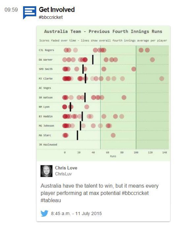
Anyone who has listened to the Tableau Wannabe Podcast knows that one thing that sticks in my craw is using red/green color palette. Am I color blind? Nope. Why do I always seem to raise the issue when we talk about vizzes with red/green colors? I don't know. I suppose it's because I want every reader to see data, maybe I like sticking up for a minority group of readers, or maybe it's a little of both. Either way, it's one of the things I am aware of when designing a visualization. But, it's not enough to just say that you shouldn't use a red/green palette in your viz. You (or I) need to understand the why...why should we not use red and green together? When I came across Chris Love's viz on Australia's cricket team, it made me think:
Which shades of red and green are safe to use together?
So I decided to do a little spare-time research and document it (so I don't forget).
What about the 80/20 rule?
I don't think that rule should be taken literally. I totally get that about 8-10% of people (mainly men) worldwide are color deficient and it does beg the question, why go through this consideration for just 8%? I can think of three ways to respond to this:
Does this mean you have to be a Grinch at Christmas?
Which shades of red and green are safe to use together?
So I decided to do a little spare-time research and document it (so I don't forget).
What about the 80/20 rule?
I don't think that rule should be taken literally. I totally get that about 8-10% of people (mainly men) worldwide are color deficient and it does beg the question, why go through this consideration for just 8%? I can think of three ways to respond to this:
- If you know your audience isn't color deficient, then no need to concern yourself. Though maybe that super awesome viz you did on pay equity or wildfires or [insert super important topic here] might go viral or get picked as a viz of the day (and then 1,000s more may now be in your audience).
- You might not know who is in your audience. What if you chose reds and greens that are hard to distinguish in your 'Should we begin a military action?' viz you are presenting to the president? If you were presenting to Bill Clinton, that might have been an issue. Can you imagine the president not being able to read your viz? Not a career highlight.
- Consider the converse. In the 80/20 rule, 20% of readers may miss your message. Yikes, that sounds like a lot! So 8% might miss the message, so what? Eight is a lot better than 20, but looking at it from various perspectives, exceptions that are over 5% (and even 1% in some industries) might be too high. But I hear someone asking, “What about the other types of color deficiencies besides the red/green types, Em?” Those are 1% or less and so I put those in the 3rd standard deviation bucket. My position (until my learning evolves my position) is that it seems reasonable to capture two standard deviations.
Does this mean you have to be a Grinch at Christmas?
Now that I've made the case against using a red/green color palette, you actually can use the two colors together and enjoy the reds and greens that Christmas has to offer. Let's revisit Chris's viz, through a different lens.
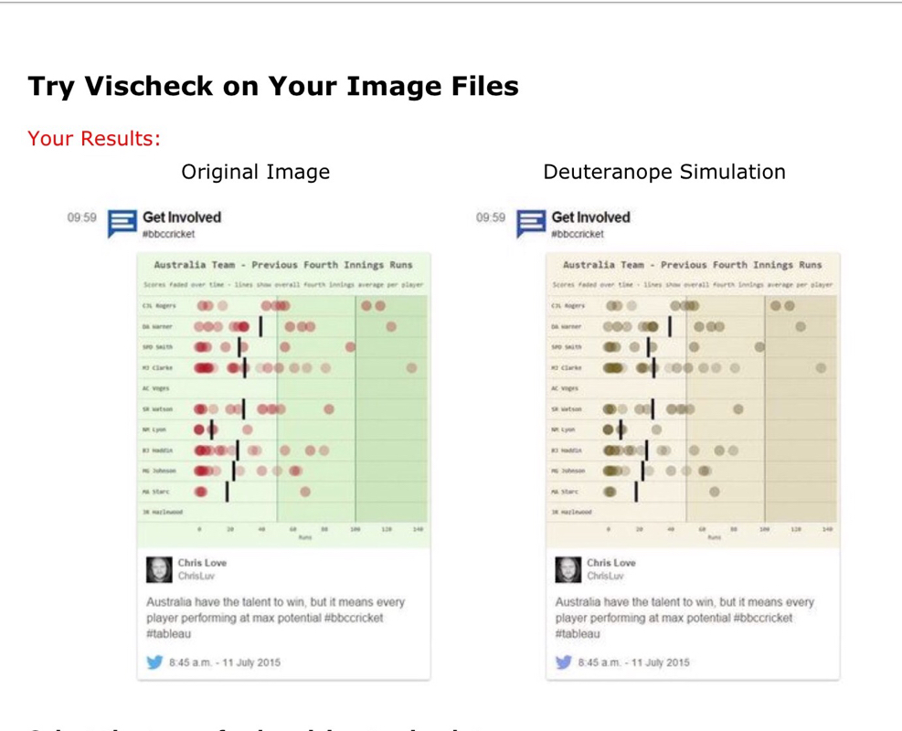
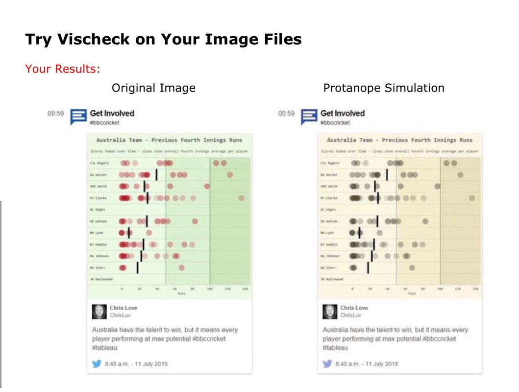
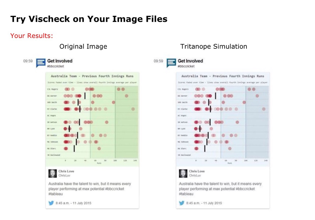
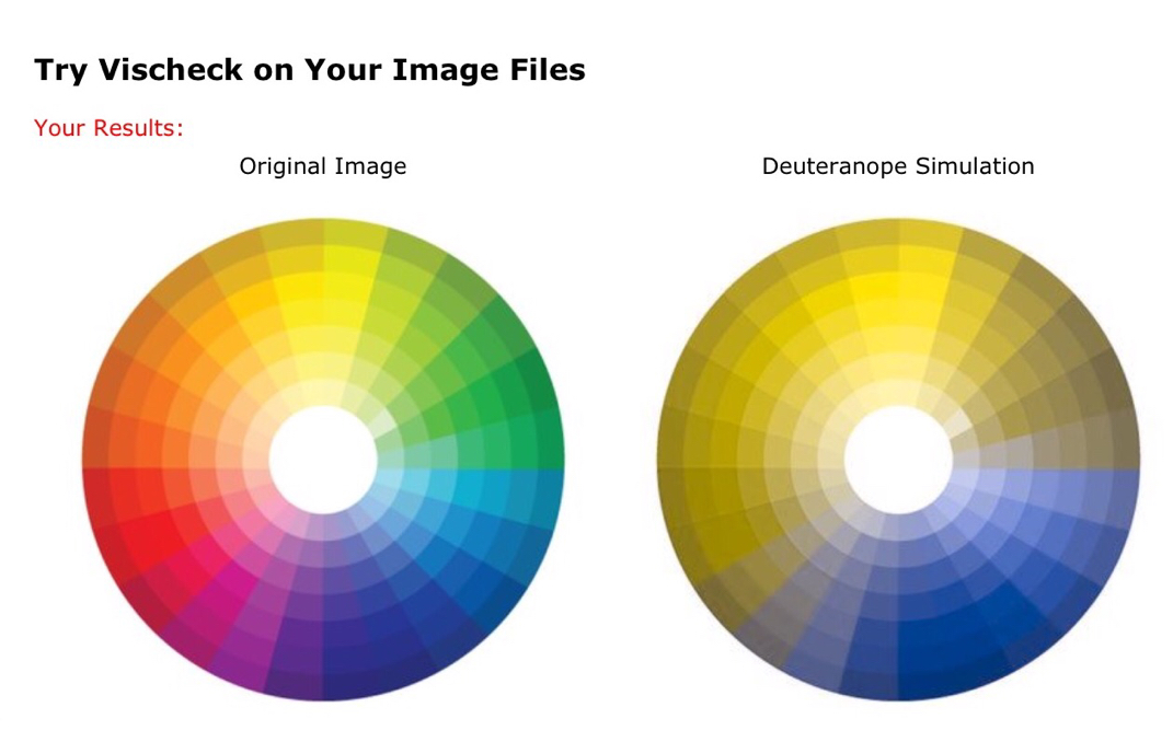
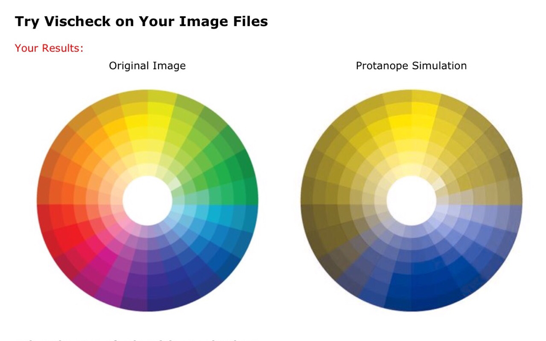
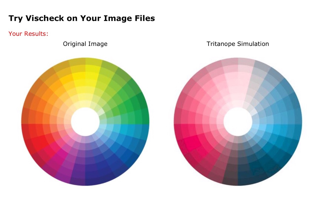
I put an image of Chris's viz through VizCheck and here's what it looks like for the three types of color deficiencies.
I put an image of Chris's viz through VizCheck and here's what it looks like for the three types of color deficiencies.
So, what we can see is that by using a highly contrasting red and green palette, we can see the visualization regardless of the color deficiency type. And that's the key:
Use a high contrast red and green color palette to ensure everyone can #seeallthedata.
Use a high contrast red and green color palette to ensure everyone can #seeallthedata.
And for reference, here is the color wheel and how it looks with the three types of color deficiencies: deuteranope, protanope, and tritanope.
 RSS Feed
