Wannabe Awesome Me
  • Viz 'Em
    • Tiny Tableau Tips
  • Mentor Match
    • Mentor Match Blog
  • A Pop of Color

Oh Hey, I Totally Gave a Tableau Talk (Last Year)

1/25/2015

1 Comment

 
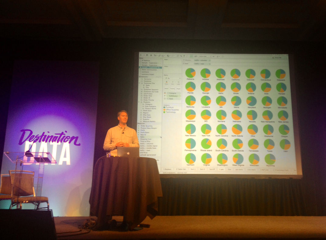
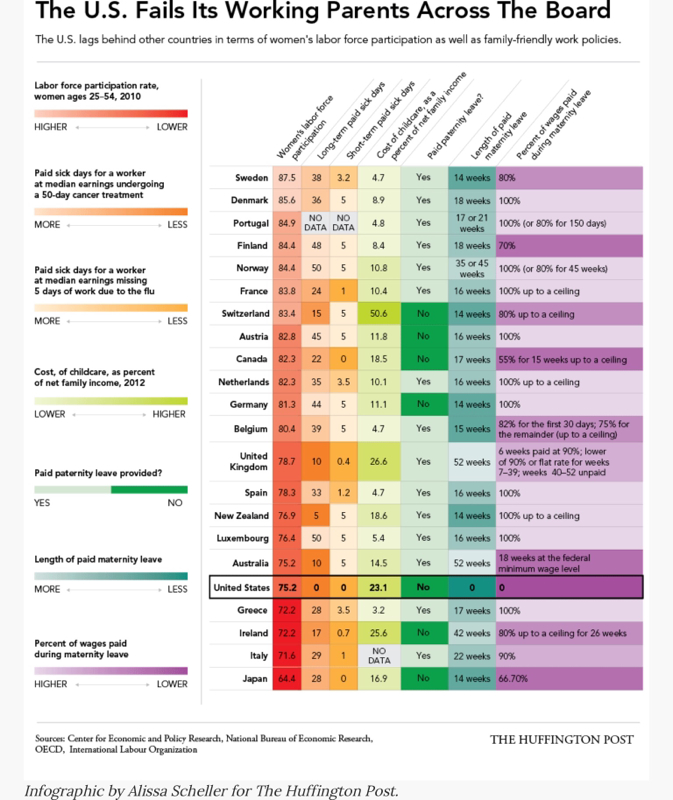
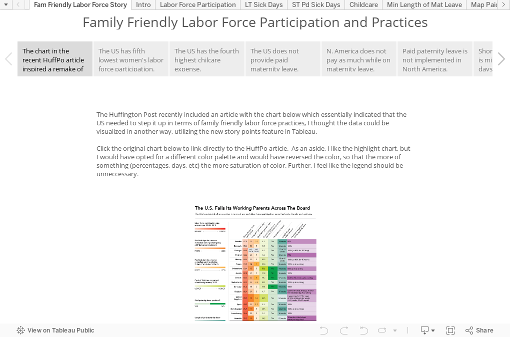
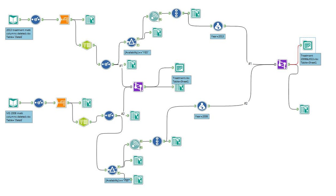
I've been meaning to post this talk I gave at [redacted]. It was a lot of fun and I LOVED LOVED LOVED it. Since my agency has robust ethics rules, I redacted some information out but I thought I would share what I presented.  The talk was about 30-45 minutes and there was a great group with some senior leadership in the room which was really nice.  I love seeing management take an interest in visual analytics.  

I'm trying to clear a backlog of things that I've been meaning to do. And this is just one of them.  Going through the slide deck again made me remember how awesome it felt to talk to folks who are just getting started.  Did I mention that I LOVED LOVED LOVED it? 

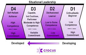
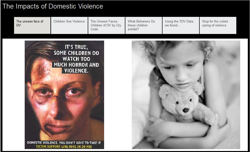
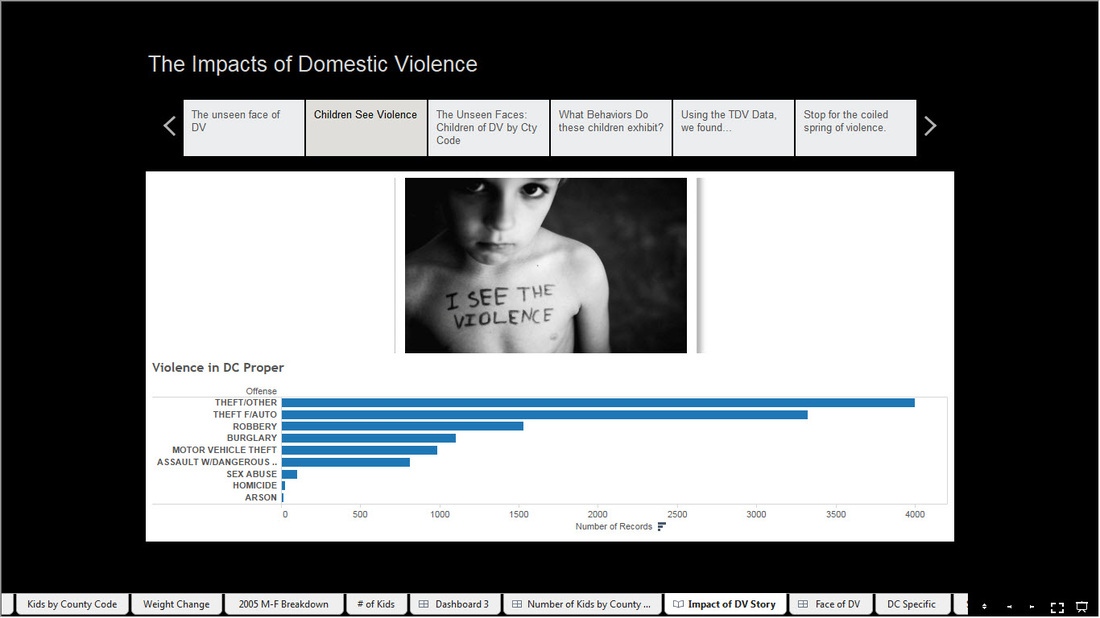
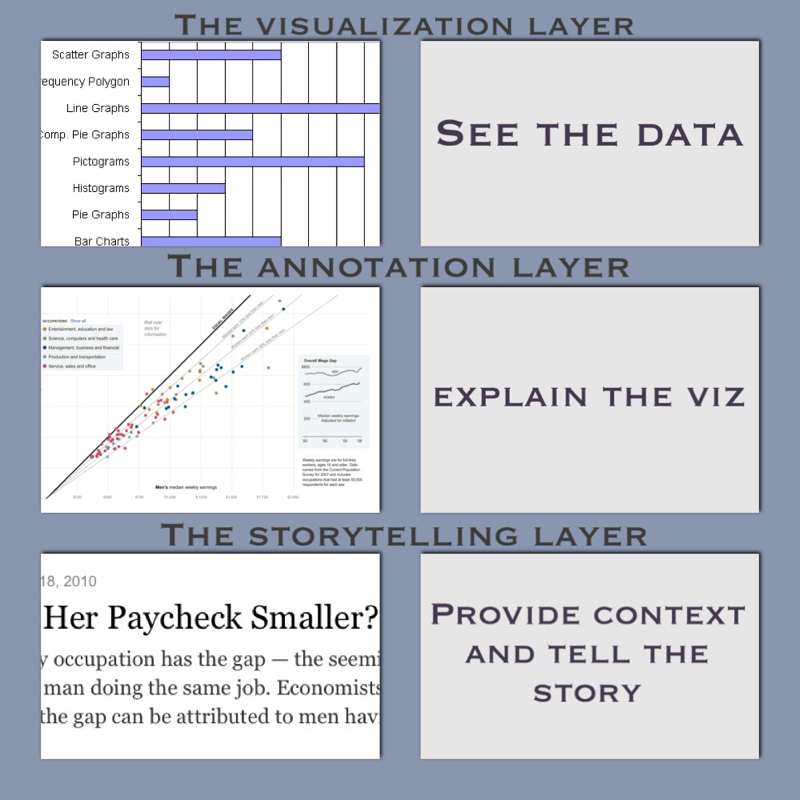
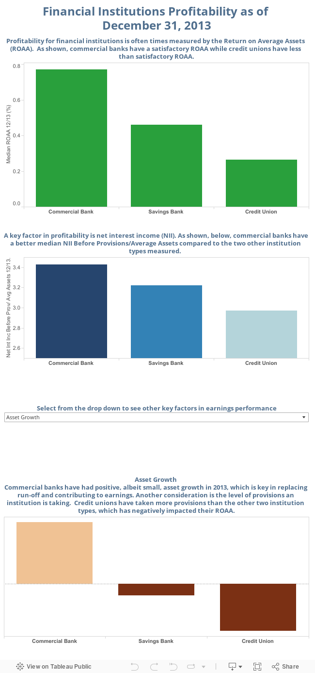
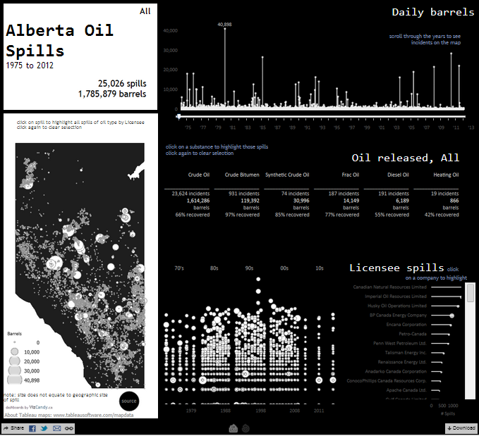
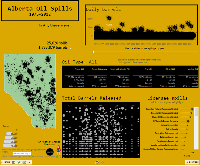
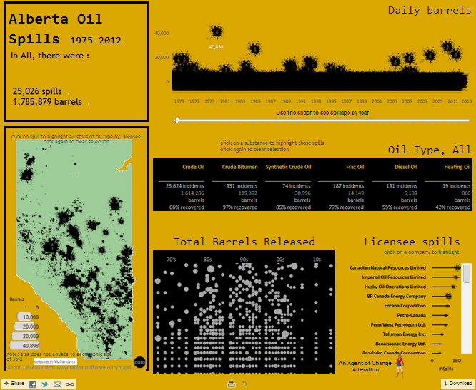
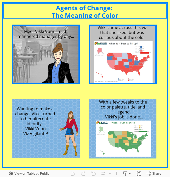
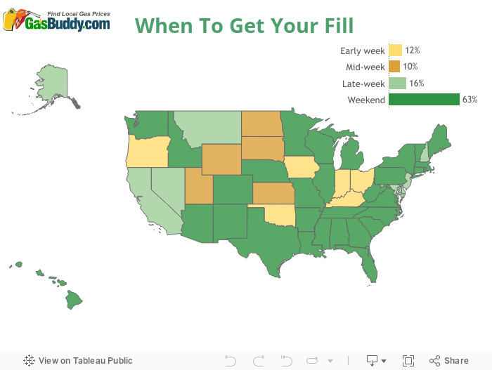
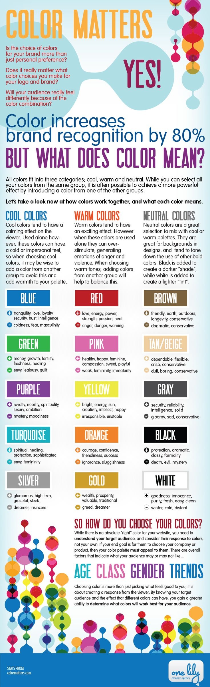
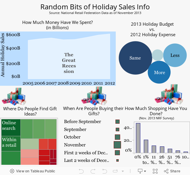
There's nothing earth shattering in the deck but it led to some good discussion during and after the talk. Click the pic and check it out! 
Picture
1 Comment

Do Something: A Data Viz Call to Action

1/21/2015

3 Comments

 
Picture
I haven't been shy about talking about my time management concerns. I want to do so much and I have so many ideas but I just don't have the time to tackle them all. I'm not lucky enough to have one of those jobs where I can where I am encouraged to blog or do visualizations...it's not part of my job. In fact, as of December, I think I officially became a tableau hobbyist. I'm no longer directly involved with reporting. So I have work that's full-time, I'm a mom, and I have a strong commitment to fitness.


However I want to make contributions to the Tableau community. It's finding the time to do that and to put out what I think is good work that's a good representation of myself. I have more ideas than time, so I had this thought...I just need to do something, anything. It doesn't have to be the most awesomest viz in the whole entire world. I can't worry about it if it shows up on WTF viz, is a candidate for Makeover Monday, or two people talk about how bad it is on a podcast.. I just need to do something just to feel better about myself and so I'm not on the sidelines looking at others thinking,"Gee, I wish I could..., Wouldn't it be nice if ..." The fact of the matter is I don't have a job where I can blog and put out super awesome content all of the time. So instead of fretting about what I can or can't do as a result of my job and looking at others thinking, "They're so fortunate and they probably don't even realize it", I'm going to do something.

Instead of letting my backlog pile up or to let someone else implement my ideas (which can be kind of frustrating), or worse yet, let the ideas sit somewhere untouched, I'm just going to take action. I'm not going to be able to do everything, but I can do something. And I invite you to do the same. 


3 Comments

Thank You Tableau Community

12/12/2014

1 Comment

 
It's been about a month since I wrote my post titled Is It Enough? I was really frustrated because there's so much to learn and I feel like I have so many shortcomings when it comes to data viz.  It reminds me of the Situational Leadership II model developed by Ken Blanchard.  In it, he describes four types of people. There are the energetic beginners. With their fresh perspective and eagerness to learn, they're like a puppy with a new toy (that's my description, not his).  Then there are the disillusioned learners. These folks are overwhelmed and their commitment decreases. There's also the capable, but cautious performer, and the self-reliant achiever.  I felt like I was between a D2 and D3 (and you can definitely be a D3 in one specific area and a D1 in another). Here's a little image that a company prettied up about these four types. Side note: if you can, you should totally take this training. It will change your perspective!
Picture
At any rate, I just wanted to say thank you! I really, really, REALLY appreciate the comments and the support.  Y'all are the best! I'll be sticking around and am energized to work on some exciting projects in 2015. So enough of the typing. I'll finish this post with a message and two simple words.
Picture
Picture
1 Comment

Is it enough?

11/17/2014

17 Comments

 
About a year ago, I wrote about my Tableau Identity Crisis. In it, I wrote about how I didn't know what skill or who I wanted to be in the Tableau community.  Over the course of the year, I've really enjoyed the storytelling and design aspects of data visualization and I feel like I've been a data viz cheerleader; supporting people in the community.  


But, is it enough?

Don't get me wrong, I LOVE, LOVE, LOVE supporting people in the Tableau community.  I love doing the podcast, I love learning from people, I love networking, but I'm not sure it's enough for me. While being a data viz cheerleader is fun, what technical skill can I point at to say, "Yep, that's my thing!" I think people can appreciate good design and a good story, but I'm not Kelly Martin, Anya A'Hearn, Matt Francis, or Ramon Martinez.   And I'm not trying to be them per se. But I think it raises the question...I'm okay at design and storytelling, but not stellar, and I'm definitely weak on the data side, so, what' my thing? And while I think it's a romantic notion to think that being a data viz cheerleader is my thing, let's face it, in this community, technical skills rule.  I feel like I talk around Tableau and not about technical aspects of Tableau. And if you're honest, wouldn't you be more interested/likely to read about how to do reference lines behind bars, how to format story points correctly, how to select a color palette, how to [insert topic] versus observations or commentary that might be interesting, but isn't going to help you do a visualization (better)? I want to be a resource for others, beginners in particular, and I'm just not sure that putting out commentary is enough. 

I look back over the past year and feel like I've been treading water.  I still struggle with the basics of data blending/joins and have made some improvements in the world of table calculations.  I'm not trying to be a Joe Mako, Jonathan Drummey or any other zen.  And while I might be able to craft the bones of a story, there actually isn't a story to design if there's no data in it. Using the DV Data Dive as an example, I was able to explore some of the data and focused on one potential story that I thought was there.  The problem...several data sets that required blending/joining/unicorn magic.  Given the time constraints, I gave up on trying to figure how to make the data work and basically made a story points template of what my data story might entail. Note: The viz below is how I left it from the data dive (meaning, it needs to be cleaned up in addition to having data behind it). 

Picture
Click on the image to go to the viz on Tableau Public
Picture
A story point from The Impacts of DV story I was crafting.

10,000 hours...Is the juice worth the squeeze?

On a recent podcast, Jonathan talked about how if he wanted to get good at Tableau, he needed to put in the time and practice, practice, practice, using Malcom Gladwell's 10,000 hours as the basis.  He also stated that Tableau was his hobby. That's a comment I've heard from a couple other zen masters too; when they're not using Tableau, they're dreaming about Tableau. So I think about how I might apply the practice, practice, practice rule for me. Basically what it comes down to is that I tried to have data viz study hours from 4:30-5am on non-running mornings to study Tableau/data viz topics.  But then, I slept in...until 5am (slacker, I know). But even at 30 minutes at time, it would take me forever to get good at Tableau.  Tableau/data viz is not my only hobby. I have two young kids, I work full time with a round trip commute of about 2.5 hours, and I love fitness and want (and need) to dedicate my time to that as well...Tableau can't be my everything. And, I'm left wondering, do I need to get good at Tableau?

I'm tired of having this conversation with myself...of feeling like I'm essentially in the same place as I was a year ago.  I'd have to give up something else I love to get better at Tableau (specifically the data wrangling in Tableau). So, is the juice worth the squeeze?  Tableau is touted as being quick and easy.  And it is, once you understand all of your data and understand the nuances of the tool (including major functionality like table calcs). Is it quick and easy to create a visualization? Absolutely. You can select two data items, click show me (or throw them up on the row/column shelf) and create something.  That something might be totally inaccurate, but you were able to quickly create a visualization. 

So, I'm frustrated and wondering if I need to take a hiatus from being actively involved in the Tableau community.  What will this hiatus get me? Quite frankly, I don't know.  Maybe I'll find a little peace with not thinking about how I can get out of the remedial data class. Maybe it will reinforce that even though I have issues with using the tool, that being a cheerleader is at least being in the stadium, if I can't be in the game.  It's heart-wrenching to think about taking a break from Tableau since I have fallen in love with visual analytics as a result of using Tableau. Heck, I did two podcast recordings while I was on vacation! I want people to have information to make well-informed decisions.  I love participating in hackathons for good causes. But I do wonder if I'm really the person to use the tool as it is currently. Are there other roles for me in the data viz community? All questions to ponder.  

So what's next?

For someone who loves to plan, I don't really know what's next.  My current thought is to continue to try to improve my data skills through year-end and then assess how I feel about it to see whether I should take a hiatus or keep on keepin' on.  I'm in the middle of doing a strengths assessment, so maybe that will help me figure out the next steps in my data viz/Tableau journey.

So for the few people who read this, my questions to you are: 
What are your thoughts?  Have you been in a similar situation and what did you do? 
 

17 Comments

Orioles Magic

10/14/2014

0 Comments

 
I'm not gonna say that I'm the biggest baseball fan or that I'm a diehard Orioles fan.  But I like my O's or as I might have said a few times, #ilikeourguys! By the way, I love all the twitter hashtagging going on for Baltimore (#wewontstop and #BUCKleUp are among my faves and side note: I might use #BUCKleUp a little more since the O's are down two games and the Tuesday night game in KC is a must win). Those O's fans & marketing folks are clever. Anyways, hubs is a diehard fan and I think he started watching the O's in 1984. So as one might suspect, having the O's in the ALCS is a BFD in our household. 


I'm pretty excited for the team and like any good nerd would do, I'm showing my pride by finding a story about the O's I could visualize. Thank you baseballreference.com for the Orioles data set.  There was so much data (all the data! as the cool kids would say). My head was spinning with what I could do. I thought a story around stadiums would be cool because the O's have a long history (and have been in three different cities)! But in the end, I thought back to all of the parody accounts on twitter (which are hilarious...my favorites are Seductive Tommy H and Not Buck Showalter) and thought...it's all about the fans. They are awesome, as evidenced by the following clip.


If you aren't pumped up for this viz, then I think you might be a little dead inside (too much??). The fans showed up big time for the first two games of the ALCS, but did they show up to the ballpark for the first ten years in the millennium when the O's were less than stellar (to put it nicely)? Have yourself a little look at this viz I created and find out for yourself. 

Oh, but before you do, I want to give a shout out to two of my favorite viz folks out there...Andy Kriebel and Matt Francis. They provided a really good review and help where needed.  

Okay, now you can go through the turnstyle and see what attendance has been like since Oriole Park at Camden Yards opened.  Interested in the data? Click here. 
Picture
0 Comments

Where Do I Even Start? TUG Quick Reference Guide

10/1/2014

1 Comment

 
I am so super excited to help people that I put together this quick reference guide to help all of the folks who were inspired by #data14 to start a TUG. A super huge shout out to Andy Kriebel for his review and edits! Hopefully this is the first in a series. Click the link under the tips/advice section to add your own TUG tips/advice! 
where_do_i_even_start_.pdf
File Size: 18 kb
File Type: pdf
Download File

1 Comment

Sleepless in Seattle aka #Data14

9/22/2014

3 Comments


I was at a blogging conference the weekend before #data14 and the organizer said we'd have an information hangover. I didn't feel the hangover the next day from the blogging conference but boy, did it hit me the next few days after data14. I must have booted and rallied between conferences...or something like that (since that kinda makes me sound well versed in the ways of drinking). Anyway...I found my head swimming with ideas and just the sheer magnitude of a conference this size. I want to give a massive shout out to the folks who organized the conference! There are always going to be hiccups but the positives totally outweighed the negatives. I'll touch briefly on the challenges I had during the conference, which were primarily logistical. I was surprised by how much I was impacted by having an unstructured lunch break. I didn't want to miss any of the sessions and I always seemed to miss the items in grab & go. I had the expectation to fill every slot. However, then reality set in I was super bummed that I couldn't attend Joe Mako's session on Flowing with Tableau. So that was a day I actually ate lunch and tried to put pen to paper with the ideas that were swimming through my head. I was bummed when I couldn't get in to sessions that filled up even before keynotes were finished. At least there are session recordings so I won't miss the content.

Every session I attended was very good! It was so hard to choose which sessions to go to. I think my hardest decision was between Facebook Jeorpardy: Hack Edition and Making a Viz that Stops Traffic. In the end, I chose to stop traffic. It was such a great session and reinforced some of the principals I employ and gave me new ones too. Plus, anytime you have Lt. Jim Dangle and Godzilla, you know it's going to be good.

Picture
Picture
Picture
Picture

I loved the Zen Master Tips & Tricks! A couple of takeaways from this session were:

  • How to filter without losing context (Mark Jackson)
  • Google interface shapes when adding custom shapes

It was also the first time I heard Craig Bloodworth speak. He presented tips on using server API. He sounded a bit like Charlie Brown's teacher to me. Maybe it was his accent. Joking! Actually, what he was presenting was interesting and it's amazing that there are folks that just figure this stuff out. For now, I have the reference in the event I need it.

Another session I loved was presented by Marc Reuter called 10 Tips to Becoming a Jedi or 5 things that Mark really likes. A two major takeaways for me from this presentation:

  • The summary card is underutilized. Personally, I'd like to see how we can incorporate it where it makes sense as I think it gives people a better sense of the data.
  • The trellis chart. This looks difficult, but I can see how we could incorporate it into our work products. Plus, I think it's neat, so I want to try it at home.

I also went to the Tableau Like a Sith session. It was a major production. Over my head, but there were a few things that I thought I might try at home/work.

• A hack to downgrade the version.

• Mapping images to IDs and using table calcs to set the images.

• Though this isn't really sith-like, the helper calc of '1'.

I'll probably watch this recording again just so I get a better sense of what's going on and to see dancing bobba fetts.

I found Robert Kosara's talk interesting as well. There are a few points that I recall from his talk.

  • Stories are a way to engage the reader further.
  • There are three layers when it comes to data storytelling.
Picture

In an effort to make progress on my goals, I attended a session by Bethany Lyons on table calcs. It was Jedi level and it hurt my head (though to be fair, that was her objective). A couple of key takeaways from this one:

  • Graph the intermediate calculation to see what's actually happening
  • Base table calculations on the data item versus table down/across/etc
  • Restarting the sort was magical too, I just don't know how to describe it (but I'll look it up later).

Then there was the light and fun Iron Viz. I 💗 this session so much because you can see the various headlines that come out of the same data set and you really get to see the contestant's analytical or creative nature. Preparation is also key! The contestants have the opportunity to look at the data set in advance. They can sketch it out, practice building it, but when it's game time, it's just them, the data, & their sous vizzers. It really exemplifies the many ways that Tableau can be used.

In addition to the great sessions, the keynotes were awesome. Dr. Tyson was funny but Tableau definitely saved the best for last, in my opinion. Dr. Rosling was fantastic! If you didn't think or say,"Yes!! Using data to make a meaningful global impact! Using data for good, that's what it's about!" or something similar, I'm not sure we can be friends anymore. Kidding. It takes all kinds of people to make the world go round. Least that's what I'll tell myself as I ponder our friendship. I love fun vizzes, but I get super excited when I see folks using visualizations to make the world a better place. I didn't want Dr. Rosling's talk to end. And I love his sense of humor!

Another fantastic aspect of the conference was the networking. That's where you get to put bodies to headshots. I finally met the Pauls, Jonathan Drummey, Chuck Hooper, & others in person. And I have to mention the #womenindata meet-up. It was great to hear from women & Jonathan about opportunities and experiences about women in data. I really hope we can continue the conversations post-conference! It was also a great networking opportunity, which was one of my goals for the conference.

While I could go on forever about the conference, even I'd get bored with hearing about it! So I suppose I'll write down my goals for the upcoming year.

  1. Be a newbie advocate. This was borne out of the newbie session that Matt & I presented at conference. So anything I can do to help folks out as they use the tool is a win win. It helps them and I also solidify my understanding of whatever the topic may be. I've already got some things in the works, so stay tuned! I am so super excited about it that everytime I think about it, I want to work on it.
  2. Similar to being a newbie advocate, I also want to help people become data viz leaders.
  3. Continue to build my social media presence in other channels, such as video.
  4. Make progress on understanding data blending and table calculations.
  5. Publish four visualizations per year on Tableau Public, with one-two being focused on health or social issues.

I've got my work cut out for me and I wouldn't have it any other way! I love the energy of the tableau and data viz community and I hope to make meaningful contributions. You'd make me the happiest girl in the world if you engage with me over twitter, hangouts, my blog, or on the Tableau Wannabe Podcast!

Oh and while I'm getting to work on these goals, check out my little scrapbook I created with photos from Destination Data!

3 Comments

Vizful Thinking

9/2/2014

0 Comments


I can't believe how time has flown! It's almost time for the this year's Tableau conference. I looked back on my posts throughout the course of the year and think hot damn, I'm good at goals! Kind of. Here's my resolution after attending TCC13:

I resolved to up my Tableau visibility and publish at least one viz on Tableau Public (and we'll see where it goes from there).  Big props in advance to Matt Francis for helping me expand my network! I'm also resolved to better understand and apply design concepts to make data beautiful and something that folks want to see. 
So, unlike New Year's resolutions, I think I actually kept these! I've published several vizzes on tableau public! I'm really proud of my work on the MS viz (part of the screen shot below). My first go at it was less than stellar, but relying on a good group of folks to provide me feedback, I was able to remember and apply the design concepts they pointed out to me. A super huge thanks to Kelly Martin, Ramon Martinez, Anya A'Hearn, and Matt Francis for the help!!! I'm also beyond thrilled that people have asked me to review their vizzes!! I get that I'm not the smartest person in the room, but I try to provide feedback that is meaningful and not totally annoying. For me, it's a big deal for folks to ask me to review their vizzes, so I'm really happy that I can make a contribution! 

Picture
Click the pic to visit my Tableau Public profile!
One of my objectives for the last conference was to build my network. Between the people I met in person at the conference and the new people I've met on twitter, I've definitely expanded my network. I am really excited about actually seeing some of the tweeters in person, instead of their avatars. Which reminds me, let me get on my soapbox for a minute.

Picture
I think networking is seen as a fluffy, somewhat superfluous activity (yeah, that's right...I busted out my favorite SAT word). But I see a big benefit in networking. For example, I wanted to show a Gantt chart with peak periods, but was super swamped at work and no time play around with it (you know those time where you're asking people to wait five minutes so you can get a drink of water and not die of dehydration? That kind of busy). Enter Matt Francis, who was able to whip up the peak period Gantt, which I've used at work. Then, on my personal vizzes, Matt, Anya, Kelly, and Ramon helped me with my major viz on MS.  This cause is extremely important to me and I wanted it to be Viz of the Day quality. I feel like I'm a pretty realistic person.  I know my skills are not superior, so I wanted help to make sure that in spite of my skills, the viz looked superior.  I went to people I knew, trusted, and felt comfortable getting constructive criticism from.  The result was a visualization that I think communicated the message of how MS changed in five years. To me, I see a network as a way to improve my skills. Side story: My mom and I were having a conversation about my career and she told me that I was always trying to be better or do something better.  I think she's right. I know I'm always trying to find a better mascara! Actually, I'm not content with status quo and I like to be busy. So, I think the combination results in always trying to improve. Ok, off of the soapbox now.  It just really annoys me when people don't see the value in networking.  

In one of my blogposts last year, I wrote about trying to find my tableau identity. I'm not a data person and I like the design aspect, even I will admit that I'm still learning that. I don't think anyone can be super skilled overnight or, I would submit, even a year. One of things that annoys me (even about myself) is when people complain about their lack of skills or their problems and not try to resolve them. I *might* just be into problem solving. So, to help with my lack of data skills, I took Google's data course which provided good foundational information. I also joined the Interaction Design Foundation to better understand the theory and do design the right way.

Picture
I made sense of some data! Gotta love free online courses.
Picture
I'm a member!

The thing I like about being a member is that I have access to courses for a year and can go at my own pace. And with two kids, work, and commuting, I definitely need that! Between doing and getting feedback on my vizzes as well as some of the theory I've learned, I'm definitely making progress.

In that post, I polled people to see how I should resolve my identity crisis. Here are the results (as of August 27, 2014).

Picture
And while I took a data course and became a member of IDF, I really am just letting it occur organically. Then in July, Stephanie Evergreen wrote a blogpost about Women in Data Viz. It's a really good read and I would recommend that you all read it now. Like now. I'll wait.


From Stephanie's blog...evidence that I'm on the list! 
Picture
 

Okay. So you've read it and there I am! Under the women who tweet about data viz. It was a bittersweet moment for me. Yay! I'm on the list! But booo! I'm on the list as a tweeter. I really questioned my value in the tableau (or even the data viz) community by 'just' tweeting. But then I reflected on it (& perhaps it's rationalizing to make me feel better) and felt like by tweeting & blogging, I'm bringing awareness to data viz and through that, perhaps I can help build data viz leaders...and perhaps that's my real value. I'm certainly a leadership dork and I want everyone to be a data viz leader. So if I can help people improve their data viz skills as well as mine through twitter, then I'm okay with that. And while I'm okay with that, I'm not sure that a lot of folks truly recognize that value, which can be frustrating. But at the end of the day, I think I found my tableau identity and I'm cool with it.

So with that notion of building skills and helping peeps out, I hosted a pre-conference hangout session with some TCC vets on August 29th. First, I would be remiss if I didn't thank Andy Kriebel for the idea and the other panelists, Anya A'Hearn, Chuck Hooper, and Ben Jones for bringing such great perspectives and tips to the discussion. I had a bunch of fun & would love to do it again! Plus, I think everyone like the Darth Vader that was looking over my shoulder. 
But all work and no play makes Em a dull girl.  So in that vein, I've been having a bunch of fun lately because my best bud, Matt Francis, and I started a Tableau podcast! We talk all things Tableau and it's been so much fun, I love it!!! Matt & I chat about the viz of the day, twitter topics, topic du jour, & I try to insert a Matt joke (some days it's easier then others). BTW, if you have a joke about Matt, send it my way and I'll give you a shout out! Our discussion on the podcast is so valuable (& entertaining) to me and I hope to others as well. And it made me think that Matt and I should actually do a hangout on air podcast. Doesn't everyone want to see us drink coffee and chat about Tableau?  Obviously, the answer is yes. 

So in addition to the podcasts and the hangout, Matt & I also have a pre-conference session on Monday September 8th from 3-4pm to help folks navigate through the biggest conference Tableau has hosted. We're repeating the session on Tuesday after Christian's keynote too!  I am so excited for these sessions we're doing, I'm going to have to drink decaf on those days. I just thought of a funny story about me from college that involved cherry pepsi, and chocolate covered espresso beans...good times! Anyway...there are an insane number of sessions to choose from and I think I've already reworked my schedule twice! 

I'm also excited about a #womenindata meet-up (September 9th 12:45-1:45 in the University Room at the Sheraton). I'm really pleased that someone in Tableau had the idea to do a women in data meet-up. I think it's challenging to be a woman in STEM. I could get on another soapbox about it. However, one soapbox in a blogpost might be enough. I think back to my first (& so far, only) hackathon at Bread for the World. Bread is a great cause and we focused on a great topic; women's empowerment. That really supported a saying I heard several years ago. It was from an entrepreneur who believed in giving people a hand up, not a hand out. When we support women's empowerment, the community as a whole benefits. A bit of a tangent, but I thought of it because one of the reasons I wanted to be involved with the hackathon was to improve my data skills. Did that happen? Nope. There was definitely a bit of a divide based on our team's approach and given the time constraints. And because I can't sit around, I started talking and tackling the visual aspect. You can check out more about the Bread for the World Hackathon in this Washington Post blogpost (which I'm pictured and quoted in...which is totally awesome)! At any rate, I want to improve my data skills and I believe that anyone can do anything with a mix of practice, talent, and a great support system. 

So back to #womenindata. Why does it matter if I'm a woman in data, or a woman in finance, or the only woman on my division's management team? Because by supporting women in these historically male dominated industries or roles, I show my daughter that she can be anything she wants to be, that her opinions and perspective matter just as much as anyone else's, that by lifting her up, we improve her community. And just because we love makeup doesn't mean we have to be pigeon-holed into the design side of things, but even if that's where our strength is, that's fine too.  This isn't some pendulum where we have to swing all the way to one side and all be coders. Any person's strength is knowing what they're good at, what they're weak in, and figuring out how they want to use that information (strengthen the good or strengthen the weak). 

So, I think I got on that second soapbox. At any rate, as I look back over the course of the year, I'm really proud of my progress, for the community in which I belong, and I'm looking forward to seeing what next year holds. Hope to see you at #data14!


0 Comments

Your Destination Data Itinerary

8/20/2014

0 Comments


It's time for #data14! The conference is sold out and there are so many sessions to choose from, just how does a first timer (or even a veteran who hasn't been in awhile) navigate their way through?  Luckily Matt Francis and some of my other buds are here to help! 

Stop 1: Hangout with Conference Vets

Picture
Your first stop has to be a hangout with conference vets Anya A'Hearn, Ben Jones, Andy Kriebel, Chuck Hooper, Matt Francis, and me! I am so super excited about this hangout because you'll get to hear about our conference experiences, why we keep coming back, and tips and tricks to help you survive! Oh and you get to ask hard hitting questions like, "Should I go double-fisted with the coffee?" The answer is no...get yourself a big ole cup (don't waste time on 8 oz cups when you can find a 12 or 16 oz cup somewhere). That tip is a freebie and you're welcome. 

Stop 2: Pre-Conference Session 
September 8th 3-4pm in Conference Rooms 3A/B

If you're schedule allows and you really want to rock this conference, you need to visit with Matt and me on Monday afternoon. A conference of this magnitude can be overwhelming, but Matt and I will show you how we've approached prior conferences, how we're approaching this conference, and how to keep the magic alive after the conference. 
So call it keepin' the magic alive, or trying to be a dataviz leader, or whatever, it can be tough to keep the energy up and implement all of those fantastical ideas after the conference.  Matt and I will talk about what we did in the off-season to keep the momentum going so we didn't look like this.
Picture
Credit: BR-David deviantart.com
But what if you're flying from across the country and you got up at the crack of dawn and you still can't make it to the pre-conference session?  Don't fret my pet. Matt and I will have a repeat session on Tuesday, right after the keynote.  I can't promise swag, because that would be wrong of me. But we're working to get Tuesday session attendees some special treats. It might be extra coffee, it might be Tableau swag, or it might just be our winning personalities...you never know unless you attend! 
Picture

Stop 3: Full on #data14 Fun

There are so many great things planned for this year; the stellar sessions, parties, and the meet-ups. Oh the meet-ups! I'll take a minute to promote the #womenindata meet-up happening on September 9th in the University Room at the Sheraton...right after our session! 

So, now that you've got the first leg of your #data14 trip planned, we'll see you at stop 1 (and 2)! See ya on air and in Seattle! 

Oh and a last stop was just announced! It's Fanalytics 3!! I heard last year's was great but I had to go to a meeting (sometimes it sucks to have a conference so close to your work). But this year, I registered as soon as I found out about it! This is another space is limited event, so register soon-ish! It's a great opportunity to learn, network, and maybe get some swag (and who doesn't love swag)!

Picture
0 Comments

Orange is the New Black: A Viz Makeover

7/31/2014

0 Comments


When I saw this Viz of the Day on Alabama Prison Utilization, I thought there were some changes I'd like to explore. But then life got in the way (oh those kids and work)! And then I thought about it again and really wanted to see how I might change it. I remade the viz using story points, because I thought it was well suited for a data story.

You'll note that I set up my data stories kind of like an actual story...I have an intro of sorts, the body, and a closing. Because it feels weird to me to not have an ending to a story (unless it's To Be Continued...).

At any rate, this is my take on what the author orginally did. I opened it up a little more to include medium and close-security prisons, whereas the original primarily focused on close-security.

Oh and funny story. I was showing husband what I was working on and saying things like,"Wow, Alabama's prisons are really understaffed and overcapacity." And I thought to myself, that's got to sound funny to hear from me. And we don't even live in Alabama. So enough of the chattin'! Take a look and see how I changed it (and then play around with how you might visualize it)!

Learn About Tableau
0 Comments

A Story about a Story

6/30/2014

0 Comments


I like HuffPo and I can usually find an article on the twitter timeline that will grab me. Most recently, it was a story about how the US doesn't provide for family leave and has a lower participation rate of women in the workforce. Last time I read a similar article about how pay equality wasn't a big issue as people were making it to be, I wrote a blogpost about how pay equality wasn't just a lady issue. This time however, it was the chart that caught my attention.

Picture

I like the idea of putting some narrative with each area that I want to call out. I had story points on the brain the other day when I attended my first hackathon at
Bread for the World Institute. I was part of a group that was working on visualization concepts to raise awareness and show the linkage between women's empowerment and stunting. Since we ran out of time, I now have another little side project to work on...telling the story of child development/stunting among various countries. I think story points could be very impactful.


Getting back to the current story, I didn't read a help file, so I've probably just scratched the surface on what story points can do and how I can really make it look sharp. The way I see it, I have lots of stories to tell, which means lots of opportunities to leverage this new feature in Tableau.


Tell your own story by getting some data and downloading Tableau Public 8.2!

Learn About Tableau
The story here was about the US and it's position amongst the other countries. As I was reading the chart, I was all like, "Dang, the US is the only country that doesn't provide paid maternity leave?" And I would make a similar comment for each area being measured. Then the light bulb went off...What if I remade this chart using story points? It gave me a good excuse to play around with the new feature. So that's what I did.

0 Comments

What Every Mother Wants...A Mother's Day-ta Viz Card

5/10/2014

0 Comments

 
In my effort to build and keep my skills fresh, I was on the lookout for another viz I could do. 
When I started looking, Mother's Day was right around the corner, so I thought I'd go to my trusty national retail federation site to see what they had in store for me (bad pun, I know). I go to the Retail Insight Center which has a wealth of information and since I like shopping and worked retail in college, I can relate.  
Picture
When I looked at the charts, they weren't horrible, so it's not like I was thinking, "Ah yes, let me makeover this horrendous viz." Rather, I wanted to explore and see if there was a story there. And, I think I found one in the data. But first, how to present it.

The last time I went to NRF's site, I made the viz below.  The best laid plans...it's chart junky and really could have been better, I'll admit that. I really should go back and fix it because there are so many things wrong with it (though I do like the area chart).  
Learn About Tableau
So what to do? I like to have fun and I wanted a fun viz but at the same time, I didn't want the winter holiday shopping viz trainwreck.  That's when I thought about getting a Mother's Day card and it seemed to fall into place (I think. If not, be kind with your criticism). 
Learn About Tableau
So a couple of things about this viz that I like and how I balanced fun with hopefully a good design.  It looks like a Mother's Day Card, which I think is fun. I used pages from my digital scrapbooking software to create the "card". When you click the bouquet (which is an embellishment from the software), you see the inside of the card.  I tried to tie in the colors, which all correspond to the palette shown on the cover, to around three color choices.  I also tried to tell the story that I found in the data, which to me is that Mother's Day is the third largest holiday from a spending perspective (I actually thought it was second) and that online isn't quite as popular as I thought it would have been since people still plan to go to stores to buy gifts.  Since I had a little extra space, I floated a little line graph on historic Mother's Day spending by the first chart. 

I went back and forth on the background color.  While I really like the blue as a background, given that the front of the card was blue, I thought it was too much, so I went with purple. Because I wanted it to have that card feel, I signed it kind of like how I sign my Mother's Day (and almost any card), with a heart and my name. Keeping in mind what I learned from Jock McKinlay's session at Tapestry, I wanted people to have access to the the site where I got the data, so the heart links to the Mother's Day overview from NRF.  Of course, if you download the workbook, you have the data I used too. 

So, there you have it. What every mother wants...a Mother's Day Viz.  Maybe it's the thought that counts! 
Happy Mother's Day! 

Picture
Picture
0 Comments

Making the MS Viz

4/24/2014

0 Comments

 
I wrote a non-viz blog post (I know, I'm still shocked!) about why MS matters to me and why I thought it would be a good idea to do a MS viz. Way easier said than done. But I stumbled upon the Atlas of MS database and I thought 'This is great! I'll get all of the data for 2008 and 2013, it will come down in excel, and I'll create a Viz of the Day worthy viz.' Oh and while I'm at it, a genie will appear and grant me three wishes (including unlimited wishes). No genie appeared. Major frownie face. So I had to resort to trying to do this myself. After I downloaded some data and tried to work with it and then banging my head against my chair, I looked to my network, keeping in mind what Jonathan Drummey once wrote; we're not experts in every area. So instead of hanging my head in shame, I asked Matt Francis to help organize it in a manner that would be tableau friendly and then help me understand how I could have done it myself. Some data makes me happy. Other times, it's a four letter word that makes me channel my inner Ralphie (who says the mother of all curse words, the F--- word). Matt and I discussed the data side of things, which you can listen to here (look at me being all multimedia).

So you heard (or spoiler alert), the data was horrid...even for a seasoned tableau stud like Matt (thanks for that little gem, Nelson). So, lesson learned for me: I need to plan to spend 50% of my time getting up close and personal with the data (coffee or wine may facilitate this). Towards the end, Matt used Alteryx to blend the data together to make it useful. Here's a look at what he did.
Picture
Data magic via Alteryx
Now we get to the part of the viz that makes me happy; the visual. I think it's important to understand my original objective. I wanted this viz to help raise awareness about MS and as part of that, I thought it would be valuable to have a visualization that could be printed out that shows the comparison for the two years (2008 vs 2013). It was also important for me to use the MS colors; orange being the primary color. This led me to use gray and orange theme. For some reason, I didn't want to go with a black background, I felt gray worked better. While there was so much data, I had a tendency to want to include as much as I could (more information is better, right??? uh, maybe not). While I used Matt for data help, he also provided my first level of review (a concept he's talked about in his blog post about rubber ducks). I also sought out feedback from three other folks; Kelly Martin, Anya A'Hearn, and Ramon Martinez. I felt uncomfortably comfortable asking them to review the viz. All three provided excellent constructive criticism. For example, I underlined some text, totally spacing on the fact that it would then make people think it was actionable (if not printed out). Anya dished out some tough love that made me re-think what I presented. That was super difficult to hear, but after taking the afternoon to reflect, I applied a saying I love, shown below. I looked at it as a valuable learning experience.
Picture

Ramon provided some feedback on showing the data on the map as well as the bar graph to show the change from the two years. As a result of the feedback received, I reassessed what I wanted to show in the viz and tweaked how I wanted to show it. Essentially I scrapped the concept of being able to print out the visualization. When it came down to it, I thought the relevant point was still being shown and if folks wanted to print it out, they could. I reframed the viz so that I had three major sections; How prevalent is MS?; When are people diagnosed?; and What prescriptions are they using to manage their symptoms? I scaled back what I was showing, applying the less is more concept. I used Ramon's suggestion of the showing the difference on the map, for the bar chart to the entire view next to the map to show the range of values, showing the mean age on onset for 2008 and 2013, and then ranking the positions of prescriptions for 2008 and 2013 using a slope graph.

Learn About Tableau
I think the end result is much better and while I've had moments of wishing I could have done this all on my own, I remind myself that there are very few people that are experts in everything and (this is probably the hardest part for me), I should not expect myself to be as good as people who have years of practice or studied visualization. However, since I can count on one hand the visualizations I've done, it's not too shabby. And more importantly, I learned something from the experience (least that's what I keep telling myself) and if one person views the viz and learns something new or supports the cause to provide support for MS, then I'll be happy.  

Though I mentioned them in the post, I would be remiss if I did not extend a big thanks to Matt, Kelly, Anya, and Ramon for taking their time to review and provide support me in developing a visualization that is extremely significant to me.

0 Comments

Analytic Tools for the Data Warrior Princess

4/23/2014

0 Comments


I kind of remember Alteryx from TCC13, but to me, they were just another vendor (sorry, y'all). It wasn't until this year, when either I got smarter, they're doing a heck of a job with marketing, or a combination of both (which is probably the case), that I kind of understood what this Alteryx was about.  So when I saw that they had an event nearby called Analytic Tools for the Data Warrior, I knew I had to attend.  I rounded up an analyst at work who likes this kind of thing, and we headed over to Bethesda.  First, the Tableau rep, Pat, nailed it when he said that events in DC are tough, that it seems like people can't escape their offices.  Which is pretty much why I was sitting front and center; a result of arriving five minutes before the event was supposed to begin (but in fact, had just started.  Side note, they must prescribe to the Tom Coughlin rule of meetings...If you're five minutes early, you're late!). Anyway, the Alteryx dude gave a brief background on Alteryx, which has been around for over 10 years, with a name change (and mission change) in 2010.  I thought the demo was pretty interesting, as was the happy hour (data=happy). It was quite clear that they have a strong background in spatial analysis.  I think Alteryx is similar to tableau in the sense that you can see what you're doing as you go along.  I think the preview functionality is brilliant! Now, is the software completely intuitive and so easy that someone off of the street could pick it up and start going?  No, and that's not a bad thing. I think for data management tool, I think it's probably as intuitive as it can possibly be.   There are a few things that I saw from the demo that I thought were pretty cool.  

  • Previewing results (let's me make sure I'm on the right path).
  • Cool spatial analytic tools. Like drive-time!! I actually thought of a use case at work for this.
  • No scripting for R. I know very little about R, except that you can do some awesome predictive analytics with it. Now, why is this bullet point worthy? Because you don't actually have to know how to code in R...they have wrappers to help people like me (or data management people, at least). 
  • I also like that it can create an extract that will feed tableau (yay! less work for me!) and
  • Drag and drop workflow

After Alteryx did their portion of the demo, it was time for tableau to show their stuff. Based on raised hands in the crowd, about 2/3rd of attendees had used Tableau.  That's pretty good!  The Tableau representative took the extract and re-built the sample dashboard and stopped there, which kind of annoyed me, especially as there was time remaining in his portion of the event.  The question being answered was 'Who Do We Send A Second Mailing To?' While his primary objective was to rebuild a dashboard with four views on it, since he had time, he could have made the dashboard more meaningful by doing a few tweaks to it, like putting a title on it and changing the color palettes (because I'm pretty sure he used orange twice). Thinking back, I'm not sure if the R stuff done in Alteryx was explained clearly when it came to showing it in Tableau. Maybe it was and I just have a bad memory.  Overall, I felt like there was so much more than could have been done to really show off Tableau, that I was just itching to go up there and do some tweaks.  But I didn't. Though I did quietly say something about reusing orange and the other analyst from work just chuckled at me. He knows that I don't like re-using colors, especially on views in the same dashboard.  I guess that means that I was interested in the tools being shown, since I wanted to fill the time with information about both.  

Next up was the customer story by Bernardo Roschke of Discovery CommunicatIons about how they use Alteryx and Tableau to track operations and how productive their equipment and people are. This was a great example of how both tools worked well together. The highlight for me was that Bernardo was able to take seven separate data sources and use the whiz bangery of alteryx to solve their data problem.

At the happy hour (which was really an extension of the presentations), I was able to ask my burning questions. How much does it cost and what about these duplicative offerings between the two tools? Alteryx tiers their licenses and natch, a server license costs more. I think it might be a matter of perspective. While it seems expensive (to me, though I haven't researched the costs of data prep tools), it certainly costs less than waiting for the work to be done by others (like the cost of one FTE). If the data/report/dashboard is not timely, then it's not relevant. Next up...what's the deal with redundancy. When is it appropriate to use the visualization and R features in the respective tools? From what I gathered, visualization in alteryx seems like a side dish to the main meal. As for R, the benefit of using alteryx for this is that you don't need to know how to code in R, as you would in tableau. Non R coders Rjoice!

Overall, this was a nice little event and I was glad I was able to get out of DC to go. I expanded my network and learned more about a data prep tool, which gets me thinking about how we might be able to use it at work. We even got a free copy of their booklet Predictive Analytics for Dummies. The wheels are a-turnin', so I'm counting this as a productive outing.

Picture
0 Comments

Mid-Term Review

3/26/2014

0 Comments


I'm a nerd (this probably is not shocking to anyone). Here's a prime (& relevant) example. In high school, when my parents couldn't make a parent teacher conference, I held it with my anatomy & physiology teacher (I think it was the first time he had ever had a student hold a PTC). And those who know me know that I like to plan. What do you get when you combine a nerd who loves to plan, who asks for feedback, and who is goal oriented? You get an accountability blog post! It's been six months since TCC13 where I resolved that I wanted to keep the energy from the conference alive in order to build my profile and skill set to be a good resource at work. Am I still energized? I think so. Here's what I've done in the last six months to keep the spark alive!

Picture
In October, I held a Design Skills to Thrill contest at work. It was completely fun and I loved loved loved it. I hope others did too so that we can do it again next year. The goal of this contest was more about creativity than about visual best practices. The vizes had chart junk and Tufte would curse me out, of that I am sure. But it did open people's eyes to a different way of using tableau that went beyond the defaults. It was about what is possible. And it built some networks too and that's always a good thing. 

Picture
And as people at work and my husband know, I tend ask a lot of questions. I think folks get tired of hearing me say, "So I have a question..." I can't help it. It's the way I'm built (seriously, I have a questioning personality type, which kind of works out well as an examiner). And so me being me, I asked Andy Kriebel a question about his gas buddy viz. Andy was super nice and while he mentally may have been thinking (in what would probably sound like the Wizard of Oz speaking with a booming voice) "I am the great and powerful Data  Visualization Guru, how dare you question me. What he actually did was to encourage me to download his workbook and play with it. Oh and in the process, I created a very rough kind of comic book panel and data viz super hero, Vikki Vonn. That was so fun, because I pretending that I was creating Wonder Woman.  

Now, we have a little theory at work where you'll learn enough to realize that there is still so much to learn. I think that's where I was at with my Tableau Identity Crisis post. What do I want to be when I grow up? I ask that all the time. I wanted to raise my profile and increase my skill set, with the ultimate goal of being a recognized resource at work when it comes to visualizations. Three major things happened for me earlier this year; my identity crisis blog post was named as one of the most influential Tableau related blog posts (I seriously felt like I won a major award and I *might* have given a speech to my vanity mirror); I did a guest post for the tableau public blog (how awesome is that!!!), and Paul asked me to do Two Minutes With... for his blog. I was honored to be asked and I thought was great fun (hopefully his readers liked it too)!

And lucky me, I have an awesome support system, which was actually one of the goals I set for TCC13. I got such positive feedback from the identify crisis post and have a network that truly supports me. The list would be too long to write everyone's name down, but I do want to give a shout out to a few people...Anya, Andy K, Andy C, Matt, Kelly, Paul & Ramon! This network makes me be a better analyst (cue the patriotic music) and that's what I want. The feedback sucks sometimes and I have my doubts that I can actually do this, especially when hacking seems so commonplace and I'm still trying to remember how to do a parameter. But that's when I think back to a good ole fashion pep talk my dad once gave me (You're a Todd! You do what you can do to prepare and go in there and do the best you can)! The nerd in me takes over and refreshes my memory that the feedback will make me better and like a good little nerd, I take comfort in that.

I also got myself into a pickle. Kelly Martin & Matt Francis thought it would be neat to see what I could do with her
Bubble, Bubble, Oil, and Trouble viz. This time I didn't have a question, but just a challenge to explore. Now I think Kelly's vizes are great. I made some tweaks and I don't I love it nearly as much as hers, but I did love the thought process. 

I also had a goal to do six vizzes between conferences. That might not seem like a lot, but factor in a long driving commute, a job, two young kids, working out, and life in general, I think six is reasonable. Since I don't actually do the viz magic at work (I oversee it), I wanted to do some off-hours vizzing so that I could build my skills. I created a Wonder Woman viz before floating dashboards and boy, I should really go back and remake that one.  It's poppy and fun and awful, but I got my first exposure to IFTTT out of it, so it's not all bad. I also downloaded some holiday sales data in November and made a fun viz (for me).  Neither vizzes set the world on fire (and truth be told, some people may want to set my vizzes on fire) and that's okay. Now I have something to go back and remake. Side note: I really wish Tableau Public had folders that I could file my work in. Like a "I'm Goofing Off" or a "Channeling Tufte" folder so that people could tell when I'm having fun and when I'm try to create something that abides by visual best practices. 

I recently got excited because the light bulb went off in this random brain of mine. So in an effort to build my skills, I remembered that I could download financial data for banks and do some vizzes with that data.  This is perfect for me! It takes a skill that I already have, such as assessing the condition of banks and allows me to focus on the building my tableau skill set. And because there is such a breadth and depth of data, I can do little snippet now and another snippet next month or next quarter, so that I have a series! If you couldn't tell that I'm excited about this, you should see how fast I typed these sentences out...my keyboard was on fire! And another reason why I'm happy about this is because I can really focus on those things I learned at Tapestry (a little on that in a minute). The examiner in me is not totally impressed with this...I can dig much further to better understand the level, quality, and trend in earnings.  However, this really just started with me messing around and now...it seems like the possibilities are endless.  I feel a little like a kid in a candy store, a big data candy store.

Learn About Tableau
Now let me touch on Tapestry. I was super lucky to attend. The conference was so great and I'm really hoping I get an invitation back (don't make me beg, Tapestry conference planners. I mean I will, but I prefer not to). I learned so much, had such great discussions, and had fun. Read about my takeaways here. 

And then there's the big one, this MS viz that I've been working on for a couple of months. I want this to be a really good viz, not just one that I play with for an hour. To that end, I used my network. I reached out to others to get their feedback and it was tough, but necessary. This is where the dad pep talk and the nerd entered. And I took a step back and thought, the viz that I put out there for comment was my fifth one I think (including two work projects). So I let that settle for a minute. For my fifth one, it wasn't so bad. And that's when I felt better (though still frustrated). I hope to finish it soon so that I can time it with WalkMS. And then I'll do a post on it, since there are a couple of stories waiting to be told about it. 

Sure I have room to improve and I have lofty expectations. But the way I see it, I've made progress. I've really enjoyed the ride the last six months since TCC13 and I'm looking forward to the next six months being just as awesome!

0 Comments

Tapestry Takeaways

3/4/2014

4 Comments

 
This was my first Tapestry conference and wow, was it a fantastic experience! To start, I loved that it was in Annapolis (woohoo Maryland!!!) and it was super pretty with ambient snow, but dang, was it cold! Tapestry marries up data visualization and story-telling in a one-day conference packed with keynotes, short stories, and demos and posters that presented in a science-fair style format.  And, the conference is limited to 100 attendees, so I was super lucky that my request for invitation was accepted! All I can say is that I'm requesting an invitation to next year's conference, I loved it so much! 

The networking was great.  During the conference, I had the opportunity to talk with Tableau Zen Master Ramon Martinez, who is so kind and helpful! I hung out with the incredible Anya A'Hearn and I'm hoping that her design sense rubs off on me! I met Peter Gilks in person instead of twitter, and I'm hoping he/Slalom will be kind enough to let me post my MS viz to Viz for a Cause when it's done. In addition to the always charismatic Tableau employees, I was in a conversation with Jock McKinlay(!!), who is extremely bright and talented.  And though not there in person, Matt Francis never slept and was tweeting away to the point that he is responsible for me making a connection with Regina Nuzzo, a freelance journalist and stats professor. We spoke about the Rubber Duck concept that Matt recently blogged about.  Oh, and I can't forget the very smart and funny Dan Murray! We had a great conversation and he looks good in a women's turquoise scarf! Having a conference that small really allows for some genuine connections and that's the best way to build great networks.  

Alberto was Insightful

After a cool introduction by Ellie Fields, the Tapestry Chair, we got to listen to the amazing Albert Cairo, Professor at the University of Miami.  One of the things I'll remember most about Alberto's talk is that he can provide constructive criticism in such a great way, like you know is commentary is harsh but at the same time, you know you'll be better as a result.  Listening to him talk, I wanted to get his book that's out and plan on getting his new book when it's released.  He discussed points that we need to consider when doing visualizations; be truthful, functional, beautiful, insightful, and therefore enlightening.  He also talked about visualizations for social change. This one resonated with me as I'm in the process of doing a visualization about Multiple Sclerosis, and based on what I heard, I'm going about it the right way.  His overall message is that we should be evidence-driven communicators as opposed to activists.   Alberto suggested that we never begin with an idea and get data to support it, but rather see what the data says.   My other takeaways from Alberto's talk was to embrace but be skeptical of creativity.  Even with creativity, there must be a focus on the core message.  So, design to bring attention to the message.  Finally, he recommended to be very familiar with the traditional graphs before moving on to the more exotic graphs. He definitely set the stage for a great conference.  I could have listened to him speak for at least another hour, if not more. 

Short Stories

From there, the conference moved into the Short Stories section.  First up was Jon Schwabish from the Congressional Budget Office. He was really good! I had a few key takeaways from his story. He's dealing with massively huge numbers, which can be hard to communicate.  He provided some really good examples of how to make comparisons, and offered the following advice.
  • Make comparisons big enough but not too big
  • People remember things in context
  • Have a soul...connect by making people feel 
  • Communicating requires connecting

The next short story came from Jock McKinlay of Tableau. Jock talked about Data Sushi, which is to make visualizations beautiful on the outside and have raw data on the inside.  Jock gave a few reasons why we should have data sushi and a few excuses not to. 

Reasons

  1. Increase dwell time (the amount of time spent on the page/view)
  2. Validate the author (by providing the data used in the viz)
  3. Encourage conversations

Excuses 

1. There's cooked data! 
2. Lots of work goes into making data usable, so there might be a tendency not to share.
3. It's just hard technically to share. 
The next short story was by Emma Coates, who worked at Pixar and is now a freelance movie writer.  This was a little different, but I really liked it. My overall takeaway from her story was to engage! During her story, she mentioned that the audience wants to be enthralled, delighted, and to connect (hey, Jon talked about communicating required connecting!!)  Another takeaway that applies not only to written but visual stories, is that simplicity is key for the message (didn't Alberto talk about a focus on the message?!) 
Next up in the short story line up was Santiago Ortiz.  Wow! I don't even know where to begin with him. You know when you hear people so brilliant that you just sit there in awe? That's basically what I did when Santiago talked. His presentation was beautifully done, the way he slid through slides, and wowza! the earnings v. taxes visualization he is working on is crazy good.  You can draw a shape like _/ for example and companies with performance that match that shape will appear.  He's hoping to publish it this year and I'm looking forward to it. 

Last up in the short stories line up was Giorgia Lupi in a talk called Beautiful Reasons.  I'm sensing a bit of a theme...connection! The biggest takeaway from her was that you can generate attention and emotional connection, if done well. The example they used to support this assertion was from a visualization they were commissioned to develop. Click on the image to read more about the visualization!

Picture

Aron was Engaging

Aron Pilhofer is the Associate Managing Editor, Digital Strategy at The New York Times. Because I was so engaged in his talk, I didn't take many notes (nor did I tweet, which is unlike me!). The biggest point that I took away was that they are incorporating visualizations in the stories to start a conversation and to know your audience/reader, just don't launch things (one could say they are being evidence-driven (communicators) by doing some analyses of their readers. See what I did there? If not, then read the Alberto section again). 

Now, this made me feel pretty good. Why? Because on this specific point, we've done that with our a couple of our analytics.  We have a narrative analyses that accompanies our charts and because we know people still like to print or don't have time to get all interactive, we have the static chart with a link to the interactive one for those who want to explore...so we're trying to meet the needs of two types of readers in the one document. 

Science Fair Fun

The demos and posters that were presented in a science-fair style format were fantastic!  There were some really smart people presenting some innovative ideas.  It reminds me of Malcolm Gladwell's advice that I heard at a Tableau Customer Conference: Be a tweaker (and I'm pretty sure he wasn't talking about drugs). It's great invent something first, but the first one isn't necessarily the most successful one.  There were several folks that were presenting their versions of data visualization tools.  One of the ones I'm most excited about is a data visualization tool without programming that some folks out of Stanford are working on. It's currently static (not interactive), but I think it will be very interesting to see what happens with this and others. The posters were fantastic (I wish I took pictures of them).  A lot of people people spent a lot of time and energy to make some really magnificent work. 

Fernanda Viégas and Martin Wattenberg were Entertaining and Informative

One of the biggest things I learned is that Fernanda and Martin do not like periodic tables or subway maps.  I think Fernanda's exact words were "They need to stop."  Their point was that viz developers can't just shove data into a formula, when it doesn't make sense. 
Picture
One example I found on the interweb of a periodic table map of the good ole US of A. I'm pretty sure Fernanda and Martin would be opposed to this one.
Another point they made, which I found interesting is about infographics. They are the pop stars of visualization right now.  Keep simple, be careful, be purposeful.  They then compared different visualization types to different genres. This is the point where I wish I took better notes. Again, I was engrossed and trying to keep up with these brainiacs.  The one that I remember most was the collections genre. I don't know why. Maybe it's very similar to the genre name, so I didn't have to think to hard. Maybe it's because I saw a big butt (and I cannot lie!).  I'm really hoping slides will be posted for keynotes and short stories, so I have better materials.


My biggest takeaway: request an invitation to next year's conference! 

Between the networking; the fantastic and informative talks (of both of the keynote and short story variety); and the science fair demos and posters (which were informative and spurred really good discussion), Tapestry is a conference I want to attend for years to come. 
4 Comments

Agents of Change: A Different Story

2/17/2014

0 Comments


@Matt_Francis @emily1852 For fun - why don't you or @emily1852 give it a makeover? I'd be honored. Is this a job for Vikki Von??

— Kelly Martin (@VizCandy) February 10, 2014

Oh crap! Oh my! What have I gotten myself into? I think angels sing when Kelly publishes a viz. After the customer conference last year, I showed a coworker one of her vizzes and said, "See how beautiful these visualizations can be?" So why would or how could I change one of her vizzes? However, I gave it a go, because I thought two things would either happen. I would either do a good job or I would get some valuable lessons from Kelly (read: it would suck and she would very politely tell me where I went wrong and then instruct me to never attempt to makeover one of her vizzes in the future, as thunder claps and I shake in my boots and bow before her, telling all of her greatness. Okay, that last part might be a little dramatic).

Honestly, this was a bit of a stretch for me in that I, err... Vikki Vonn, didn't really have a question about the viz, as with the GasBuddy one.   There was only the very broad question, "Is there anything I would change about this viz?" 

Picture
Kelly Martin's viz from her blogpost Bubble, Bubble, Oil, and Trouble (such a clever title)!

Having that question really helped focus me.  My first thought was that I wanted to make it more oily looking. Kelly's narrative that accompanies her viz is really good, and I thought making it oilier really emphasized her points. So instead of a black background, I switched the colors so the marks were black. And I thought it would be cool to have oil splats because I thought it would work well in the viz.  I fired up ye ole Google and lo and behold, found a shape I wanted. I'm sure a bunch, if not everyone, knows this but you can save an image as a picture file and then copy it to the shapes folder in your My Tableau Repository, that way you have some custom shapes you can work with. Not shown in the published version, but a feature I really liked, was putting the date on the page shelf for the daily barrels view. It was really neat to see the incidents over time on a playback loop. The only problem with it is that it didn't really work well when published (boooooo!!!!! C'mon Tableau, help a non-techie nerd out!).  Anywho, here I was, thinking about Black Gold again.

In addition to getting The Beverly Hillbillies theme song stuck in my head, I also had the background...gold (or gold-ish). Admittedly, I was crazy busy this week and didn't have time to get the exact specifications for gold, but I'm hoping the black gold, oil that is, comes across in the viz.  So, I had my splats, I had my black gold, and there was one other change I made...I made the map a shade of green to represent land/the environment. I know, I could have left it as gray like Kelly did, but now you can see my bias...I think oil spills harm the environment (I'm a bit of a tree-hugger).  

So, is it better or worse?  I don't think it's better, I'm hoping it's not worse, and actually, I just think it's different.  I don't think you all know how nervous I was when I sent Kelly the altered viz.  There may have been some rambling, and a please dear lord, please don't let me suck, because that would be so embarassing.  I think I closed out the message with 
"please-don't-curse-me-or-think-I-have-zero-skills."  However, at the end of the day, this would be a good opportunity for me because she would either tell me where I went astray or she would like it, and I would be happy either way.  Overall, Kelly thought it was neat to see how some tweaks can put a different spin on the same story.  

Picture
The altered viz. Click on it to go to Tableau Public!
And of course, she had a few tweaks of her own, primarily as it relates to alignment. Of course, she made some changes and sent me the file, only for me to pull a total ditz move and overwrite them based on feedback I read about.  So, I'm going to pretend that my changes matched up perfectly to her zen changes and I became queen of the world (too much?).  Not surprisingly, the final one (well, as final as it's gonna get for now) is much better.  
Picture
One of the biggest lessons I learned in this alteration is that it's fun to play but I can't forget to keep track of the changes. And unless Kelly has changed her mind, I think she's like Mikey in the Life cereal commercials...she likes it!  What a relief! and of course, she displayed the very common traits that the Zens display, which is encouragement and kindness. Which goes to show that given the same data, the same bones of a viz, and a little play, you can get a different story from each person that tells it.  And on that note, I recapped this little adventure in Agents of Change: A Different Story.

Learn About Tableau
0 Comments

The Meaning of Color

2/8/2014

4 Comments

 
Oh my gosh! I have a few things that have been rolling around in my head and I just need to get them out. First off, tableau's data blogging month was cool. Personally, I love how supportive and accessible the community and tableau employees are. One prime example is shown in the clip below. A data blogging panel discussion? Fun times made even funner by accessorizing Ben Jones. I felt really good after listening to the discussion because it validated what I think I do...write for me in my own voice. Sadly, I couldn't attend the hangout live because I was in a meeting. However, I took to twitter after I watched it and asked Andy Kriebel and Ben what made them start a Facebook (FB) page for their blogs. I summed up their responses in two thoughts; level of activity (don't spam your friends on FB with skiing the slopegraphs all the time) and meaningful interaction (FB gives you the opportunity to have a conversation longer than 140 characters available on Twitter). Cool. I'm not planning to start a FB page, but maybe someone sees that little nugget and makes a good decision about whether they should start a page. 

Check out the Data Blogging Hangout below! 

Andy Kriebel created a nifty viz on his blog that answered the question every car owner has asked,"When is the best time to fill up?" His blogpost was really more about the visualization type and how a map can be better than a table. What caught my eye though, was his use of a red and blue palette for the map. So, I asked the question and had a good dialogue (that's what the FB page is for, right?). Encouraging me to give it a go, I downloaded the workbook and tweaked the colors, title, and legend. The result is demonstrated below in a little four panel comic I put together in tableau. I seriously was frustrated and had fun at the same time trying to do this comic, which I think may be a recurring feature (and hopefully it will improve over time). Big props to Matt Francis for his help! 

Click on the maps to visit Andy's post or the remade viz on tableau public. 
Learn About Tableau
This leads me to the third thing I wanted to chat about; the meaning of color. When I was conversing about color palettes and was asked which color I would use, I replied with green...green is good, weekends are good, I have more green in my pocket because I pay less in gas. I was really curious as to why Andy didn't use green in the map.  His focus on on the palette type; he wanted to use a diverging palette and he also considered colorblindness when picking his palette.  I get that, but I didn't really use that methodology.  I picked colors out of a palette (either traffic light or tableau medium 20), that used green. I also played around with a couple of different color choices. Like, green with more brown, which I liked.  I also used green and a shade of blue...that was really pretty, but I didn't use it because I thought someone might associate blue with water and green with land since they were looking at a map.  So, I tried the green and yellow/gold combo and I kept going back to it as the one I liked. I'm not really sure if it's right, but I am digging it (and it kind of incorporates the colors of the GasBuddy logo, which I totally meant to do (if you didn't catch the humor, it's really just a happy coincidence). 
Learn About Tableau
There are a bunch of good articles and blogposts on color and I'm not even going to try to recount all of that now.  I think color selection can make a big difference and that's discussed in a Tableau Public blogpost I like from Ryan Sleeper called Leveraging Color to Improve Your Data Visualization. I like his post for a couple of reasons; he breaks down the color wheel (super helpful) and also talks about the psychology of color.  Which, is kind of the point to this whole post...there is meaning associated with colors and I think visualizations are made better for considering that colors have meaning.  I know colorblindness causes issues with how we present data, I've run into it at work. I'm measuring performance and it's a good/bad and originally I picked a red/green to visualize the data.  It was after taking the Visual Analytics course soon after I developed the visualization, the light bulb went off and I went to someone in management and told them that I really needed to change the colors in the viz because folks with the typical colorblindness won't be able to see what we're trying to show. So, the change was made (yay me! though I do admit that things like having to be in compliance with section 508 helped my cause).  My whole point with this post is really to serve as a reminder to me to be present when making my color choices and to try to make the best decision I can. And that not everyone wants a pinkalicious custom palette I created...I don't know, maybe they think it's too girly.
Picture
4 Comments

Agents of Change

1/25/2014

2 Comments

 
Picture
So I'm taking this lunchtime leadership series and I'm finding a few nuggets of wisdom here and there. Last week's topic was on agents of change (which kinda reminds me of Agents of S.H.I.E.L.D., but I digress) and influence. I took this Vital Smarts influencer self-assessment and found areas that I excel in and others that I don't do so spiffy in. It was a really worthwhile exercise. Now, you're probably thinking what is this post doing in the Viz a Viz section, Em? Well, I was thinking about a report I was reviewing the other day and hearing someone ask for a pie chart, and I thought, "Holy cow. This is too big. People want their pie to explode. How are we going to implement visual best practices if people ask for exploding pies with labels?"  And I was discouraged, I mean, the report I was looking at was the example of what not to do back from a Perceptual Edge Newsletter from 2007!  Then as I was getting ready to go to work the next day, I took that old Toys R Us motto and put it to use...I turned my frown upside down. Instead of being discouraged, I thought this could be a really great opportunity.  If I could influence a couple of people that have credibility and influence in their own right, then maybe, just maybe, we can change our reports for the better.

A lot of times, I try to work from the top down and bottom up, so that we can meet in the middle.  In this case, if I can influence the couple of people mentioned above, that will definitely help.  But, there's also the challenge that people have been generating reports with exploding pies or using garish colors for decades.  I've taken a couple of classes like Tufte's one day course on Presenting Data and Information as well as the Visual Analytics course offered by Tableau (which by the way, I thought it was outstanding!!! Seriously, if you've not taken a visual analytics course, you must take this one! I actually thought it was too short!) and I feel like I know the basics, but it might be a little bit more than what others know.  So, I thought, why not do a lunch and learn session on these basics and impart the little bit of knowledge I have to them?  Then at least they have the knowledge and can think through their chart or color choice or whether we need to have bars or pies in 3D.  And then I thought about being pregnant.  I know, it seems like I'm in left field.  You might know (and if you don't, then I'm here to impart some wisdom to you), when a woman gets pregnant and gains the baby weight, it doesn't magically come off after she delivers the baby. It took nine (well, technically ten) months to get there, it's not going to come off overnight or even in one month. My point? People have been using 3D bars or exploding pies with lifesaver colors for decades.  Realistically, I can't expect one lunch and learn or one cheat sheet to change the reporting culture overnight. 

If you follow me on twitter, you'll sometimes see references to my alter ego, Penny Planner.  I love to plan and make lists, so Penny Planner sees plenty of action.  So I've decided to rough out a plan for providing guidance on visual best practices.  It's not complete yet (I would absolutely love love love to get your thoughts), but I have a short-term and longer-term plan.  In the short-term (within the next six months), I'll: 
  • sit in on a couple of upcoming report discussions so that I can contribute with respect to the visual,
  • conduct short lunch & learn sessions where we focus on various visual practices,
  • provide a quick reference guide, and  
  • have someone speak about visual best practices at a lunch-time session.  

While I could make all of the items above tableau related, it's important for me to make them tool agnostic. Tableau might be the better tool, but there are people that hold on to their SAS, Business Objects, or Excel, and they need to know this stuff too.  Longer-term is a bit fuzzier. I only have two bullet points right now:
  • Delve into color choice
  • Go on a diet. No more exploding pies (that are labeled!)

Do I expect there to be resistance? Heck yeah! Does it mean that I should give up? Heck no! (look at me, keeping it PG). Maybe I won't change the culture, but maybe I'll influence a couple of people and that's good. I've got to start somewhere. Plus, I've heard that resistance is futile. You will be assimilated. 
2 Comments

Identity Crisis

12/19/2013

25 Comments

 
I drink the Tableau kool-aid sometimes. I believe in the idea to help people see data. It turns data into information, which can lead to well informed decisions. What I struggle with is that I'm somewhere between the end-user and a developer.  I don't have those super awesome data skills that I do believe are essential to make a viz (exploratory or just part of a regular suite of reports).  As folks have acknowledged, data is rarely packaged up in a beautiful red bow like in those Christmas car commercials saying, here I am, take me for a spin!
Picture
Don't we all wish we had this (the Lexus or data)?
After attending TCC13, I wanted to raise my Tableau profile because personally, I thought it would be awesome and professionally, I think it would add more credability to what I was talking about. Here's where the identify crisis comes in.  I'm not a data or a techie person (and while you don't have to be a techie to use the software, let's face it, it sure does help to have that background).  If you want to talk to me about the condition of financial institutions and what reports would be helpful, I'm your chick (and yes, I called myself a chick, back down folks who take offense). Sooo, how does one raise their Tableau profile, with being handicapped on the data side and oh yeah, has more idea and work than staff and two young kids at home, and spends nights at the gym (point here: it's not like I have a ton of time to read up on stuff...I hardly take a lunch as it is).  My skills are still developing (from my perspective) and I'm one of those crazies that wants it done right the first time. 

I could come up with a fancy term for myself that if I hashtag enough, could gain worldwide acceptance (okay, maybe acceptance among five people worldwide).  Data artisan is becoming popular and that sounds cool.  What if I call myself a visualization seer or a visualization translator?  I can help translate what the end user wants to what the tableau developer needs to know. That actually is my biggest strength (I think) and leverages my background.  But I also want to (and am actually tasked this fiscal year) with developing a reporting strategy, which I totally dig.  The only challenge for me is that it's not solely my show, so I envision some brainstorming, collaborative sessions that for this introvert, will be completely exhausting (but if they are productive, I'm all about it).  

My goal is to publish six vizzes on Tableau public (I'm at two pretty disappointing ones). I love to plan, but I need to see action (my disc profile has me pegged).  So what's a girl to do? My fate rests in your hands. Well, maybe it's not that dramatic, but I'm pretty sure it is.  I'll be the lost wandering soul at TCC14 and no one wants to be that person, now do they? 
25 Comments

Holiday Shopping

12/1/2013

0 Comments

 
A viz in progress, I think.  I wanted to play around a bit and since we just went through one of the biggest shopping weekends of the season, I thought it would be fun to have random bits of holiday sales information. Since I'm not the one vizzing at work anymore, I'm still getting used to the functionality in V8. I love graphics, but I didn't want it to be too infographicy, so I picked an image of a bunch of presents that I hope tie to the blues, light gray, reds, and greens together in the viz. Interested in what the data looks like on the National Retail Federation's website? Then click here!
Learn About Tableau
0 Comments

Design Skills to Thrill

10/25/2013

0 Comments

 
Inspired by Tableau's Design Month, I thought it would be cool to have an Iron Viz like contest at work that focused on design. Data is super important, but it's not the only important aspect of a visualization. I think the Iron Viz and our Design Skills to Thrill contests really highlight that the data and design are important; design can draw people in (think of this year's Iron Viz Champ, Ryan Sleeper's winning viz Do Old Movies Get Better with Age?) or turn people off (like my early stuff and no, I'm not providing a visual because I don't want to make your eyes bleed).  

A few of the contestants described their Tableau skills as basic and were concerned about their abilities.  And while I think filters, actions, and parameters are total awesomeness, they aren't required to create an interesting visualization that you want to look at, so those folks were encouraged to give it a go. By the way, I love to plan and make lists (I'm making a mental list right now!), but I didn't do any of that for this contest. As a result, I hyped it up one week before it was held and hoped for the best. I think participation was good in spite of my poor planning.

So let's take a minute and chat about the data, shall we? I wanted to do something fun and not work related, so I downloaded Halloween data from the National Retail Federation website, combined it into one excel workbook, and bribed a data dude at work with a slice of cheesecake (thank you Wegman's) to give me a little help so that the data wasn't the biggest challenge. Data ranged from a yes/no as to whether folks would celebrate Halloween to economic impact, planned spending, and other fun stuff.  Contestants received the data about one day in advance to review and start to think through what story they wanted to tell and how they might present it. These five brave folks had 45 minutes to create their visualizations (no pre-built worksheets or dashboard were allowed) while their coworkers watched the magic happen before their eyes. I channeled my inner Ross and Jewel and whew! that's a tough job for one person.  I did not have the showmanship that Ross displayed while biting into the pepper, but I did supply a pumpkin dip for the audience to snack on.  And interestingly, one of the contestants brought atomic fireballs in for folks (personally, I think he was trying to buy some viz love and as a result, I now call him Fireball). All contestants were very polite towards each other, even though I thought one might have started trash talking, which I totally encouraged.

While the contestants were doing their thing, I talked to the audience, asking questions about what they wanted to get out of the contest to whether they tried the pumpkin dip (I made the deliciousness up at 10pm the night before), to probing questions as to why they didn't enter (when I know they have the skills).  I made best friends with a couple of folks who told me that I was doing a good job emceeing (Ross & Jewel would be proud). I was totally hamming it up and had fun with the audience members. I also used that time to ask folks about some of their takeaways from TCC13 since this was the first time a bunch of Tableau users were together in the same room (and here's a shameless plug for my TCC13 blog post).

The contestants were nervous I think, but they all did a fantastic job. It was cool to see the various types of visualizations, one incorporated a 'sophisticated analysis' (conclusionary) paragraph, while others brought in images from ye ole internet.   Interestingly, two of the contestants went with the same color scheme, but in the end, there could be only one winner.  Each contestant was the Flavor Flav for their viz (google hype man and public enemy and it will make sense if it doesn't already). And at the end, the winner was chosen using a decibel app on my phone by how loud the audience applauded. And the (image of the) winning viz is...

Picture


One of the items that the winner discussed was thinking about whether there was too much on the viz. That was a topic I heard discussed throughout the conference.  I call think of the accessories rule.  When putting on your accessories, take a look in the mirror and then take one accessory off, then you will look good.  It's basically the less is more/don't junk up your viz idea for those who don't accessorize (I'm not sure who that might be, but I put it out there anyway).

So the contest was a success and people want to do it again next year! The winner received a  $25 Amazon gift card and all contestants received a mini oscar trophy for being brave enough to build a viz with their bosses, friends, and coworkers watching. I told someone I was a like a mama hen, proud of her chicks.  I am proud that the contestants that weren't afraid to fail (dang, that's another takeaways from TCC13) and amazed at what people can do with the same data and the same tool.   And I am pleased that the five contestants from different areas within our organization have connected and built a network, which should better our reporting, analytics, and organization as a whole.  I totally had a blast and one of the contestants told me I reminded him of Bob Barker, to which I replied, "Don't forget to spay and neuter your pets!" (I'm taking it as a compliment and not that I look like an elderly white haired man).

So next year, I'm thinking smoke machines, music, a chest filled with items that represent the data being visualized, and a Ross to my Jewel to co-host.   Thanks to Tableau for thinking about Tableau Design Month, so that I could have a fun and educational event at work.

0 Comments

A Look Back at TCC13

9/15/2013

2 Comments

 
Attending the Tableau Customer Conference is a few fun-filled, high energy days where I get to focus on all things Tableau. It's great to have the energy and passion for helping people see data...as well as the tool to do it. For some reason, I approached this year's conference with a slightly different perspective. This year, it was about networking, where I tried to achieve a balance between topics that I wanted to learn about and supporting the folks in the Tableau community that I've come to know over twitter (shameless plug for you to follow me @emily1852 where you get to see musings in full effect for everything from makeup (love my girl Jessica & my boy Matt at the Annapolis Sephora) to data visualization to fitness to football (#HTTR).

I think the biggest thing that struck me from this conference was how beautiful and polished these visualizations can be. This Fireworks Injuries visualization is so cool and not all charty. It was this visualization that caused me to be evangelistic when I got back to the office and was chatting with someone who is not Tableau's #1 fan. 
Me: Look at this viz (showing pictures from my phone of the iron viz challenge), there aren't all charty, they looks so professional! We have to aspire to this level, otherwise, we are going to publish visualizations that look all charty, and not harnessing the beauty.
Her: <Speechless>
Me: It really depends on the skill level as to how good it looks, It will look like a plain bar chart if that's all the person knows, but if you know the visual aspect and really know how to use the tool, it can be something really beautiful. 
Her: Yeah...it's that way with Excel too. 
Me: Oh yeah, I think we need a reference guide as to using the most appropriate tool.
And with that, we ended that conversation. 

A few other things that stuck with me...I love the way that Andy from Facebook has really established a good culture for Tableau usage..the office hours, the hackathons, and the marketing. I think it sets a good Tableau foundation, which is what I want to establish and communicate at work.

I also really appreciated the way that Anya brought emotion to her dashboards and how awesome they look. And the way that Kelly Martin has a great perspective and thought that she brings to her visualizations.  Oh, and I can't forget a person I discovered at the conference (that's known to many), Ryan Sleeper, who also puts great thought into his work and makes it seem so effortless.   I can't forget the random dude in the audience of one of the sessions who had an idea to record a tutorial and embed in the visualization. 

There were so many great things I learned and people I met in person and for the first time, it really help build my network of Tableau peeps.  So I ended the week energized and resolved. I resolved to up my Tableau visibility and publish at least one viz on Tableau Public (and we'll see where it goes from there).  Big props in advance to Matt Francis for helping me expand my network! I'm also resolved to better understand and apply design concepts to make data beautiful and something that folks want to see. 

So all in all, I think the Tableau Customer Conference was pretty successful for me. Now to catch up on some of the sessions that I wanted but didn't have the chance to attend.
Picture
Picture
Picture
Picture
Picture
2 Comments
Forward>>
    Follow my blog with Bloglovin

    RSS Feed

    What's This About?

    After using Tableau in my last position, I'm now a data viz hobbyist and this is my little slice of world dedicated to data visualization...typically Tableau related. 

    Vizzed and Confused? 
    Here are some great resources!

    Anya A'Hearn 
    Andy Cotgreave 
    Kelly Martin
    Andy Kriebel
    Matt Francis
    Jonathan Drummey
    Jewel Loree
    Peter Gilks
    Paul Banoub
    Dan Murray
    Ramon Martinez
    Ben Jones
    Allan Walker

    Tweets about "#dataviz"
    Tweets about "@tableau"

    Archives

    May 2018
    December 2017
    November 2017
    October 2017
    June 2017
    May 2017
    January 2017
    November 2016
    October 2016
    August 2016
    July 2016
    June 2016
    April 2016
    March 2016
    February 2016
    January 2016
    December 2015
    October 2015
    September 2015
    August 2015
    July 2015
    June 2015
    May 2015
    April 2015
    March 2015
    February 2015
    January 2015
    December 2014
    November 2014
    October 2014
    September 2014
    August 2014
    July 2014
    June 2014
    May 2014
    April 2014
    March 2014
    February 2014
    January 2014
    December 2013
    October 2013
    September 2013

Powered by Create your own unique website with customizable templates.